QSS官方文档:https://doc.qt.io/qt-5/stylesheet-reference.html
图标制作例子: normal hover press disable
图标制作
按钮设计指南
按钮多态的几种方法
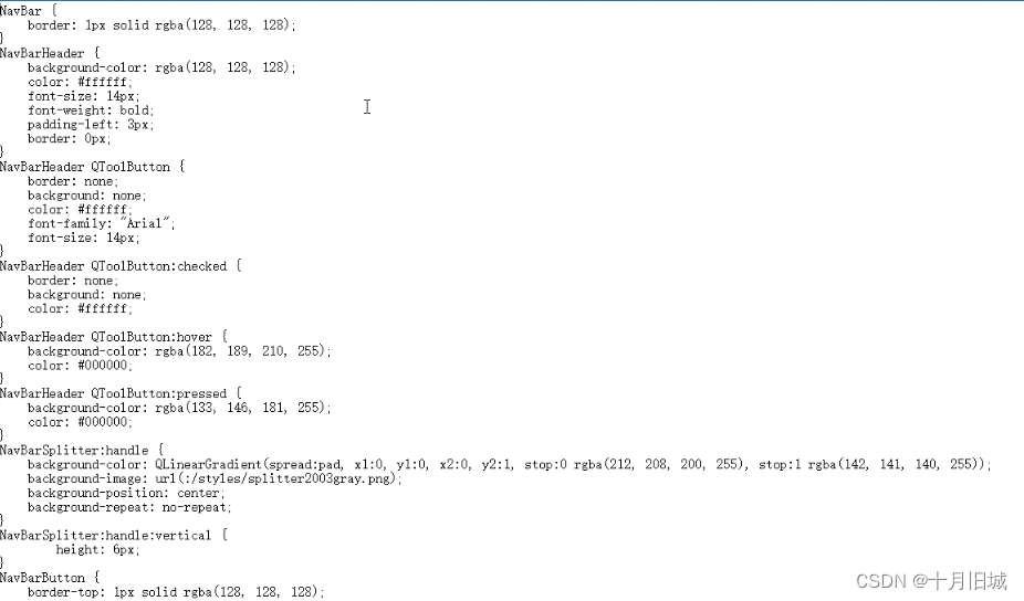
一、程序应用qss文件
QString qssPath = QString("%1/stylesheet/style.qss").arg(a.applicationDirPath());
QFile file(qssPath);
if(file.open(QFile::ReadOnly))
{
//     a.setStyleSheet(file.readAll());//在main()中this->setStyleSheet(file.readAll());//在MainWidget中}
file.close();
二、单个应用qss及语法
CSS语法教程
样式表子控件查阅
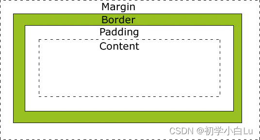
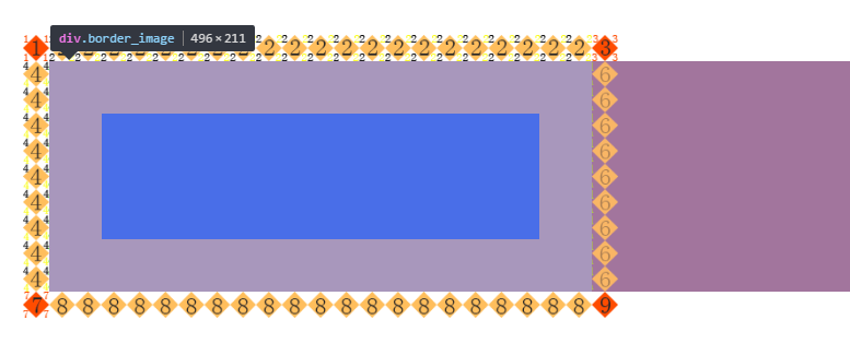
1、从里到外区域依次为:content、padding、border、margin。
2、冲突时,优先使用更具体的选择器
3、QSS遵循css规则,注释只能用/**/。不能用//或#。而且注释不能嵌套,最好一行一行的进行注释。
4、伪状态的冒号左右不能有空格,否则会报错,QSS解析错误,错误代码:Could not parse application stylesheet。
//不同的属性间用;分隔,同一个属性可以设置多个值,用空格分隔
selector {property1: value1 value2; property2: value3}
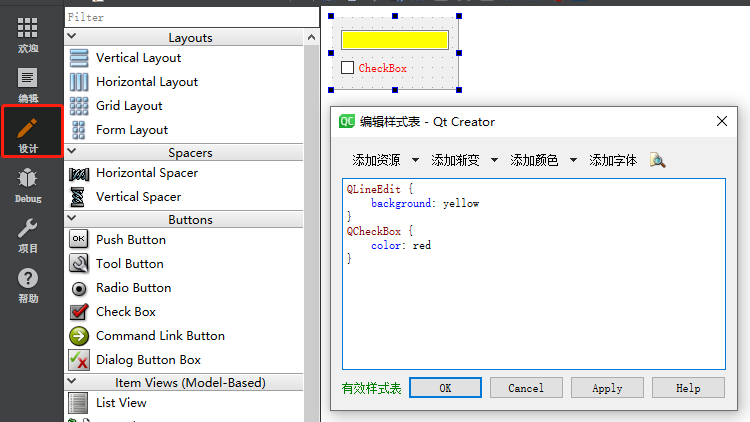
this->ui->label_2->setStyleSheet("{color:red}");//特定控件使用setStyleSheet(),不需要加选择器
myDialog->setStyleSheet("QLineEdit { background-color: yellow }");
m_centralWidget->setStyleSheet("QWidget#centralWidget{background-color:rgb(242, 242, 242,180)};");
QPushButton{color:blue;}/*实例及其子类*/
.QPushButton{color:blue;}/*实例不包含子类*/
QPushButton, QLineEdit{color:blue;}/*分组*/
QPushButton#okButton { color: gray }/*根据对象ID*/
#btnOK{font-weight:bold;}/*根据对象ID*/
#frameCut,#frameInterrupt,#frameJoin{font-weight:bold;} /*根据多个对象ID*/
#mytable  QPushButton{font-weight:bold;} /*表示选择所有id为mytable的容器下面的QPushButton实例*/
QPushButton[flat="true"] {color:red;}/*根据属性*/
QPushButton[flat="true"][default="false"]{color:red;}/*根据多个属性*/
QDialog QPushButton{color:red;}/*后代:QDialog容器中包含的QPushButton,不管是直接的还是间接的*/
QDialog > QPushButton{color:red;}/*子元素:QDialog容器下面的QPushButton,其中要求QPushButton的直接父容器是QDialog*/
QPushButton:hover{color:white}/*伪状态*/
QRadioButton:!hover{color:red}
QPushButton:hover:enabled{color:white}/*多个伪状态*/
/*子控件选择*/
QRadioButton::indicator::unchecked:disabled{image: url(:/qss/radiobutton_unchecked_disable.png);
}
QComboBox::drop-down:hover{background-color:red;}
ui->frame->setStyleSheet("QFrame{ color: red; border:1px solid red }");/*只Frame*/
ui->frame->setStyleSheet("QPushButton{ color: red; border:1px solid red }");/*frame下QPushButton*/
ui->frame->setStyleSheet("*{ color: red; border:1px solid red }");/*frame下所有*/
//设置边框颜色和像素的时候,必须是第一种顺序,而CSS中是无所谓的
border:1px solid red; //Ok
border:solid 1px red; //Error
border:red 1px solid; //Error
border:red solid 1px; //Error
//设置宽高必须要使用 min-width和min-height,max-width,max-height来设置,用width和height
//QComboBox由3部分组成,一个是QComboBox的外框,里面有一个下拉按钮,这个下拉按钮上面一般会有一个向下的箭头。
QComboBox::drop-down{//控制下拉按钮位置,左边或右边
}
QComboBox::down-arrow{//指定向下箭头的图像
}
QComboBox QAbstractItemView {//设置当点击下拉按钮之后弹出的下拉列表的样式,要注意的是这里的样式//仅仅只能设置弹出的整个下拉列表范围的矩形的样式,不能设置下拉列表//中的每一个下拉项的样式,例如不能设置每一个下拉项高度
}
QcomboBox{//设置未弹出下拉列表的样式
}QComboBox QAbstractItemView::item {
//设置弹出下拉列表中的每一个下拉项的样式,这里的样式要想生效,必须先
//对QcomboBox做下面的设置
//QStyledItemDelegate* itemDelegate = new QStyledItemDelegate();
//combox->setItemDelegate(itemDelegate);
}
3.1 CSS文字属性
CSS文字属性及示例 说明
color:#999999; 文字颜色
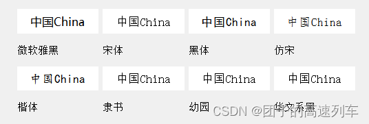
font-family:Microsoft Yahei,sans-serif; 字体家族
font-size:16pt; 字体大小
font-style:itelic;(normal、oblique) 字体样式
letter-spacing:1pt; 字间距离
line-height:200%; 设置行高
font-weight:bold;(lighter、normal、数值900) 字体粗细
text-decoration:underline;(line-through、overline、none) 字体修饰
text-align:left;(right、center、justify) 文字左对齐
vertical-align:top;(bottom、middle、text-top、text-bottom) 垂直对齐方式
text-transform:uppercase;(lowercase、capitalize) 英文大写
font-variant: small-caps;(normal) 小型大写字母
3.2 CSS背景样式:
CSS背景样式及示例	说明
background:black;	背景颜色为黑色
background-color:#F5E2EC;	背景颜色
background-image:url(/image/bg.gif);	背景图片
background:transparent;	透视背景
background-repeat : repeat;	重复排列-网页默认
background-position : center;	指定背景位置-居中对齐
3.3 CSS边框空白
CSS边框空白及示例	说明
padding:5px 10px 5px 10px;	所有边框留空白
padding-top:10px;	上边框留空白
padding-right:10px;	右边框留空白
padding-bottom:10px;	下边框留空白
padding-left:10px;	左边框留空白
3.4 CSS框线
CSS框线建议书写方式	说明
border:1px solid red;	所有边框线
border-top:1px solid #6699cc;	上框线
border-bottom:1px solid #6699cc;	下框线
border-left:1px solid #6699cc;	左框线
border-right:1px solid #6699cc;	右框线
border-radius:8px;	边框圆角半径
以上是建议书写方式,但也可以使用常规书写方式,如下表所示:
CSS框线常规书写方式	说明
border-top-color:#369;	设置上框线颜色
border-top-width:1px;	设置上框线宽度
border-top-style:solid	设置上框线样式
其他框线样式如下:
solid - 实线
dotted - 虚线
double - 双线
inset - 凹框
outset - 凸框
groove - 立体内凸框
ridge - 立体浮雕框
3.5 CSS边界样式
CSS边界样式及示例	说明
margin-top:10px;	上边界值
margin-right:10px;	右边界值
margin-bottom:10px;	下边界值
margin-left:10px;	左边界值
注:px:相对长度单位,像素(Pixel)。pt:绝对长度单位,点(Point)。
/*按钮普通态*/
QPushButton
{   font-family:Microsoft Yahei;    /*字体为微软雅黑*/ font-size:20pt;       /*字体大小为20点*/color:white;         /*字体颜色为白色*/ background-color:rgb(14 , 150 , 254);    /*背景颜色*/  border-radius:8px;     /*边框圆角半径为8像素*/
}
/*按钮停留态*/
QPushButton:hover
{     background-color:rgb(44 , 137 , 255);  /*背景颜色*/
}
/*按钮按下态*/
QPushButton:pressed
{      background-color:rgb(14 , 135 , 228);   /*背景颜色*/padding-left:3px;     /*左内边距为3像素,让按下时字向右移动3像素*/   padding-top:3px;     /*上内边距为3像素,让按下时字向下移动3像素*/
}
/*加图片*/
QPushButton{/*image: url(:/user.ico) ;image-position:0px left;*/ qproperty-icon: url(:/user.ico) off, url(:/user.ico) on; qproperty-iconSize: 16px 16px;
}
//正往下,负往上
QGroupBox::title{subcontrol-position:top center;top:20px;}
font-size:16px; //字体大小
三、失效原因
解决继承QWidget后设置样式(QSS)无效的办法
1、实现背景图像随Widget大小自动缩放
background-image:指定的背景图像无法随Widget大小自动缩放,
border-image:图像从border及其内的区域绘制,border被覆盖,支持缩放。
image:图像绘制到content区域内,image指定的url为SVG图像,则支持自动缩放,非SVG图像仅支持自动缩小。
(MainWidget、主Widget)设置有效,其他widget需在其上放一个QFrame,再设置QFrame的图像。但其子对象也继承该背景图片,最好用下面的方法。
//设置背景图
QPixmap pixmap("/bigback.png");
QPalette pe;
pe.setBrush(QPalette::Background,QBrush(pixmap));
setPalette(pe);
setAutoFillBackground(true);
2、窗口设置为透明的时候,才会出现QTextEdit、QLineEdit的背景颜色不生效的情况。
(1)QTextEdit设置背景色透明无效
直接调用background:transparent;无效。需要添加border:none;
(2)QLineEdit 设置 background:transparent; 无效,可能是没有设置 # border 属性
this->setStyleSheet("QTextEdit{color: red; background-color: green; border:0px;}");
this->setStyleSheet("QTextEdit{color: red; background-color: green; border:1px solid red;}");
this->setStyleSheet("QTextEdit{color: red; background-color: transparent; border:1px solid red;}");
3、QLineEdit 设置 padding-left 的时候,会把原来的大小撑大
4、QToolButton 中的menu设置样式无效,可能是 menu没有作为子窗体 无法继承自父窗体样式
5、QPushButton设置背景颜色须同时设置边框

因为pushbutton的原生边界把背景色给覆盖住了,要想使背景色生效,必须设置一下某个border属性,border-color、border-width等等任何一个跟border相关的属性都行。
四、例子
QSS入门
QSS应用
qss样式表笔记大全:可设置样式的窗口部件列表(上)
qss样式表笔记大全:可设置样式的窗口部件列表(中)
qss样式表笔记大全:可设置样式的窗口部件列表(下)
qlineargradient渐变色
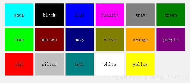
颜色设置有:
qlineargradient(线性渐变颜色设置)qradialgradient(辐射渐变)qconicalgradient(圆锥形渐变)QLinearGradient:显示从起点到终点的渐变。
QRadialGradient:以圆心为中心显示渐变。
QConicalGradient:围绕一个中心点显示渐变。
QGradient::PadSpread :填充区域内最接近的停止颜色。这是默认的。
QGradient::RepeatSpread : 在区域外继续重复填充。
QGradient::ReflectSpread : 在区域外反射填充。
PyDracula - 界面美化模板【视频】
PyDracula【Github地址】
QtDracula【Github地址】

//以窗口最大化/还原按钮为例说明动态属性
//如果之前已经设置了样式,重新设置时需要调用unpolish先卸载之前的样式,
//也可以直接使用setStyle(QApplication::style())一步到位
void Widget::setMaxButtonProperty()
{m_buttonMax->setProperty("maximizeProperty", this->isMaximized() ? true : false);m_buttonMax->style()->unpolish(m_buttonMax);    //先卸载之前的样式m_buttonMax->style()->polish(m_buttonMax);      //重新加载样式
//或者
//  m_buttonMax->setStyle(QApplication::style())    m_buttonMax->update();
}
QSpinBox,QComboBox{  /*设置spinBox combox 类和他们的所有子类的style*/
border:1px solid #242424; /*设置border*/
border-radius:3px;/*设置border圆角*/
padding:2px;
background:#484848; /*背景颜色*/
/*selection-background-color:#484848;
selection-color:#DCDCDC;*/
color : white;/*文本颜色,ComboBox上显示的,不是item里的*/
}QComboBox::down-arrow{/*设置combox 的下三角 style*/
image:url(:/psblack/add_bottom.png); /*设置图片*/
width:10px;
height:10px;
right:2px;
}
QComboBox::drop-down:on{
top:1px;
}
QComboBox::drop-down{
subcontrol-origin:padding; /*在padding区域 显示三角*/
subcontrol-position:top right; /*设置子控件的位置 右上 */
width:15px;
border-left-width:0px;
border-left-style:solid;
border-top-right-radius:3px;
border-bottom-right-radius:3px;
border-left-color:#242424;
}QComboBox:hover{ /*QComboBox的鼠标滑过  设置渐变色*/background:qlineargradient(spread:pad,x1:0,y1:0,x2:0,y2:1,stop:0 gray,stop:1 #525252);
}QComboBox QAbstractItemView { /*设置IQComboBox里的item 属性*//*  border: 2px solid darkgray;*/selection-color: white; /*选泽时的字体颜色*/selection-background-color: #484848;/*选泽时的背景颜色*/color : black;/*未被选择的字体颜色*/border: 0px; outline:0px; /*去掉虚线*/}QRadioButton{ /*设置QRadioButton的字体颜色*/color : white;
}QRadioButton::indicator::unchecked{ /*当radiobutton不被选中是的圆圈图片*/
image:url(:/psblack/radiobutton_unchecked.png);
}QRadioButton::indicator::unchecked:disabled{/*当radiobutton不被选中同时disabled状态时,的圆圈图片*/
image:url(:/psblack/radiobutton_unchecked_disable.png);
}QRadioButton::indicator::checked{ /*同理选中时*/
image:url(:/psblack/radiobutton_checked.png);
}QRadioButton::indicator::checked:disabled{
image:url(:/psblack/radiobutton_checked_disable.png);
}QTabWidget::pane{ /*好像是tabwidget的窗口*/background-color:#484848;
}
/* shuxing wei tab=true de suoyou widget baohan ta de zilei keyi
ba tabwidget nong quan hei le */
QWidget[tab="true"],.QWidget,QTabWidget{
background:#484848;
}
.QWidget{/*只是设置QWidget这一类,不会涉及到子类*/
border-bottom:1px solid #242424;
}QTabBar::tab{ /*设置tab标签*/
border:1px solid #242424;
color:#DCDCDC;
margin:0px;
min-height: 12;
background:qlineargradient(spread:pad,x1:0,y1:0,x2:0,y2:1,stop:0 #646464,stop:1 #525252);
}/*tabBar bei xuanzhong he shubiao huaguo*/
QTabBar::tab:selected,QTabBar::tab:hover{
border-style:solid;
border-color: white;
background:#444444;
}
/* shangfang de tabBar  hai you zuo you xia fang de bar */
/*设置在上面的tab标签,默认tab在控件上方*/
QTabBar::tab:top,QTabBar::tab:bottom{
padding:3px 8px 3px 8px;
}/*QTabBar::tab:left,QTabBar::tab:right{
padding:8px 3px 8px 3px;
} 被选中和鼠标滑过时*/
QTabBar::tab:top:selected,QTabBar::tab:top:hover{
border-width:0px 0px 2px 0px;
border-left-width:1px;
border-left-color:#242424;
border-right-width:1px;
border-right-color:#242424;
}.QLabel:disabled{color : gray;
}
QCheckBox,QLabel{color : white;
}QCheckBox:disabled{color : gray;
}
QCheckBox::indicator:unchecked{/*QCheckbox的方框*/
image:url(:/psblack/checkbox_unchecked.png);
}QCheckBox::indicator:unchecked:disabled{
image:url(:/psblack/checkbox_unchecked_disable.png);
}QCheckBox::indicator:checked{
image:url(:/psblack/checkbox_checked.png);
}QCheckBox::indicator:checked:disabled{
image:url(:/psblack/checkbox_checked_disable.png);
}QCheckBox::indicator:indeterminate{
image:url(:/psblack/checkbox_parcial.png);
}QCheckBox::indicator:indeterminate:disabled{
image:url(:/psblack/checkbox_parcial_disable.png);
}
.QGroupBox{
border:1px solid darkgray;
border-radius:4px;
margin-top:8px;
padding: 6px 0;
}.QGroupBox::title{ /*groupbox 的标题*/
subcontrol-origin:margin;
position:relative;
left:10px;
color : white;
}
QLineEdit {border: 1px solid gray;border-radius: 4px;padding: 0 0;background: gray;color : white;selection-background-color: rgb(4,113,206,220);
}/*.QPushButton{background:rgb(4,113,206,220);border-radius:4px;border:1px solid darkgray;min-width:60;min-height:18;color : white;
}*/
.QPushButton{
border-style:none;
border:1px solid #242424;
color:#DCDCDC;
padding:5px;
min-height:15;
min-width : 60;
border-radius:5px;
background:qlineargradient(spread:pad,x1:0,y1:0,x2:0,y2:1,stop:0 #484848,stop:1 #383838);
}
QPushButton#pushButton_SettingClose{/*只针对objectName为pushButton_SettingClose 的btn*/image:url(:/16-9/Exit.png);border : 0px ;padding:5px 0;min-width : 30;background: #484848;
}
QPushButton#pushButton_SettingClose:hover{/*当这个objectName的btn 鼠标经过时*/
background:qlineargradient(spread:pad,x1:0,y1:0,x2:0,y2:1,stop:0 #646464,stop:1 #525252);
}
.QPushButton:hover{
background:qlineargradient(spread:pad,x1:0,y1:0,x2:0,y2:1,stop:0 rgb(4,113,206,220),stop:1 rgb(4,113,206,100));
}.QPushButton:hover{
background:qlineargradient(spread:pad,x1:0,y1:0,x2:0,y2:1,stop:0 #646464,stop:1 #525252);
}.QPushButton:pressed{ /*btn按下时*/
background:qlineargradient(spread:pad,x1:0,y1:0,x2:0,y2:1,stop:0 #484848,stop:1 #383838);
}
.QPushButton:disabled{background:darkgray;
}QHeaderView::up-arrow{margin: 1px;top: 1px;right: 5px;width: 14px;image: url(:/res/arrow_up.png);
}
QHeaderView::down-arrow{margin: 1px;top: 1px;right: 5px;width: 14px;image: url(:/res/arrow_down.png);
}
/*浮动窗口*/
QDockWidget{color:rgb(230,230,230);/*背景色*/background-color:#343434;
}
/*浮动窗口-子控件弹出-鼠标停靠*/
QDockWidget::float-button:hover{/*背景色*/background-color:#0099ff;
}
/*按钮*/
QPushButton{/*前景色*/color:#e6e6e6;/*背景色*/background-color:rgb(0,153,255);/*边框-圆角*/border-radius:3px;/*字体*/font-family: "Microsoft YaHei";/*字体加粗*/font-weight:bold;/*字体尺寸*/font-size: 12px;/*高度*/height: 20px;
}
/*按钮-鼠标停靠*/
QPushButton:hover{/*背景色*/background-color:rgb(0,120,215);
}
/*按钮-鼠标按下*/
QPushButton:pressed{/*设置定位元素左外边距边界与其包含块左边界之间的偏移。*/top: 1px;/*设置定位元素的上外边距边界与其包含块上边界之间的偏移。*/left: 1px;
}
/*单行文本编辑*/
QLineEdit{/*前景色*/color:rgb(230,230,230);/*背景色*/background-color:rgb(51,51,55);/*边框*/border: 1px solid rgb(67,67,70);/*左内边距*/padding-left: 4px;/*最小宽度 - 1em 等于当前的字体尺寸。*/min-width: 6em;
}
/*单行文本编辑 - 鼠标停靠*/
QLineEdit:hover{/*前景色*/color:rgb(230,230,230);/*背景色*/background-color:rgb(51,51,55);/*边框*/border: 1px solid rgb(0,122,204);/*左内边距*/padding-left: 4px;/*最小宽度*/min-width: 6em;
}
/*文本编辑*/
QTextEdit{/*前景色*/color:rgb(0,0,0);
}
/*单选按钮*/
QRadioButton{/*前景色*/color:rgb(230,230,230);/*边框*/border:none;/*字体*/font-family: "Microsoft YaHei";/*字体加粗*/font-weight:bold;/*字体尺寸*/font-size: 12px;
}
/*带文本的复选框*/
QCheckBox{/*前景色*/color:rgb(230,230,230);/*边框*/border:none;/*字体*/font-family: "Microsoft YaHei";/*字体加粗*/font-weight:bold;/*字体尺寸*/font-size: 12px;
}
/*标签*/
QLabel{/*前景色*/color:rgb(230,230,230);/*边框*/border:none;/*字体*/font-family: "Microsoft YaHei";/*字体加粗*/font-weight:bold;/*字体尺寸*/font-size: 12px;
}QTabWidget {border: 0px transparent rgb(0,122,204);
}QTabWidget::pane {border-bottom: 0px transparent rgb(0,122,204);  padding: 5px;    	margin: 0px;
}QTabBar {  border-top: 2px solid rgb(0,122,204);    qproperty-drawBase: 0;
}QTabBar:focus {border: 0px transparent black;outline: 0px;
}QTabBar::tab:top {color: rgb(230,230,230);    border: 0px transparent rgb(0,122,204);    border-bottom: 1px transparent black;    background-color: rgb(45,45,48);    padding: 5px;    min-width: 50px;
}
QTabBar::tab:top:selected {color: rgb(230,230,230);    background-color: rgb(0,122,204);    border: 0px transparent rgb(0,122,204);    border-bottom: 2px solid rgb(28,151,234);
}
QTabBar::tab:top:!selected:hover {background-color: rgb(28,151,234);
}
/* BOTTOM TABS */QTabBar::tab:bottom {color: rgb(230,230,230);   border-top: 2px solid rgb(0,122,204);      background-color: rgb(45,45,48);   padding: 5px;            min-width: 50px;
}
QTabBar::tab:bottom:selected {    background-color: rgb(0,122,204);
}
QTabBar::tab:bottom:!selected:hover {background-color: rgb(28,151,234);border-top: 2px solid rgb(0,122,204);
}
/* LEFT TABS */QTabBar::tab:left {color: rgb(230,230,230);    border: 0px transparent rgb(0,122,204);    border-left: 1px transparent black;    background-color: rgb(45,45,48);    padding: 5px;            min-height: 50px;
}
QTabBar::tab:left:selected {color: rgb(230,230,230);    background-color: rgb(0,122,204);    border: 0px transparent rgb(0,122,204);    border-left: 2px solid rgb(28,151,234);
}
QTabBar::tab:left:!selected:hover {background-color: rgb(28,151,234);
}
/* RIGHT TABS */QTabBar::tab:right {color: rgb(230,230,230);    border: 0px transparent rgb(0,122,204);    border-right: 1px transparent black;    background-color: rgb(45,45,48);    padding: 5px;            min-height: 50px;
}
QTabBar::tab:right:selected {color: rgb(230,230,230);    background-color: rgb(0,122,204);    border: 0px transparent rgb(0,122,204);    border-right: 2px solid rgb(28,151,234);
}
QTabBar::tab:right:!selected:hover {background-color: rgb(28,151,234);
}QTabBar QToolButton::right-arrow:enabled {image: url(:/qss_icons/rc/right_arrow.png);
}
QTabBar QToolButton::left-arrow:enabled {image: url(:/qss_icons/rc/left_arrow.png);
}
QTabBar QToolButton::right-arrow:disabled {image: url(:/qss_icons/rc/right_arrow_disabled.png);
}
QTabBar QToolButton::left-arrow:disabled {image: url(:/qss_icons/rc/left_arrow_disabled.png);
}
/*菜单栏*/
QMenuBar {/*前景色*/color: rgb(230,230,230);/*背景色*/background-color: rgb(49,54,59);
}
/*菜单栏-子项目*/
QMenuBar::item {/*背景透明*/background: transparent;
}
/*菜单栏-子项目-选中*/
QMenuBar::item:selected {/*背景透明*/background: transparent; /*边框*/border: 1px solid rgb(118,121,124);
}
/*菜单栏-子项目-按下*/
QMenuBar::item:pressed {
/*菜单*//*前景色*/color: #eff0f1;/*背景色*/background-color: #3daee9;/*边框*/border: 1px solid #76797C;/*外边距-底部*/margin-bottom: -1px;/*内边距-底部*/padding-bottom: 1px;
}
QMenu {/*前景色*/color: #eff0f1;/*背景色*/background-color: #3daee9;/*边框*/border: 0px solid #76797C;/*外边距*/margin: 1px;
}
/*菜单-图标*/
QMenu::icon {/*边距*/margin: 5px;
}
/*菜单-子项目*/
QMenu::item {/*背景色*/background-color:rgb(44,44,44);/*边框*/border: 1px solid transparent; /*内边距*/padding: 5px 30px 5px 30px;
}
/*菜单-子项目-选中*/
QMenu::item:selected {/*前景色*/color: #eff0f1;
}
/*菜单-分割线*/
QMenu::separator {/*背景*/background: lightblue;/*高度*/height: 1px; /*内边距-左*/margin-left: 10px;/*内边距-右*/	margin-right: 5px;
}
/*菜单-指示器*/
QMenu::indicator {/*宽度*/width: 18px;    /*高度*/height: 18px;
}
/*数据表格*/
QTableWidget{/*前景色*/color:rgb(230,230,230);/*背景色*/background-color:rgb(35,35,35);/*网格线的颜色*/gridline-color:rgb(50,50,50);/*边框*/border:1px solid rgb(50,50,50);
}
/*数据表格-子项目-选中*/
QTableWidget::item::selected{/*前景色*/color:rgb(230,230,230);/*背景色*/background-color:rgb(0,112,204);
}
/*数据表格-子项目-焦点*/
QTableWidget::item::focus{/*前景色*/color:rgb(230,230,230);/*背景色*/background-color:rgb(255,112,204);
}
/*数据表格-表头*/
QTableWidget QHeaderView::section{/*前景色*/color:rgb(230,230,230);/*背景色*/background-color:rgb(30,30,30);/*边框*/border:1px solid rgb(50,50,50);/*边框-左*/border-left:0px;	/*边框-底部*/border-bottom:1px solid rgb(50,50,50);/*高度*/height:30;
}
/*数据表格-子项目-鼠标停留*/
QTableWidget::item:hover{
}
/*表右侧的滑条*/
QScrollBar:vertical{
}
/*滑块*/
QScrollBar::handle:vertical{
}
/*滑块悬浮*/
QScrollBar::handle:hover:vertical{
}
/*滑块按下*/
QScrollBar::handle:pressed:vertical{
}
/*滑块已经划过的区域*/
QScrollBar::sub-page:vertical{
}
/*滑块还没有划过的区域*/
QScrollBar::add-page:vertical{
}
/*微调框*/
QSpinBox,QDoubleSpinBox{/*前景色*/color:rgb(230,230,230);/*背景色*/background-color:rgb(51,51,55);/*边框*/border: 1px solid rgb(67,67,70);/*内边距-左*/padding-left: 4px;/*最小宽度*//*min-width: 6em;*/
}
/*微调框*/
QSpinBox:hover,QDoubleSpinBox:hover{/*边框*/border: 1px solid rgb(0,122,204);
}
/*微调框-向上、向下按钮*/
QSpinBox::up-button,
QSpinBox::down-button,
QDoubleSpinBox::up-button,
QDoubleSpinBox::down-button{/*背景色*/background-color:rgb(51,51,55);/*边框*/border: 1px solid rgb(67,67,70);
}
/*微调框-向上、向下按钮-按下*/
QSpinBox::up-button:pressed,
QSpinBox::down-button:pressed,
QDoubleSpinBox::up-button:pressed,
QDoubleSpinBox::down-button:pressed{/*背景色*/background-color:rgb(0,122,204);/*边框*/border: 1px solid rgb(0,122,204);
}
/*微调框-向上箭头*/
QSpinBox::up-arrow,
QDoubleSpinBox::up-arrow{/*宽度*/width: 7px;/*高度*/height: 3px;/*背景图片*/background-image: url(:/TradeClient/Resources/up_Arrow.png);
}
/*微调框-向下箭头*/
QSpinBox::down-arrow,
QDoubleSpinBox::down-arrow{/*宽度*/width: 7px;/*高度*/height: 3px;/*背景图片*/background-image: url(:/TradeClient/Resources/down_Arrow.png);
}
/*群组框*/
QGroupBox{/*最小高度*/min-height:35px;/*前景色*/color:rgb(230,230,230);/*边框*/border: 1px solid rgb(67,67,70);/*外边距-顶部*/margin-top: 6px;/*字体*/font-family: "Microsoft YaHei";/*字体加粗*/font-weight:bold;/*字体尺寸*/font-size: 12px;
}
/*群组框-标题*/
QGroupBox::title{subcontrol-origin: margin;subcontrol-position: top left;left:10px;     margin-left: 0px;padding:0 1px;
}
/*下拉框*/
QComboBox{color:rgb(230,230,230);/*背景色*/background-color:rgb(51,51,55);/*边框*/border: 1px solid rgb(67,67,70);/*内边距-左*/padding-left: 4px;
}
/*下拉框 - 鼠标停留*/
QComboBox:hover{/*背景色*/background-color:rgb(51,51,55);/*边框*/border: 1px solid rgb(0,122,204);/*内边距-左*/padding-left: 4px;
}
/*下拉框 - 下拉按钮*/
QComboBox::drop-down {/*边框*/border: 0px solid rgb(67,67,70);/*背景色*/background-color:rgb(51,51,55);/*内边距 - 左*/padding-left: 4px;subcontrol-origin: padding;subcontrol-position: top right;/*宽度*/width: 15px;
}
/*下拉框 - 下拉按钮 - 展开的状态*/
QComboBox::drop-down:on
{/*边框*/border: 0px solid rgb(67,67,70);/*背景色*/background-color:rgb(51,51,255);/*内边距- 左*/padding-left: 4px;subcontrol-origin: padding;subcontrol-position: top right;/*宽度*/width: 15px;
}
/*下拉框-下拉箭头*/
QComboBox::down-arrow {/*宽度*/width: 11px;/*高度*/height: 5px;left: -2px;/*背景图片*/background-image:url(:/TradeClient/Resources/combobox_arrow.png);
}
/*下拉框-下拉箭头-展开状态*/
QComboBox::down-arrow:on { top: 1px;left: -1px;
}
/*下拉框-下拉列表*/
QComboBox QAbstractItemView {/*前景色*/color:rgb(230,230,230);/*背景颜色*/background-color:rgb(27,27,28);/*选中时背景颜色*/selection-background-color: rgb(63,63,70);/*边框*/border: 0px solid darkgray;outline: 0px;
}
/*下拉框-下拉列表-子项目*/
QComboBox QAbstractItemView::item {border: 0px;  min-height: 25px;
}
/*下拉框-下拉列表-子项目 - 选中*/
QComboBox QAbstractItemView::item::selected {background-color: rgb(63,63,70);min-height: 30px;
}
/*日期编辑框*/
QDateEdit{color:rgb(230,230,230);/*背景色*/background-color:rgb(51,51,55);/*边框*/border: 1px solid rgb(67,67,70);/*内边距-左*/padding-left: 4px;
}
/*日期编辑框*/
QDateEdit:hover,QDateTimeEdit:hover{/*边框*/border: 1px solid rgb(0,122,204);
}
/*日期编辑框-下拉箭头*/
QDateEdit::down-arrow
{/*宽度*/width: 11px;/*高度*/height: 5px;left: -2px;/*背景图片*/background-image:url(:/TradeClient/Resources/combobox_arrow.png);
}
/*日期编辑框-下拉箭头- 展开状态*/
QDateEdit::down-arrow:on
{ top: 1px;left: -1px;
}
/*日期编辑框-右侧按钮*/
QDateEdit::drop-down
{color:rgb(230,230,230);/*背景色*/background-color:rgb(51, 51, 55);/*边框*/border:0px solid rgb(0,122,204);/*内边距-左*/padding-left:4px;subcontrol-origin: padding;subcontrol-position: top right;/*宽度*/width:15px;
}
/*日期时间编辑框*/
QDateTimeEdit
{color:rgb(230,230,230);/*背景色*/background-color:rgb(51,51,55);/*边框*/border: 1px solid rgb(67,67,70);/*内边距-左*/padding-left: 4px;
}
/*日期时间编辑框 - 向上、向下按钮*/
QDateTimeEdit::up-button,
QDateTimeEdit::down-button
{/*背景色*/background-color:rgb(51,51,55);/*边框*/border: 1px solid rgb(67,67,70);
}
/*日期时间编辑框 - 向上、向下按钮-按下*/
QtDateTimeEdit::up-button:pressed,
QtDateTimeEdit::down-button:pressed
{/*背景色*/background-color:rgb(0,122,204);/*边框*/border: 1px solid rgb(0,122,204);
}
/*日期时间编辑框 - 向上箭头*/
QtDateTimeEdit::up-arrow
{/*宽度*/width: 7px;/*高度*/height: 3px;/*背景图片*/background-image: url(:/TradeClient/Resources/up_Arrow.png);
}
/*日期时间编辑框 - 向下箭头*/
QtDateTimeEdit::down-arrow
{/*宽度*/width: 7px;/*高度*/height: 3px;/*背景图片*/background-image: url(:/TradeClient/Resources/down_Arrow.png);
}
QPushButton#title_max[maximizeProperty=false]
{width: 40px;height: 40px;background: transparent;border-image: url("://img/title/btn_max_normal.png")
}
QPushButton#title_max[maximizeProperty=false]:hover
{border-image: url("://img/title/btn_max_hover.png")
}
QPushButton#title_max[maximizeProperty=true]
{width: 40px;height: 40px;background: transparent;border-image: url(":/img/title/btn_maxTonormal_normal.png")
}
QPushButton#title_max[maximizeProperty=true]:hover
{border-image: url(":/img/title/btn_maxTonormal_hover.png")
}
原始属性
任何被Q_PROPERTY声明的属性都能在QSS中使用qproperty-<property name>语法进行设置。
以QToolButton为例,QToolButton继承至QAbstractButton,QAbstractButton拥有以下被Q_PROPERTY声明的属性,子类也可通过QSS使用父类中被Q_PROPERTY声明的属性,如下,text、icon、iconSize等属性均可在QSS中使用。
class Q_WIDGETS_EXPORT QAbstractButton : public QWidget
{Q_OBJECTQ_PROPERTY(QString text READ text WRITE setText)Q_PROPERTY(QIcon icon READ icon WRITE setIcon)Q_PROPERTY(QSize iconSize READ iconSize WRITE setIconSize)
#ifndef QT_NO_SHORTCUTQ_PROPERTY(QKeySequence shortcut READ shortcut WRITE setShortcut)
#endifQ_PROPERTY(bool checkable READ isCheckable WRITE setCheckable)Q_PROPERTY(bool checked READ isChecked WRITE setChecked DESIGNABLE isCheckable NOTIFY toggled USER true)Q_PROPERTY(bool autoRepeat READ autoRepeat WRITE setAutoRepeat)Q_PROPERTY(bool autoExclusive READ autoExclusive WRITE setAutoExclusive)Q_PROPERTY(int autoRepeatDelay READ autoRepeatDelay WRITE setAutoRepeatDelay)Q_PROPERTY(int autoRepeatInterval READ autoRepeatInterval WRITE setAutoRepeatInterval)Q_PROPERTY(bool down READ isDown WRITE setDown DESIGNABLE false)//.......
}
QToolButton
QToolButton
{ qproperty-text: "QSS使用属性1";qproperty-icon: url(://img/cat.png);qproperty-iconSize: 121px 121px;
}
QToolButton { /* all types of tool button */border: 2px solid #8f8f91;border-radius: 6px;background-color: qlineargradient(x1: 0, y1: 0, x2: 0, y2: 1,stop: 0 #f6f7fa, stop: 1 #dadbde);}QToolButton[popupMode="1"] { /* only for MenuButtonPopup */padding-right: 20px; /* make way for the popup button */}QToolButton:pressed {background-color: qlineargradient(x1: 0, y1: 0, x2: 0, y2: 1,stop: 0 #dadbde, stop: 1 #f6f7fa);}/* the subcontrols below are used only in the MenuButtonPopup mode *///只对 弹出方式为 MenuButtonPopup 的QToolButton有效QToolButton::menu-button {border: 2px solid gray;border-top-right-radius: 6px;border-bottom-right-radius: 6px;/* 16px width + 4px for border = 20px allocated above */width: 16px;}QToolButton::menu-arrow {image: url(downarrow.png);}
QMenu
/*Qmenu Style Sheets*/
QMenu {background-color: white; /* sets background of the menu 设置整个菜单区域的背景色,我用的是白色:white*/border: 1px solid white;/*整个菜单区域的边框粗细、样式、颜色*/
}
QMenu::item {/* sets background of menu item. set this to something non-transparent  if you want menu color and menu item color to be different */background-color: transparent;padding:8px 32px;/*设置菜单项文字上下和左右的内边距,效果就是菜单中的条目左右上下有了间隔*/margin:0px 8px;/*设置菜单项的外边距*/border-bottom:1px solid #DBDBDB;/*为菜单项之间添加横线间隔*/
}
QMenu::item:selected { /* when user selects item using mouse or keyboard */background-color: #2dabf9;/*这一句是设置菜单项鼠标经过选中的样式*/
}
QSlider
//水平方向
QSlider::groove:horizontal {
border: 1px solid #4A708B;
background: #C0C0C0;
height: 5px;
border-radius: 1px;
padding-left:-1px;
padding-right:-1px;
}QSlider::sub-page:horizontal {
background: qlineargradient(x1:0, y1:0, x2:0, y2:1, stop:0 #B1B1B1, stop:1 #c4c4c4);
background: qlineargradient(x1: 0, y1: 0.2, x2: 1, y2: 1,stop: 0 #5DCCFF, stop: 1 #1874CD);
border: 1px solid #4A708B;
height: 10px;
border-radius: 2px;
}QSlider::add-page:horizontal {
background: #575757;
border: 0px solid #777;
height: 10px;
border-radius: 2px;
}QSlider::handle:horizontal
{background: qradialgradient(spread:pad, cx:0.5, cy:0.5, radius:0.5, fx:0.5, fy:0.5, stop:0.6 #45ADED, stop:0.778409 rgba(255, 255, 255, 255));width: 11px;margin-top: -3px;margin-bottom: -3px;border-radius: 5px;
}QSlider::handle:horizontal:hover {background: qradialgradient(spread:pad, cx:0.5, cy:0.5, radius:0.5, fx:0.5, fy:0.5, stop:0.6 #2A8BDA, stop:0.778409 rgba(255, 255, 255, 255));width: 11px;margin-top: -3px;margin-bottom: -3px;border-radius: 5px;
}QSlider::sub-page:horizontal:disabled {
background: #00009C;
border-color: #999;
}QSlider::add-page:horizontal:disabled {
background: #eee;
border-color: #999;
}QSlider::handle:horizontal:disabled {
background: #eee;
border: 1px solid #aaa;
border-radius: 4px;
}
QScrollBar
QScrollBar:vertical/*垂直滚动条整个区域*/
{padding:8px 0px 8px 0px;/*预留出的上下两个按钮的空间*/background-color:red;min-width:10px;max-width:10px;
}
QScrollBar::handle:vertical/*垂直滚动条 中间滑块*/
{min-width:10px;max-width:10px;background-color:yellow; }QScrollBar::add-line:vertical/*滑块下方点击按钮*/{min-height:20px;max-height:20px;background-color:rgb(0,255,255); }QScrollBar::sub-line:vertical/*滑块上方点击按钮*/{min-height:20px;max-height:20px;background-color:rgb(0,255,255); }QScrollBar::add-page:vertical/*滑块下方按钮到滑块下方区域*/{min-height:20px;max-height:20px;background-color:rgb(0,255,0); }QScrollBar::sub-page:vertical/*滑块上方按钮到滑块上方区域*/{min-height:20px;max-height:20px;background-color:rgb(0,255,255); }//垂直方向QSlider::groove:vertical {
border: 1px solid #4A708B;
background: #C0C0C0;
width: 5px;
border-radius: 1px;
padding-left:-1px;
padding-right:-1px;
padding-top:-1px;
padding-bottom:-1px;
}QSlider::sub-page:vertical {
background: #575757;
border: 1px solid #4A708B;
border-radius: 2px;
}QSlider::add-page:vertical {
background: qlineargradient(x1:0, y1:0, x2:0, y2:1, stop:0 #c4c4c4, stop:1 #B1B1B1);
background: qlineargradient(x1: 0, y1: 0.2, x2: 1, y2: 1,stop: 0 #5DCCFF, stop: 1 #1874CD);
border: 0px solid #777;
width: 10px;
border-radius: 2px;
}QSlider::handle:vertical
{background: qradialgradient(spread:pad, cx:0.5, cy:0.5, radius:0.5, fx:0.5, fy:0.5, stop:0.6 #45ADED,
<span>	</span>stop:0.778409 rgba(255, 255, 255, 255));height: 11px;margin-left: -3px;margin-right: -3px;border-radius: 5px;
}QSlider::sub-page:vertical:disabled {
background: #00009C;
border-color: #999;
}QSlider::add-page:vertical:disabled {
background: #eee;
border-color: #999;
}QSlider::handle:vertical:disabled {
background: #eee;
border: 1px solid #aaa;
border-radius: 4px;
}
QScrollBar:horizontal
{padding:0px 8px 0px 8px;background-color:red;min-height:10px;max-height:10px;
}
QScrollBar::handle:horizontal
{min-height:10px;max-height:10px;background-color:rgb(152,152,1); }QScrollBar::add-line:horizontal{min-width:20px;max-width:20px;background-color:rgb(255,0,0); }QScrollBar::sub-line:horizontal{min-width:20px;max-width:20px;background-color:rgb(255,0,0); }QScrollBar::add-page:horizontal{min-height:20px;max-height:20px;background-color:rgb(0,255,0); }QScrollBar::sub-page:horizontal{min-height:20px;max-height:20px;background-color:rgb(0,255,255); }
QCheckBox
QCheckBox::indicator   /*QCheckBox可勾选区域*/
{width:20px;height:16px;
}
QCheckBox::indicator:checked /*QCheckBox勾选*/
{border-image:url(image/selected.png);
}
QCheckBox::indicator:unchecked /*QCheckBox未勾选*/
{border-image:url(image/unSelect.png);
}
QCheckBox::indicator:indeterminate  /*QCheckBox半勾选*/
{background-color:red;
}
QComboBox
QTabWidget
QTabBar::tab  /*tab页的颜色*/
{color:red;background-color:yellow;}QTabBar::tab:hover{background-color:red;}QTabBar::tab:selected/*当前选择的tab页*/{background-color:white;}QTabWidget:pane /*QTabWidget 中间窗体的背景色*/
{border:none;   }
QTableView
QTableView {color: white;                                       /*表格内文字颜色*/gridline-color: black;                              /*表格内框颜色*/background-color: rgb(108, 108, 108);               /*表格内背景色*/alternate-background-color: rgb(64, 64, 64);selection-color: white;                             /*选中区域的文字颜色*/selection-background-color: rgb(77, 77, 77);        /*选中区域的背景色*/border: 2px groove gray;border-radius: 0px;padding: 2px 4px;
}
QCalendarWidget
QCalendarWidget QTableView
{color:#ffffff;    alternate-background-color:#3275d4;background-color:#3275d4;
}
QCalendarWidget QTableView
{selection-color: yellow;selection-background-color: rgb(77, 77, 77);}QToolButton#qt_calendar_nextmonth
{background-color:red;
}QToolButton#qt_calendar_prevmonth
{background-color:red;
}QToolButton#qt_calendar_monthbutton
{background-color:yellow;}QToolButton#qt_calendar_yearbutton
{background-color:rgb(0,255,255);}QSpinBox#qt_calendar_yearedit
{background-color:#3275d4;color:yellow;} QWidget#qt_calendar_navigationbar{color:yellow;background-color:yellow;}
QSpinBox
QSpinBox::up-button/*右侧上方点击按钮*/
{}
QSpinBox::down-button/*右侧下方点击按钮*/
{}
QSpinBox::up-arrow/*右侧上方点击按钮中的小三角区域*/
{}
QSpinBox::down-arrow/*右侧下方点击按钮中的小三角区域*/
{}
QPushButton::menu-indicator{image:None;}
QPushButton:focus{padding: -5;}
QMenuBar
{background-image: url(./images/background_main_top.png);
}
QTreeWidget#treeWidget
{background-image: url(./images/background_main_left.png);padding-top:5px;
}
QFrame#frame
{background-image: url(./images/background.png);border: 0px;
}
QFrame#frame_3
{background-image: url(./images/background.png);border: 0px;
}QPushButton#pushButton_1
{background-image: url(./images/btn_1.png);background-color: transparent;border: 0px;
}
QPushButton#pushButton_1:hover{background-image: url(./images/btn_1_hover.png);border: 0px;
}
QPushButton#pushButton_1:checked{background-image: url(:/res/image/11.png);border: 0px;
}QPushButton#pushButton_10{background-image: url(./images/btn_10.png);background-color: transparent;border: 0px;
}
QPushButton#pushButton_10:hover{background-image: url(./images/btn_10_hover.png);border: 0px;
}
QPushButton#pushButton_10:checked{background-image: url(:/res/image/22.png);border: 0px;
}
4、分类示例
4.1 QPushButton
QPushButton图标和文本的位置
QPushButton{background-color: #2786ba;				/* 背景颜色 */border-radius:5px;					    /* 按钮边框的圆角设置 *//* 按钮背景图标设置 */background-image: url(:/configIcon.png);  /* 背景图片 */background-origin: content;background-position: center;			/* 背景图片的位置 */padding-right: 40px;				    /* 背景图标的padding参数 */padding-bottom: 2px;					/* 背景图标的padding参数 */background-repeat: no-repeat;			/* 设置背景图像的平铺模式 *//* 按钮文本设置 */text-align: top;						/* 文本的位置 */padding-left: 2px;						/* 文本的padding参数 */		padding-top: 2px;font-size: 12px;color: #FFFFFF;							/* 文本颜色 */
}
4.2 QTabWidget
QTabWidget扁平样式
4.3 QTableWidget
QTablewidget只显示横分割线,不显示竖分割线
ui->tableWidget->setShowGrid(false);
ui->tableWidget->setStyleSheet(	"QTableWidget::Item{border:0px solid rgb(255,0,0);""border-bottom:1px solid rgb(255,0,0);}"
);
4.4 QGroupBox
groupBox->setStyleSheet("QGroupBox {border-width:1px;border-style:solid;border-color:lightGray;margin-top:1.5ex;}"\"QGroupBox::title{subcontrol-origin:margin;subcontrol-position:top left;left:7px;margin-left: 0px;padding:0.1px;}");