一、选择器类型
Qt QSS选择器和CSS2、CSS3的选择器类似,建议先学习或者复习一下CSS选择器的语法。QSS虽然和CSS类型,但有也稍许不同,而且支持的语法也没那么多,具体讲解如下。
1.1 类选择器
/*
匹配QPushButton的实例及其子类
*/
QPushButton {color: blue;
}/*
匹配QPushButton的实例,但不包含子类
*/
.QPushButton {color: blue;
}
1.2 选择器分组
/*同时匹配QPushButton、QLineEdit的实例
*/
QPushButton, QLineEdit {color:blue;}
1.3 ID选择器
/*
匹配所有objectName为btnOK的实例
*/
*#btnOK {font-weight:bold;}/*
和*#btnOK一样,匹配所有objectName为btnOK的实例
*/
#btnOK {font-weight:bold;}/*
匹配所有objectName为btnOK的QPushButton实例
*/
QPushButton#btnOK {font-weight:bold;}
1.4 属性选择器
/*
匹配包含flat属性的所有实例
*/
*[flat] {color:red;}/*
匹配包含flat属性的所有QPushButton的实例
*/
QPushButton[flat] {color:red;}/*
匹配flat属性为true的所有QPushButton的实例
*/
QPushButton[flat="true"] {color:red;}/*
匹配falt属性为true且default属性为false的所有QPushButton的实例
*/
QPushButton[flat="true"][default="false"] {color:red;}
1.5 后代选择器
/*
匹配属于QDialog后代(孩子,孙子等)的QPushButton所有实例
*/
QDialog QPushButton {color:red;}
1.6 子元素选择器
/*
匹配属于QDialog直接子类的QPushButton所有实例
*/
QDialog > QPushButton {color:red;}
1.7 伪状态
/*
匹配hover状态的所有QPushButton的实例
*/
QPushButton:hover { color: white }/*
匹配同时为hover和enabled状态的所有QPushButton的实例
*/
QPushButton:hover:enabled { color: white }/*
匹配不为hover状态的所有QPushButton的实例
*/
QRadioButton:!hover { color: red }
1.8 子控件选择器
QRadioButton::indicator::unchecked:disabled {image: url(:/qss/radiobutton_unchecked_disable.png);
}
二、选择器优先级
一句话归纳为:优先使用更具体的选择器。
具体实例如下:
/*
QPushButton#okButton选择器比QPushButton更具体,所以选择QPushButton#okButton
*/
QPushButton#okButton { color: gray }
QPushButton { color: red }
/*
如下2个规则应用于QPushButton实例时:
因为QPushButton继承QAbstractButton,所以QPushButton比QAbstractButton更具体,选择QPushButton
*/
QPushButton { color: red }
QAbstractButton { color: gray }
/*
指定伪状态比不指定伪状态的选择器更具体,所以当鼠标悬停时选择QPushButton:hover,否则选择QPushButton
*/
QPushButton:hover { color: white }
QPushButton { color: red }
/*
如下2个规则应用于处于Enabled状态的QPushButton实例时:
鼠标悬停时,QPushButton:hover更能具体描述当前状态,所以选择QPushButton:hover
其他时候选择QPushButton:enabled
*/
QPushButton:enabled { color: red}
QPushButton:hover { color: white}
/*
如下2个规则应用于处于Enabled状态的QPushButton实例时:
鼠标悬停时,QPushButton:enabled:hover更能具体描述当前状态,所以选择QPushButton:enabled:hover
其他时候选择QPushButton:enabled
*/
QPushButton:enabled { color: red}
QPushButton:hover { color: white}
QPushButton:enabled:hover { color: white}
三、QSS支持的类型、属性、伪状态、子控件
关于QSS支持哪些类型、每种类型支持哪些属性、伪状态和子控件,在Qt的官方的英文文档中有详细的介绍,这里就不赘诉了。
《Qt Style Sheets Reference》
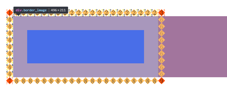
四、盒子模型
在使用QSS设置样式时,有一个关键的概念需要知晓,那就是“盒子模型”(即Box Model)。

每个Widget都被视为具有4个同心矩形的框:
MARGIN矩形、BORDER矩形、PADDING矩形和CONTENT矩形,上图标注了每个矩形的区域。
默认情况下MARGIN矩形、BORDER矩形、PADDING矩形的宽度都为0,这样在默认情况下,4个矩形就重合为1个CONTENT矩形了。
同样,默认情况下background-image指定的背景,只在border内的区域绘制。但我们要也可以使用background-clip或background-origin属性来更改这种默认行为。
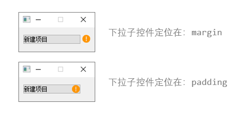
如何实现背景图像随Widget大小自动缩放?
background-image指定的背景图像无法随Widget大小自动缩放,要提供可以随Widget大小缩放的背景图像可以使用border-image和image属性,二者区别如下:
- border-image属性指定的图像从border及其内的区域开始绘制,会导致border属性被覆盖。
- image属性指定的图像从绘制到content区域内,image指定的url为SVG图像,则支持自动缩放,非SVG图像仅支持自动缩小。