Stack/Positioned是用来做页面布局定位的组件,需要结合使用
Stack
children:一个数组,里面可放多个Widgetalignment:Alignment.topCenter//对齐方式,会对所有的子组件统一设置对齐,不灵活,一般不用Positioned
child:一个子组件left,top,right,bottom,width,heigh://设置这些值会改变子组件的大小,位置(相对于最外层组件)
Stack
Stack组件可以将子组件叠加显示,根据子组件的顺利依次向上叠加,用法如下:
Stack(children: <Widget>[Container(height: 200,width: 200,color: Colors.red,),Container(height: 170,width: 170,color: Colors.blue,),Container(height: 140,width: 140,color: Colors.yellow,),ElevatedButton(onPressed: (){}, child: Text('这个视图按钮好'))],)
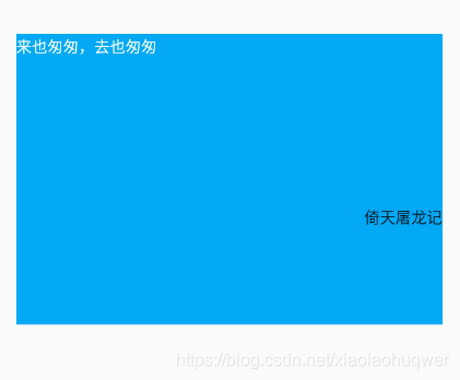
从效果可以看出视图一次从左上方开始堆叠,子视图最下方的视图展示再最外层。
Stack未定位的子组件大小由fit参数决定,默认值是StackFit.loose,表示子组件自己决定,StackFit.expand表示尽可能的大,用法如下:
Stack(fit: StackFit.expand,...
)Stack未定位的子组件的默认左上角对齐,通过alignment参数控制,用法如下:
Stack(alignment: Alignment.center,...
)
有没有注意到fit和alignment参数控制的都是未定位的子组件,那什么样的组件叫做定位的子组件?使用Positioned包裹的子组件就是定位的子组件,用法如下:
Stack(fit: StackFit.loose,alignment: Alignment.center,children: <Widget>[Container(height: 200,width: 200,color: Colors.red,),Container(height: 170,width: 170,color: Colors.blue,),Container(height: 140,width: 140,color: Colors.yellow,),Positioned(bottom: 0,right: 0,child: ElevatedButton(onPressed: (){}, child: Text('这个视图按钮好')))],)
如果子组件超过Stack边界由clipBehavior控制,默认是裁剪,下面设置总是显示的用法:
Stack(clipBehavior: Clip.none,children: <Widget>[Container(height: 200,width: 200,color: Colors.red,),Positioned(left: 100,top: 100,height: 150,width: 150,child: Container(color: Colors.green,),)],)
IndexedStack
IndexedStack是Stack的子类,Stack是将所有的子组件叠加显示,而IndexedStack只显示指定的子组件,用法如下:
Column(children: [_buildView3(),Row(children: [ElevatedButton(onPressed: (){setState(() {_index=0;});}, child: Icon(Icons.fastfood)),ElevatedButton(onPressed: (){setState(() {_index=1;});}, child: Icon(Icons.cake)),ElevatedButton(onPressed: (){setState(() {_index=2;});}, child: Icon(Icons.local_cafe))],)],)_buildView3(){return IndexedStack(index: _index,children: [Center(child: Container(height: 300,width: 300,color: Colors.yellow,child: Icon(Icons.fastfood,color: Colors.blue,),),),Center(child: Container(height: 300,width: 300,color: Colors.red,child: Icon(Icons.cake,color: Colors.blue,),),),Center(child: Container(height: 300,width: 300,color: Colors.blueGrey,child: Icon(Icons.local_cafe,color: Colors.blue,),),),],);}效果(点击切换_inex,只显示第index层视图):


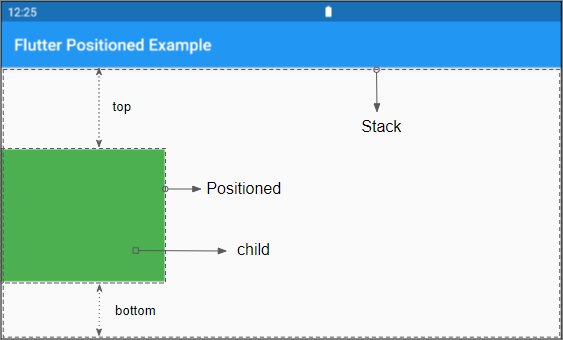
Positioned
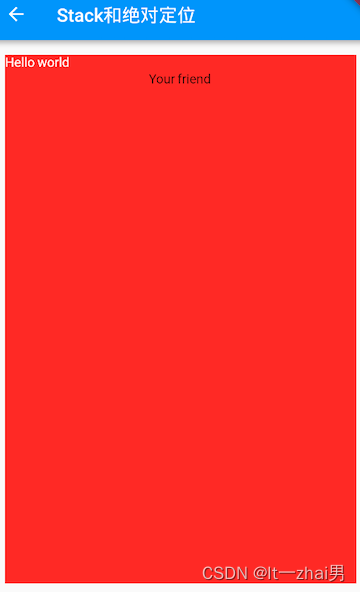
Positioned用于定位Stack子组件,Positioned必须是Stack的子组件,基本用法如下:
Container(height: 300,width: 300,color: Colors.amberAccent,child: Stack(children: <Widget>[Positioned(left: 10,right: 10,top: 10,bottom: 10,child: Container(color: Colors.red),),],),)
相关说明:
-
提供
top、bottom、left、right四种定位属性,分别表示距离上下左右的距离。 -
只能用于Stack组件中。
-
left、right和width3个参数只能设置其中2个,因为设置了其中2个,第三个已经确定了,同理top、bottom和height也只能设置其中2个。
Positioned提供便捷的构建方式,比如Positioned.fromRect、Positioned.fill等,这些便捷的构建方式万变不离其宗,只不过换了一种方式设置top、bottom、left、right四种定位属性。