前言
之前在饼图中提到过,要整理一下南丁格尔玫瑰图的画法😑
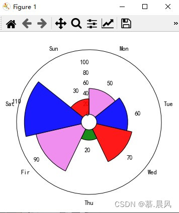
南丁格尔玫瑰图又名鸡冠花图、极坐标区域图,是南丁格尔在克里米亚战争期间提交的一份关于士兵死伤的报告时发明的一种图表。南丁格尔玫瑰图是在极坐标下绘制的柱状图,使用圆弧的半径长短表示数据的大小(数量的多少)。
- 由于半径和面积的关系是平方的关系,南丁格尔玫瑰图会将数据的比例大小夸大,尤其适合对比大小相近的数值。
- 由于圆形有周期的特性,所以玫瑰图也适用于表示一个周期内的时间概念,比如星期、月份。
图
需要的工具
可视化:ggplot2
处理:stringr、dplyr
library(ggplot2)
library(dplyr)
library(stringr)
数据处理
来源:https://github.com/rfordatascience/tidytuesday
hike_data <- readr::read_rds("https://raw.githubusercontent.com/rfordatascience/tidytuesday/master/data/2020/2020-11-24/hike_data.rds")
hike_data$region <- as.factor(word(hike_data$location, 1, sep = " -- "))
hike_data$length_num <- as.numeric(sapply(strsplit(hike_data$length, " "), "[[", 1))plot_df <- hike_data %>%group_by(region) %>%summarise(sum_length = sum(length_num),mean_gain = mean(as.numeric(gain)),n = n()) %>%mutate(mean_gain = round(mean_gain, digits = 0))
数据长这个样子:

先画一个柱状图
使用:geom_col
p <- ggplot(plot_df) + geom_col(aes(x = reorder(str_wrap(region, 5), sum_length),y = sum_length,fill = n),position = "dodge2",show.legend = TRUE,alpha = .9)p

转为极坐标
使用:coord_polar()
p <- p + coord_polar()
p

加一点细节
p + geom_hline(aes(yintercept = y), data.frame(y = c(0:3) * 1000),color = "lightgrey") +geom_segment(aes(x = reorder(str_wrap(region, 5), sum_length),y = 0,xend = reorder(str_wrap(region, 5), sum_length),yend = 3000),linetype = "dashed",color = "gray12") +scale_y_continuous(limits = c(-1500, 3500),expand = c(0, 0),breaks = c(0, 1000, 2000, 3000)) + scale_fill_gradientn("Amount of Tracks",colours = c( "#6C5B7B","#C06C84","#F67280","#F8B195")) +guides(fill = guide_colorsteps(barwidth = 15, barheight = .5, title.position = "top", title.hjust = .5)) + theme_minimal()+theme(axis.title = element_blank(),axis.ticks = element_blank(),axis.text.y = element_blank(),axis.text.x = element_text(color = "gray12", size = 12),legend.position = "bottom")
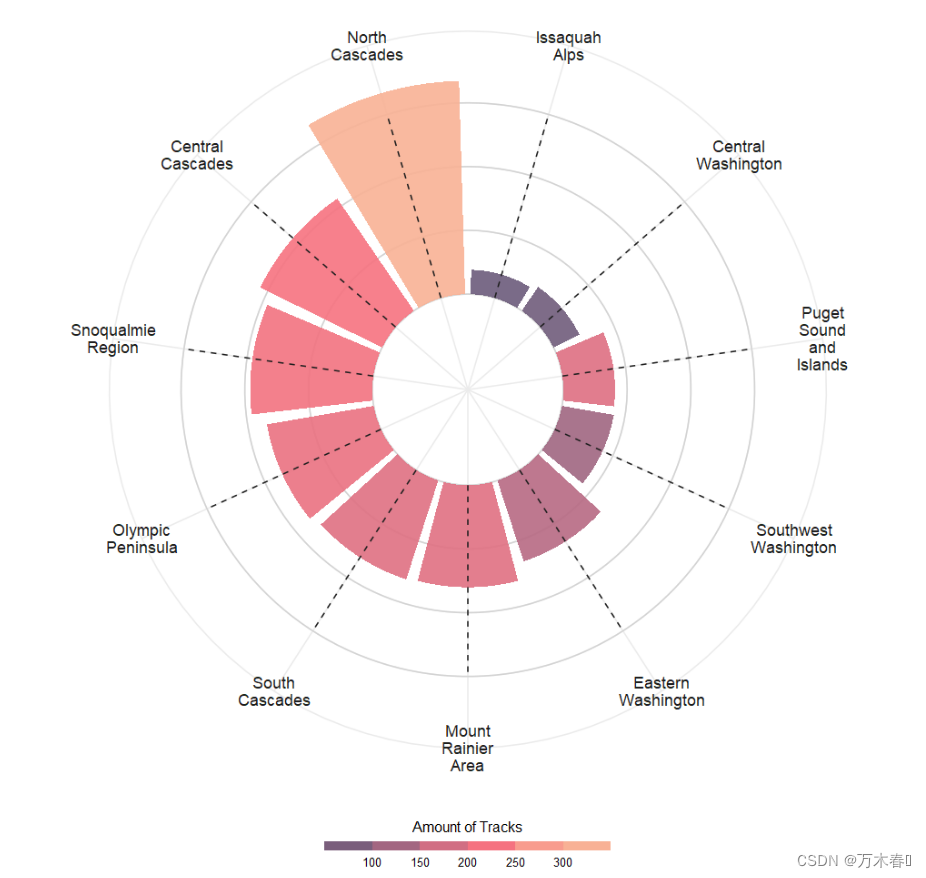
最后的图大概就是这个样子,还挺好看😑
所有的代码
library(ggplot2)
library(stringr)hike_data <- readr::read_rds("https://raw.githubusercontent.com/rfordatascience/tidytuesday/master/data/2020/2020-11-24/hike_data.rds")
hike_data$region <- as.factor(word(hike_data$location, 1, sep = " -- "))
hike_data$length_num <- as.numeric(sapply(strsplit(hike_data$length, " "), "[[", 1))plot_df <- hike_data %>%group_by(region) %>%summarise(sum_length = sum(length_num),mean_gain = mean(as.numeric(gain)),n = n()) %>%mutate(mean_gain = round(mean_gain, digits = 0))plt <- ggplot(plot_df) +geom_hline(aes(yintercept = y), data.frame(y = c(0:3) * 1000),color = "lightgrey") + geom_col(aes(x = reorder(str_wrap(region, 5), sum_length),y = sum_length,fill = n),position = "dodge2",show.legend = TRUE,alpha = .9) +# Lollipop shaft for mean gain per regiongeom_segment(aes(x = reorder(str_wrap(region, 5), sum_length),y = 0,xend = reorder(str_wrap(region, 5), sum_length),yend = 3000),linetype = "dashed",color = "gray12") + coord_polar()plt <- plt +scale_y_continuous(limits = c(-1500, 3500),expand = c(0, 0),breaks = c(0, 1000, 2000, 3000)) + scale_fill_gradientn("Amount of Tracks",colours = c( "#6C5B7B","#C06C84","#F67280","#F8B195")) +guides(fill = guide_colorsteps(barwidth = 15, barheight = .5, title.position = "top", title.hjust = .5)) + theme_minimal()+theme(axis.title = element_blank(),axis.ticks = element_blank(),axis.text.y = element_blank(),axis.text.x = element_text(color = "gray12", size = 12),legend.position = "bottom")


![[数据可视化] 南丁格尔玫瑰图](https://img-blog.csdnimg.cn/img_convert/d43ddd8d26cc8eb1bb8a8063f9b31d5c.png)