一、📚网页介绍
明天就是女朋友的生日了, 是时候展现专属于程序员的浪漫了!你打算怎么给心爱的人表达爱意?鲜花礼物?代码表白?还是创意DIY?或者…无论那种形式,快来秀我们一脸吧!
二、🎀网页效果
▶️视频演示
HTML生日祝福网页制作(粉色主题)程序员专属生日表白网站
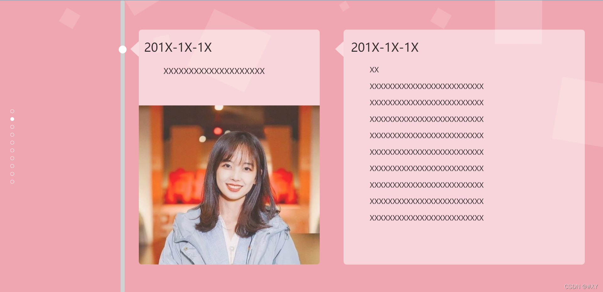
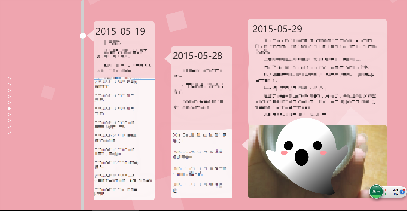
🌈图片演示


三、🏙️网页代码
💬注:以下代码为部分演示,如需完整源码请看文章末尾
🧱HTML代码
<!DOCTYPE html>
<html lang="zh"><head><meta charset="UTF-8" /><meta http-equiv="X-UA-Compatible" content="IE=edge,chrome=1" /><meta name="viewport" content="width=device-width, initial-scale=1.0" /><title>生日快乐</title><link rel="stylesheet" type="text/css" href="css/index.css" /></head><body><div class="htmleaf-container"><div class="wrapper"><div class="container"><h1>生日快乐</h1><form class="form"><inputid="userName"name="userName"type="text"value=""placeholder="姓名"/><input id="pwd" name="pwd" type="password" placeholder="密码" /><button type="submit" id="login-button">进入</button></form></div><ul class="bg-bubbles"><li><img src="./img/timg.gif" style="width: 100%; height: 100%" /></li><li><img src="./img/timg.gif" style="width: 100%; height: 100%" /></li><li><img src="./img/timg.gif" style="width: 100%; height: 100%" /></li><li><img src="./img/timg.gif" style="width: 100%; height: 100%" /></li><li><img src="./img/timg.gif" style="width: 100%; height: 100%" /></li><li><img src="./img/timg.gif" style="width: 100%; height: 100%" /></li><li><img src="./img/timg.gif" style="width: 100%; height: 100%" /></li><li><img src="./img/timg.gif" style="width: 100%; height: 100%" /></li><li><img src="./img/timg.gif" style="width: 100%; height: 100%" /></li><li><img src="./img/timg.gif" style="width: 100%; height: 100%" /></li></ul></div></div><audio src="music/1.mp3" autoplay="autoplay" loop="loop"><script src="js/jquery-2.1.1.min.js" type="text/javascript"></script><script src="js/index.js" type="text/javascript"></script></body>
</html>
❄️CSS代码
* {box-sizing: border-box;margin: 0;padding: 0;font-weight: 300;
}
body {font-family:"Microsoft YaHei";color: white;font-weight: 300;
}
body ::-webkit-input-placeholder {/* WebKit browsers */font-family:"Microsoft YaHei";color: white;font-weight: 300;
}
body :-moz-placeholder {/* Mozilla Firefox 4 to 18 */font-family:"Microsoft YaHei";color: white;opacity: 1;font-weight: 300;
}
body ::-moz-placeholder {/* Mozilla Firefox 19+ */font-family:"Microsoft YaHei";color: white;opacity: 1;font-weight: 300;
}
body :-ms-input-placeholder {/* Internet Explorer 10+ */font-family:"Microsoft YaHei";color: white;font-weight: 300;
}
.wrapper {background: #ee9ca7;background: -webkit-linear-gradient(top left, #ee9ca7 0%, #ee9ca7 100%);background: linear-gradient(to bottom right, #ee9ca7 0%, #ee9ca7 100%);background-color:rgba(255,255,255,0.9);position: absolute;top:0;left: 0;width: 100%;height: 100%;overflow: hidden;}.wrapper.form-success .container h1 {-webkit-transform: translateY(85px);-ms-transform: translateY(85px);transform: translateY(85px);
}
.container {max-width: 600px;margin: 0 auto;margin-top: 7%;padding: 80px 0;height: 400px;text-align: center;
}
.container h1 {font-size: 40px;-webkit-transition-duration: 1s;transition-duration: 1s;-webkit-transition-timing-function: ease-in-put;transition-timing-function: ease-in-put;font-weight: 200;
}
form {padding: 20px 0;position: relative;z-index: 2;
}
form input {-webkit-appearance: none;-moz-appearance: none;appearance: none;outline: 0;border: 1px solid rgba(255, 255, 255, 0.4);background-color: rgba(255, 255, 255, 0.2);width: 250px;border-radius: 3px;padding: 10px 15px;margin: 0 auto 10px auto;display: block;text-align: center;font-family: "Microsoft YaHei";font-size: 18px;color: white;-webkit-transition-duration: 0.25s;transition-duration: 0.25s;font-weight: 300;
}
form input:hover {background-color: rgba(255, 255, 255, 0.4);
}
form input:focus {background-color: white;width: 300px;color: #ee9ca7;
}
form button {-webkit-appearance: none;-moz-appearance: none;appearance: none;outline: 0;background-color: white;font-family: "Microsoft YaHei";border: 0;padding: 10px 15px;color: #ee9ca7;border-radius: 3px;width: 250px;cursor: pointer;font-size: 18px;-webkit-transition-duration: 0.25s;transition-duration: 0.25s;
}
form button:hover {background-color: #f5f7f9;
}
.bg-bubbles {position: absolute;top: 0;left: 0;width: 100%;height: 100%;z-index: 1;
}@keyframes square {0% {-webkit-transform: translateY(0);transform: translateY(0);}100% {-webkit-transform: translateY(-900px) rotate(600deg);transform: translateY(-900px) rotate(600deg);}
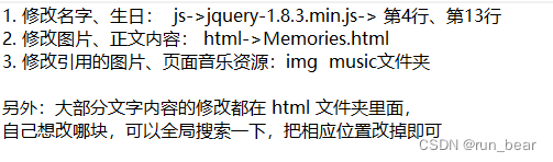
}四、🎁获取源码
1.如果我的博客对你有帮助 请 “👍点赞” “✍️评论” “💙收藏” 一键三连哦!
2.💗【👇🏻👇🏻👇🏻🉑关注我| 获取更多源码】 带您学习各种前端插件、3D炫酷效果、图片展示、文字效果、以及整站模板 、大学生毕业HTML模板 、等!
📣以上内容技术相关问题💌欢迎一起交流学习👇🏻👇🏻👇🏻