目录
- 官方自带的colormap
- 其他的colormap
- 结果
- 单独绘制一个colorbar
- 用自己的颜色创建colormap
- 获取图片颜色
- 给定一个基本颜色,通过改变饱和度来创建colorbar
官方自带的colormap
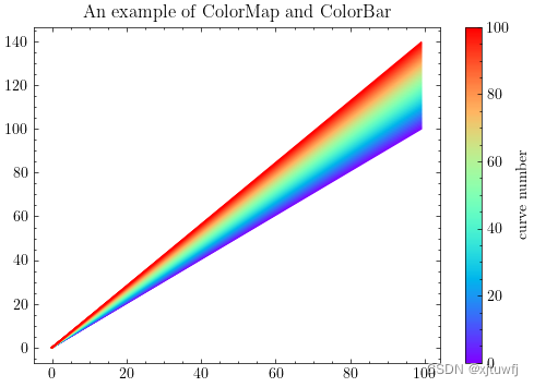
import numpy as np
import matplotlib.pyplot as pltnum_curves = 100 #100条曲线
cm = plt.cm.rainbow(np.linspace(0, 1, num_curves))
sm = plt.cm.ScalarMappable(cmap='rainbow',norm=plt.Normalize(vmin=0, vmax=num_curves))
fig = plt.figure(figsize=(6,4))
for i in range(num_curves):curve = np.linspace(0,100+0.4*i,100) #生成曲线plt.plot(curve,color=cm[i])
plt.title('An example of ColorMap and ColorBar')
cb = plt.colorbar(sm)
cb.set_label('curve number')
plt.show()
其他的colormap
可参考官网链接: https://matplotlib.org/2.0.2/users/colormaps.html
结果
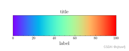
单独绘制一个colorbar
cycle_num = 100fig, ax = plt.subplots(figsize=(5, 2))  # 设置colorbar的尺寸
fig.subplots_adjust(bottom=0.3, top=0.7,left=0.1,right=0.9)  # 调整图的上下边距sm = plt.cm.ScalarMappable(cmap='rainbow', norm=plt.Normalize(vmin=0, vmax=cycle_num))
cb = plt.colorbar(sm, cax=ax, orientation='horizontal')  # 指定colorbar为水平方向
cb.set_label('label', fontsize=14)  # 设置colorbar的标签字体大小
plt.title('title', fontsize=14)  # 设置colorbar的标题字体大小
plt.show()
结果:
用自己的颜色创建colormap
from matplotlib.colors import LinearSegmentedColormap
def create_colormap(rgb_list,alpha_list=None):'''取rgb_list里面的颜色,通过等间隔线性插值,生成colormap:param rgb_list: 形如[(0.69,0.53,0.81),(0.92,0.10,0.50),(1.00,0.78,0.01)]list中的颜色为colorbar中插值点的颜色:param alpha_list: 透明度列表,形如[0.2,0.3]:return:colorbar'''num_of_colors = len(rgb_list)interpolation_points = np.linspace(0,1,num_of_colors) #插值点位置red, green, blue = [], [], []for i in range(num_of_colors):r = [interpolation_points[i],rgb_list[i][0],rgb_list[i][0]]g = [interpolation_points[i],rgb_list[i][1],rgb_list[i][1]]b = [interpolation_points[i],rgb_list[i][2],rgb_list[i][2]]red.append(r)green.append(g)blue.append(b)if alpha_list is not None: #透明度变化alpha = []local = np.linspace(0, 1, len(alpha_list))for i in range(len(alpha_list)):alpha.append([local[i],alpha_list[i],alpha_list[i]])else: #不透明alpha =[[0,1,1],[1,1,1]]color_dict = {'red':red,'green':green,'blue':blue,'alpha':alpha}my_colormap = LinearSegmentedColormap(name='my_colormap', segmentdata=color_dict)plt.register_cmap(cmap=my_colormap)return my_colormap
测试create_colormap函数
color_list = [(0.69,0.53,0.81),(0.92,0.10,0.50),(1.00,0.78,0.01)]
cmap = create_colormap(color_list)
num_curves = 100 #100条曲线
cm = cmap(np.linspace(0, 1, num_curves))
sm = plt.cm.ScalarMappable(cmap=cmap,norm=plt.Normalize(vmin=0, vmax=num_curves))
fig = plt.figure(figsize=(6,4))
for i in range(num_curves):curve = np.linspace(0,100+0.4*i,100) #生成曲线plt.plot(curve,color=cm[i])
plt.title('Another example of ColorMap and ColorBar')
cb = plt.colorbar(sm)
cb.set_label('curve number')
plt.show()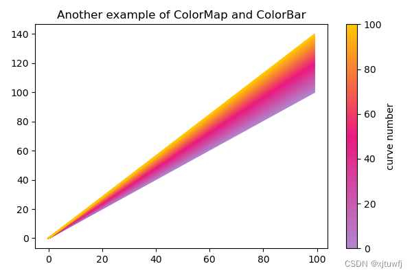
获取图片颜色
可以参考这篇:https://blog.csdn.net/baidu_38963740/article/details/125210583?spm=1001.2014.3001.5501
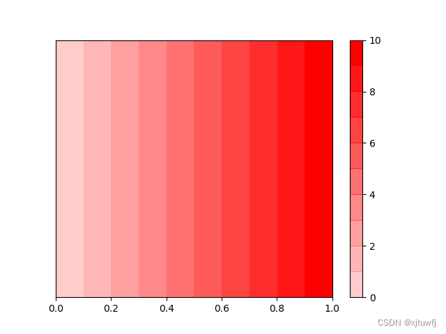
给定一个基本颜色,通过改变饱和度来创建colorbar
import matplotlib.pyplot as plt
import numpy as np
import matplotlib.colors as mcolorsdef generate_colorbar(base_color, num_steps=10):# Convert the base_color to RGB format if it's not alreadybase_color_rgb = mcolors.to_rgba(base_color)[:3]# Create an array of colors with the same hue as the base_color but varying saturationsaturation_values = np.linspace(0.2, 1, num_steps)colors = [base_color_rgb + (s,) for s in saturation_values]# Create a custom colormap using the generated colorscmap = mcolors.ListedColormap(colors)# Create a colorbar with the custom colormapnorm = mcolors.Normalize(vmin=0, vmax=num_steps)scalar_map = plt.cm.ScalarMappable(cmap=cmap, norm=norm)scalar_map.set_array([])# Plot the colorbarplt.colorbar(scalar_map)# Optional: Display a sample image with the colorbar to visualize the gradientgradient_image = np.linspace(0, 1, 100).reshape(1, -1)plt.imshow(gradient_image, cmap=cmap, aspect='auto', extent=(0, 1, 0, 0.1))plt.yticks([])# Show the plotplt.show()# Example:
base_color = 'red'
generate_colorbar(base_color, num_steps=10)
运行结果: