(推荐个别人写的css特效网站CSS3的奇思妙想,感觉有好多蛮好玩的功能,这个特效是在里面偏下面一点的位置)
(最好还是看一下动画的演示效果,直接复制粘贴就行了)
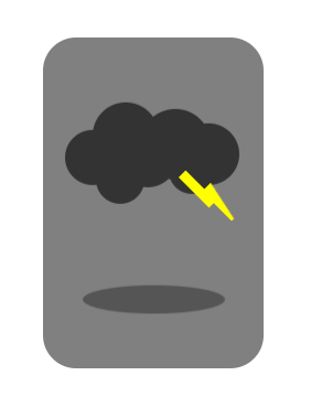
实现原理其实很简单,三个部分,云层,阴影和闪电
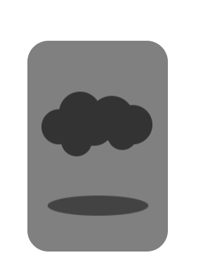
云层部分的实现可以通过一个圆球加上阴影(这样就可以制造很多圆),多个圆通过设置位置进行堆叠就可以显示出云层的样子,然后让云层上下移动就可以了
阴影部分的实现就是通过一个动画,一个边框为弧形的矩形(现在好像应该称呼它为椭圆形),让它不断进行缩放,并改变背景颜色深浅即可
闪电部分的实现,大家应该都懂怎么用边框搞出一个三角形吧(就比如把div设为 0 宽 0 高,上边框设为有颜色的 30px ,右边框设为透明的 30px ,就可以看到一个三角形),而闪电就可以看成一个矩形加一个三角形,三角形有了,再用阴影弄一个矩形就可以了(我感觉三角形太尖了不太好看,就把 div 的宽高设为 3px )。然后设置闪电是绕哪个点旋转的,其中适当调节角度和位置就可以了。最后就是设置闪电的动画,注意要把 animation-timing-function 设为 steps(1, end); 让它一步一步做(不然这闪电就在里面转起了圈)
<!DOCTYPE html>
<html><head><style>#weather_thunder_div{position: absolute;width: 200px;height: 300px;left: 50vw;top: 50vh;border-radius: 30px;background-color: grey;transform: translate(-100px, -150px);}#weather_thunder{position: absolute;left: 20px;top: 80px;width: 50px;height: 50px;border-radius: 50%;background-color: #333333;box-shadow:30px -20px 0px 5px #333333,25px 20px 0px -3px #333333,50px 0px 0px 2px #333333,75px -12px 0px 7px #333333,90px 12px 0px -4px #333333,105px -3px 0px 3px #333333;animation-name: cloud_move;animation-duration: 3s;animation-iteration-count: infinite;animation-direction: alternate;animation-timing-function: ease-in-out;}#weather_thunder::before{content: "";position: absolute;left: 80px;top: 65px;width: 3px;height: 3px;border-top: 38px solid yellow ;border-right: 8px solid transparent;border-left: 0px;box-shadow: -7px -25px 0px -1px yellow;transform-origin: 30px -80px;animation-name: thunder_change;animation-duration: 6s;animation-timing-function: steps(1, end);animation-iteration-count: infinite;}#weather_thunder::after{content: "";position: absolute;left: 17.5px;top: 145px;width: 125px;height: 25px;border-radius: 50%;background-color: rgba(0, 0, 0, 0.3);animation-name: cloud_shadow;animation-duration: 3s;animation-iteration-count: infinite;animation-direction: alternate;animation-timing-function: ease-in-out;}@keyframes cloud_move {to { transform: translateY(30px) ;}}@keyframes cloud_shadow {to {background-color: rgba(0, 0, 0, 0.6);transform: scale(1.25) translateY(-30px);}}@keyframes thunder_change {0% { transform: rotate(30deg) translate(-10px, 20px); opacity: 1}5% { transform: rotate(-45deg) translate(-10px, -20px); opacity: 1}10% { transform: rotate(20deg) translate(-10px, 20px); opacity: 1}90% { transform: rotate(-15deg) translate(10px, -10px); opacity: 1}95% { transform: rotate(0deg) translate(0px, -3px); opacity: 1}15% { opacity: 0;}}</style></head><body><div id = "weather_thunder_div"><div id = "weather_thunder"></div></div></body>
</html>
(感觉没事练练这种特效,css确实熟悉了不少,佩服这些大佬的代码水平,越学越感觉自己啥都不会)