| 目录 |
1.移动端概述和hybird模式
2.响应式布局基础
3.响应式布局之流式布局
4.做移动端项目之前的准备
5.响应式布局demo
6.rem响应式布局
7.swiper的使用和轮播图
8.综合案例-微信场景应用
| 1.移动端概述和hybird模式 |
移动端:运行在移动设备上的产品
产品大部分都只需要适配ios和安卓系统即可
响应式布局:在不同的设备上都能给予客户最好的操作体验
移动端产品分为APP手机应用和H5
目前市面上流行的APP产品大部分都是原生APP开发者做的,ios:object-c,安卓:java-native,目前市场正在趋于使用js来开发原生APP:React Native、phoneGap…
H5:HTML页面,都是运行在浏览器中的(PC端浏览器、移动端浏览器),在ios和安卓平台上浏览器大部分是webkit内核的,所以移动端做H5页面不用像PC端一样处理兼容
总结:
1.做HTMl页面,需要在PC端和移动端访问
2.PC端和移动端用的是不同的项目,例如:京东、淘宝、QQ…PC端的项目不需要做响应式
3.在移动端开发出来的HTML页面运行的环境:移动端的浏览器、原生APP(Native APP)的webView中:hyBrid模式。例如在微信中打开一个H5页面,其实就是运行在微信的webView中的
hyBrid模式(混合模式移动应用)
把开发的H5页面嵌入到Native APP中的webView中运行(所谓的webView简单理解为一个浏览器,也是webkit内核的)
| 2.响应式布局基础 |
搭建一个H5页面,需要在head中添加一个meta标签:
<meta name="viewport"
 content="width=device-width, user-scalable=no, initial-scale=1.0, maximum-scale=1.0, minimum-scale=1.0">
webstorm中:meta:vp 加tab键可以自动生成
js动态设置:
var oMeta = document.createElement("meta");
oMeta.name = "viewport";
oMeta.content = "width=device-width, user-scalable=no, initial-scale=1.0, maximum-scale=1.0, minimum-scale=1.0";
document.head.appendChild(oMeta);
viewport:视口
width=device-width:设置视口的宽度等于设备的宽度,如果不设置的话,默认宽度为980像素。通俗的说,就是告诉当前的浏览器按照多大的宽度来渲染页面,即展示当前这个页面的区域有多宽(浏览器宽度)
user-scalable=no:禁止用户手动缩放
initial-scale=1.0, maximum-scale=1.0, minimum-scale=1.0:设置屏幕默认/最大/最小的缩放比例
高清屏:
苹果手机是二倍高清屏的,也就是我们在手机上看到的那张100*100的图片,其实苹果手机是按照200*200的尺寸进行渲染的,这样的话,如果真实图片本身才100*100,最后呈现出来的就是被拉伸后变模糊的效果。故:苹果手机上需要的图片都需要比看到的尺寸大一倍才可以
DPI适配思想:在做页面的时候,最好每一张素材图片都准备2~3套,比如:logo.png是100*100,logo@2x.png是200*200,logo@3x.png是300*300
媒体查询 @media
媒体设备:all所有设备 screen所有屏幕设备(PC+移动端) print打印机设备…
媒体条件:指定在什么样的条件下指定对应样式
例如:
@media all and (max-width:319px){}宽度小于320px
@media all and (min-width:320px) and (max-width:359px){}在320~360之间
@media all and (-webkit-device-pixel-ratio:2){}二倍屏
| 3.响应式布局之流式布局 |
响应式布局的解决方法:
在真实项目中,设计师的设计稿一般是:640*1136 或 640*960 或 750*1334
流式布局法:
- 容器或者盒子的宽度一般都不是固定的值,而是使用百分比,相对于视口区域的百分比
- 其余的样式:字体、高度、margin、padding等等都按照设计稿上标注尺寸的一半来设置
- 对于有些屏幕尺寸下,设置的固定值不是特别好看的话,使用@media进行微调整
苹果手机的尺寸:
5s及以下都是320px、6是375px、6p是414px
常用的安卓机尺寸:320px、360px、480px、540px、 720px…
特殊情况:设计稿是640px,素材图也是640px,这样的话在iPhone6/6p展示的时候,图片不够大,对于这种情况需要向设计师单独要一张更大的图,比如:1280px的尺寸
@media all and (-webkit-min-device-pixel-ratio: 2) and (min-width: 321px) {.box {background: url("banner@big.png");}
}@media all and (min-width: 641px) {.box {background: url("banner@big.png");}
}| 4.做移动端项目之前的准备 |
常用的META标签(移动端)
忽略数字自动识别为电话号码:
<meta name="format-detection" content="telephone=no"/>
把页面增加到桌面主屏幕:
在苹果手机的Safari浏览器中访问一个页面,用户可以通过“添加到桌面”这一操作把网页保存到自己的主屏幕桌面上(就像安装一个APP,在主屏幕上就会有一个操作的图标),这样下一次可以直接点击图标打开页面。(只对IOS有效)
WebApp全屏模式:
<meta name="apple-mobile-web-app-capable" content="yes"/>
设置状态栏颜色:
只有在开启WebApp全屏模式下才能起到效果。content的值为 default(状态栏将为正常的,即白色,网页从状态栏以下开始显示) | black(状态栏将为黑色,网页从状态栏以下开始显示) | black-translucent(状态栏将为灰色半透明,网页将充满整个屏幕,状态栏会盖在网页之上)。
<meta name="apple-mobile-web-app-status-bar-style" content="black-translucent"/>
添加到主屏后的图标:
<link href="图片的地址" sizes="114x114" rel="apple-touch-icon-precomposed"/>
IOS系统中对ICON有一套规范,就是在IOS设备的图标统一为“四边圆角”、“高光处理”。至于“图标阴影”,是IOS设备中统一为所有桌面元素增加的,所以不作为图标单独处理的样式。rel=”apple-touch-icon-precomposed”是设定按照设计稿原图的图标显示,rel=”apple-touch-icon”是设定在原图的基础上增加一些高光光亮效果。一般来说我们的ICON的尺寸是114x114。
添加到主屏后的标题:
<meta name="apple-mobile-web-app-title" content="标题"/>
添加智能App广告条 Smart App Banner(不常用):
<meta name="apple-itunes-app" content="app-id=myAppStoreID, affiliate-data=myAffiliateData, app-argument=myURL"/>
QQ浏览器(X5内核)独有的META:
<meta name="x5-orientation" content="portrait|landscape"/> //->设置屏幕方向 <meta name="x5-fullscreen" content="true"/> //->设置全屏
UC浏览器独有的META:
<meta name="screen-orientation" content="portrait|landscape"/> //->设置屏幕方向 <meta name="full-screen" content="true"/> //->设置全屏 <meta name="viewport" content="uc-fitscreen=no|yes"/> //->缩放不出现滚动条 <meta name="nightmode" content="enable|disable"/> //->夜间模式
强制图片显示:UC浏览器为了节省流量,为用户提供了无图模式,但是如果页面的图片是必不可少的,如验证码的,需要强制浏览器显示图片,可以设置imagemode。通过META设置图片加载方式会作用于整个页面,如果希望对单个图片进行设置,那么可以使用这个<img src="" show="force"/>
<meta name="imagemode" content="force"/>
使用了application这种应用模式后,页面讲默认全屏,禁止长按菜单,禁止收拾,标准排版,以及强制图片显示。
<meta name="browsermode" content="application"/>
详细可参考:
http://www.zhufengpeixun.com/qianduanjishuziliao/mobileDevelopment/2016-07-02/480.html
常用的META标签:
http://www.zhufengpeixun.com/qianduanjishuziliao/mobileDevelopment/2016-06-29/457.html
| 5.响应式布局demo |
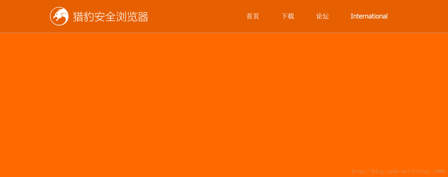
HTML代码:
<!DOCTYPE html>
<html>
<head><meta charset="UTF-8"><title>Title</title><meta name="viewport"content="width=device-width, user-scalable=no, initial-scale=1.0, maximum-scale=1.0, minimum-scale=1.0"><meta name="format-detection" content="telephone=no"/><link rel="stylesheet" charset="UTF-8" href="reset.css" type="text/css"><link rel="stylesheet" charset="UTF-8" href="index.css" type="text/css"><!--[if lt IE 9]><script charset="UTF-8" type="text/javascript" src="HTML5.min.js"></script><![endif]-->
</head>
<body><header class="header"><div class="con"><h1 class="logo"><a href="#"><img src="img/logo.png"/></a>猎豹安全浏览器</h1><nav class="nav"><ul><li class="bg"><a href="#">首页<i></i></a></li><li><a href="#">下载<i></i></a></li><li><a href="#">论坛<i></i></a></li><li><a href="#">International<i></i></a></li></ul></nav></div>
</header>
<div class="headerBg"></div><!--banner-->
<section class="banner"></section>
<script type="text/javascript"></script>
</body>
</html>
css代码:
html, body {width: 100%;overflow-x: hidden;
}a {color: #000;
}a:hover, a:active {color: #000;
}.con {width: 960px;margin: 0 auto;
}/*header*/
.header, .headerBg {height: 89px;position: absolute;top: 0;left: 0;width: 100%;overflow: hidden;z-index: 10;
}.header {border-bottom: 1px solid #999;
}.headerBg {opacity: 0.1;filter: alpha(opacity=10);background: #000;z-index: 9;
}.header .logo {float: left;width: 270px;height: 51px;margin-top: 19px;font-size: 0;
}.header .logo img {width: 100%;height: 100%;
}.header .nav {float: right;
}.header .nav li {position: relative;float: left;
}.header .nav li a {display: block;text-decoration: none;padding: 0 30px;height: 89px;line-height: 89px;color: #f4f4f4;font-size: 18px;
}.header .nav li.bg a {color: #fff;
}.header .nav li a i {z-index: -1;position: absolute;top: 0;left: 50%;width: 0; /*目标值为100%*/margin-left: 0; /*目标值为-50%*/height: 89px;background: #000;opacity: 0.1;filter: alpha(opacity=10);
}.header .nav li a:hover i {width: 100%;margin-left: -50%;/*过渡动画 PC端写5套,移动端只留第一和最后一个,顺序不能变*/-webkit-transition: all .1s linear 0s;-moz-transition: all .1s linear 0s;-o-transition: all .1s linear 0s;-ms-transition: all .1s linear 0s;transition: all .1s linear 0s;
}/*banner*/
.banner {width: 100%;height: 490px;background: #ff6900;
}/*响应式*/
@media all and (max-width: 760px) {.con {width: 100%;}.header .nav {display: none;}.header, .headerBg {height: 46px;}.header .logo {height: 28px;width: 148px;margin-top: 9px;margin-left: 10px;}.header .nav {float: right;}
}| 6.rem响应式布局 |
做的H5页面只在移动端访问,可以用rem,因为rem不兼容低版本的浏览器
rem是指当前页面中元素的REM单位的样式值都是针对于HTML元素的fontSize的值进行动态计算
例如:
让当前方块在页面中垂直、水平居中:
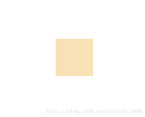
传统方式:
<!DOCTYPE html>
<html>
<head><meta charset="UTF-8"><title>Title</title><meta name="viewport"content="width=device-width, user-scalable=no, initial-scale=1.0, maximum-scale=1.0, minimum-scale=1.0"><meta name="format-detection" content="telephone=no"/><link rel="stylesheet" charset="UTF-8" href="reset.css" type="text/css"><link rel="stylesheet" charset="UTF-8" href="index.css" type="text/css"><!--[if lt IE 9]><script charset="UTF-8" type="text/javascript" src="HTML5.min.js"></script><![endif]--><style type="text/css">html {font-size: 100px;}html, body {width: 100%;height: 100%;overflow: hidden;}.box {position: absolute;top: 0;left: 0;right: 0;bottom: 0;margin: auto;width: 200px;height: 200px;background: #f7e1b5;}</style>
</head>
<body>
<div class="box"></div>
<script type="text/javascript"></script>
</body>
</html>
使用rem布局:
.box {...width: 2rem;height: 2rem;...
}第一步:从UI设计师拿到设计稿(psd格式的设计稿) 640*1136
第二步:在样式中给HTML设置一个fontSize的值,一般都设置一个方便后面计算的值,如:100px,之所以用100px,主要是浏览器最小的字体都是12px,用10px比例计算的结果和真实的UI设计稿会存在那么一点偏差
html {font-size: 100px; /*相当于1REM = 100px*/
}第三步:写页面,写样式,完全按照设计稿的尺寸来写样式,此时不用管任何事情,设计稿的宽度、高度、字体大小、margin、padding的值是多少,就写多少
但是在写样式的时候,需要把得到的像素值除以100,计算出对应的REM的值,设定的也都是REM的值,值得注意的是:真实项目中外层盒子的宽度还是不写固定值,沿用流式布局法的思想
第四步:根据当前屏幕的宽度和设计稿的宽度来计算HTML的fontSize的值
如:
| 设备 | 尺寸 | 比例 | fontSize | rem |
|---|---|---|---|---|
| 设计稿 | 640 | 600*300 | fontSize=100px | 6rem*3rem |
| 手机 | 320 | 300*150 | fontSize=50px | 3rem*1.5rem |
| 手机 | 375 | fontSize=375/640*100=58.59375px |
<script type="text/javascript">//根据当前屏幕的宽度和设计稿宽度的比例,动态计算当前宽度下的fontSize值应该是多少,如果fontSize的值改变了,之前设定的所有rem单位的值会自动跟着放大和缩小~function () {var desW = 640,winW = document.documentElement.clientWidth,ratio = winW / desW;document.documentElement.style.fontSize = ratio * 100 + "px";}();
</script>
如果页面太大,当页面比设计稿还要大的时候,可以尺寸不变,两边留白,居中显示,如京东:
将页面中的所有内容用section标签包起来:
<section id="main">...</section>
<script type="text/javascript">//根据当前屏幕的宽度和设计稿宽度的比例,动态计算当前宽度下的fontSize值应该是多少,如果fontSize的值改变了,之前设定的所有rem单位的值会自动跟着放大和缩小~function () {var desW = 640,winW = document.documentElement.clientWidth,ratio = winW / desW,oMain = document.getElementById("main");if (winW > desW) {oMain.style.width = desW + "px";oMain.style.margin = "0 auto";return;}document.documentElement.style.fontSize = ratio * 100 + "px";}();
</script>
有时候需要检测一下当前的浏览器是PC端还是移动端,如果当前浏览器是PC端,但是访问的页面是移动端的页面,我们让其跳转到PC端的页面;如果当前的浏览器是移动端的,但访问的是PC端的页面,让其跳转到移动端的页面:
跳转:window.location.href = 'xxx'
检测PC还是移动端:
if(/AppleWebKit.*mobile/i.test(navigator.userAgent) || (/MIDP|SymbianOS|NOKIA|SAMSUNG|LG|NEC|TCL|Alcatel|BIRD|DBTEL|Dopod|PHILIPS|HAIER|LENOVO|MOT-|Nokia|SonyEricsson|SIE-|Amoi|ZTE/.test(navigator.userAgent))){  if(window.location.href.indexOf("?mobile")<0){  try{  if(/Android|webOS|iPhone|iPod|BlackBerry/i.test(navigator.userAgent)){  window.location.href="手机页面";  }else if(/iPad/i.test(navigator.userAgent)){  window.location.href="平板页面";  }else{  window.location.href="其他移动端页面"  }  }catch(e){}  }
} | 7.swiper的使用和轮播图 |
swiper官网:http://www.swiper.com.cn/
注意:当开启swiper的loop模式下,它的原理是:如果是三张轮播区域,会把第一张放末尾,最后一个放开头,最后变成五个,所以索引也会改变
刚开始初始化成功的时候,默认会存在一个从索引0切换到索引1的过程
如:
当前的活动块个数:n=5
索引为0时,page是n-2,即page3
索引为1时,page1
索引为2时,page2
索引为3时,page3
索引为4即n-1时,page1
| 8.综合案例-微信场景应用 |
效果图:

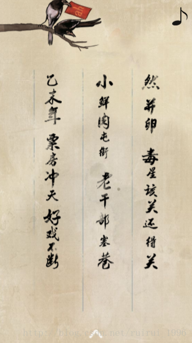
用到的插件:swiper、fastClick(解决移动端click事件的300ms延迟)、animate动画库
HTML代码如下:
<!DOCTYPE html>
<html>
<head><meta charset="UTF-8"><title>移动端场景应用</title><meta name="viewport"content="width=device-width, user-scalable=no, initial-scale=1.0, maximum-scale=1.0, minimum-scale=1.0"><link rel="stylesheet" href="css/reset.css" charset="utf-8"><link rel="stylesheet" href="css/swiper.min.css" charset="utf-8"><link rel="stylesheet" href="css/index.css" charset="utf-8">
</head>
<body><section class="main" id="main"><!--CONTAINER--><div class="swiper-container"><div class="swiper-wrapper"><!--slide1--><div class="swiper-slide page1" id="page1"><img src="img/page1-text2.png"/><img src="img/page1-text3.png"/><img src="img/page1-text4.png"/><img src="img/page1-text5.png"/></div><!--slide2--><div class="swiper-slide page2" id="page2"><img src="img/page2-text1.png"/><img src="img/page2-text2.png"/><img src="img/page2-text3.png"/><img src="img/page2-text4.png"/></div></div></div><!--ARROW--><div class="arrow"></div><!--music--><div class="music" id="musicMenu"><audio src="audio/Wired.mp3" preload="none" loop id="musicAudio"></audio></div>
</section><script charset="UTF-8" type="text/javascript" src="js/swiper.min.js"></script>
<script charset="UTF-8" type="text/javascript" src="js/index.js"></script>
<script charset="UTF-8" type="text/javascript" src="js/fastClick.js"></script>
</body>
</html>
css代码如下:
html, body, .main, .swiper-container, .swiper-slide {width: 100%;height: 100%;overflow: hidden;
}html {font-size: 100px;/*设计稿:640*960*/
}/*page1*/
.page1 {position: relative;background: url("../img/bg1.jpg") no-repeat;background-size: cover;
}.page1 img {position: absolute;opacity: 0;
}.page1 img:nth-child(1) {width: 5.5rem;height: 5.12rem;bottom: .8rem;left: .5rem;
}.page1 img:nth-child(2) {width: 3.7rem;height: 6rem;top: .28rem;right: 0;
}.page1 img:nth-child(3) {width: .96rem;height: 2.32rem;top: 2.8rem;left: 2rem;
}.page1 img:nth-child(4) {width: 7.86rem;height: 5.88rem;bottom: 0;left: -1.6rem;
}/*实现切换完成后页面中的元素再开始运动的思想:开始的时候当前这个区域没有对应的id,当切换到这个区域的时候,为其增加id,在css中把所有的动画效果都放在指定的id下,这样的话只需要让区域有id,里面的子元素就有动画了*/
#page1 img:nth-child(3) {-webkit-animation: bounceInLeft 1s linear 0s 1 both;animation: bounceInLeft 1s linear 0s 1 both;
}#page1 img:nth-child(2) {-webkit-animation: bounceInRight 1s linear .3s 1 both;animation: bounceInRight 1s linear .3s 1 both;
}#page1 img:nth-child(1) {-webkit-animation: bounceInUp 1s linear .6s 1 both;animation: bounceInUp 1s linear .6s 1 both;
}#page1 img:nth-child(4) {-webkit-animation: bounceInUp 1s linear .9s 1 both;animation: bounceInUp 1s linear .9s 1 both;
}/*page2*/.page2 {position: relative;background: url("../img/bg2.jpg") no-repeat;background-size: cover;
}.page2 img {position: absolute;width: .61rem;height: 6.38rem;top: 2.5rem;opacity: 0;
}.page2 img:nth-child(1) {width: 3.4rem;height: 1.74rem;top: 0;left: 0;
}.page2 img:nth-child(2) {left: 1.48rem;
}.page2 img:nth-child(3) {left: 3.2rem;
}.page2 img:nth-child(4) {left: 4.7rem;
}#page2 img:nth-child(1) {-webkit-animation: bounceInLeft 1s linear 0s 1 both;animation: bounceInLeft 1s linear 0s 1 both;
}#page2 img:nth-child(2) {-webkit-animation: zoomIn 1s linear .3s 1 both;animation: zoomIn 1s linear .3s 1 both;
}#page2 img:nth-child(3) {-webkit-animation: zoomIn 1s linear .6s 1 both;animation: zoomIn 1s linear .6s 1 both;
}#page2 img:nth-child(4) {-webkit-animation: zoomIn 1s linear .9s 1 both;animation: zoomIn 1s linear .9s 1 both;
}/*css3 动画*/
@keyframes bounceInLeft {from, 60%, 75%, 90%, to {animation-timing-function: cubic-bezier(0.215, 0.610, 0.355, 1.000);}0% {opacity: 0;transform: translate3d(-3000px, 0, 0);}60% {opacity: 1;transform: translate3d(25px, 0, 0);}75% {transform: translate3d(-10px, 0, 0);}90% {transform: translate3d(5px, 0, 0);}to {transform: none;opacity: 1;}
}@keyframes bounceInRight {from, 60%, 75%, 90%, to {animation-timing-function: cubic-bezier(0.215, 0.610, 0.355, 1.000);}from {opacity: 0;transform: translate3d(3000px, 0, 0);}60% {opacity: 1;transform: translate3d(-25px, 0, 0);}75% {transform: translate3d(10px, 0, 0);}90% {transform: translate3d(-5px, 0, 0);}to {transform: none;opacity: 1;}
}@keyframes bounceInUp {from, 60%, 75%, 90%, to {animation-timing-function: cubic-bezier(0.215, 0.610, 0.355, 1.000);}from {opacity: 0;transform: translate3d(0, 3000px, 0);}60% {opacity: 1;transform: translate3d(0, -20px, 0);}75% {transform: translate3d(0, 10px, 0);}90% {transform: translate3d(0, -5px, 0);}to {transform: translate3d(0, 0, 0);opacity: 1;}
}@keyframes zoomIn {from {opacity: 0;transform: scale3d(.3, .3, .3);}50% {opacity: 1;}100% {opacity: 1;}
}@keyframes bounce {from, 20%, 53%, 80%, to {animation-timing-function: cubic-bezier(0.215, 0.610, 0.355, 1.000);transform: translate3d(0, 0, 0);}40%, 43% {animation-timing-function: cubic-bezier(0.755, 0.050, 0.855, 0.060);transform: translate3d(0, -15px, 0);}70% {animation-timing-function: cubic-bezier(0.755, 0.050, 0.855, 0.060);transform: translate3d(0, -10px, 0);}90% {transform: translate3d(0, -4px, 0);}
}/*arrow*/
.arrow {width: .48rem;height: .36rem;position: absolute;bottom: .2rem;left: 50%;margin-left: -.24rem;z-index: 10;background: url("../img/web-swipe-tip.png") no-repeat;background-size: cover;-webkit-animation: bounce 1s linear 0s infinite both;animation: bounce 1s linear 0s infinite both;
}/*music*/
.music {display: none;width: .5rem;height: .6rem;position: absolute;top: .3rem;right: .2rem;background: url("../audio/Figure_rythmique_croche_hampe_haut.svg") no-repeat;background-size: 100% 100%;z-index: 10;
}.music audio {display: none;
}.music.move {-webkit-animation: bounce 1s linear 0s infinite both;animation: bounce 1s linear 0s infinite both;
}
js代码如下:
FastClick.attach(document.body);~function () {var desW = 640,winW = document.documentElement.clientWidth,ratio = winW / desW,oMain = document.getElementById("main");if (winW > desW) {oMain.style.width = desW + "px";oMain.style.margin = "0 auto";return;}document.documentElement.style.fontSize = ratio * 100 + "px";
}();/* init swiper */
new Swiper('.swiper-container', {direction: 'vertical',loop: true,on: {//当切换结束后,给当前展示的区域添加对应的id,由此实现对应的动画效果slideChangeTransitionEnd: function () {var slideAry = this.slides, //有多少个活动块curIn = this.activeIndex, //当前这个区域的索引,从1开始total = slideAry.length;//计算id是page几var targetId = "page";switch (curIn) {case 0 :targetId += total - 2;break;case total - 1 :targetId += 1;break;default:targetId += curIn;}//给当前的活动块设置id,把其余的移除[].forEach.call(slideAry, function (item, index) {if (curIn == index) {item.id = targetId;return;}item.id = null;});}}
});//music
~function () {var musicMenu = document.getElementById("musicMenu"),musicAudio = document.getElementById("musicAudio");musicMenu.addEventListener("click", function () {if (musicAudio.paused) {musicMenu.className = "meau move";return;}musicAudio.pause();musicMenu.className = "music";})function contralMusic() {musicAudio.volume = 0.5;musicAudio.play();musicAudio.addEventListener("canplay", function () {musicMenu.style.display = "block";musicMenu.className = "music move";}, false);}window.setTimeout(contralMusic, 1000);
}();
![freeimage转到cvmat 单通道图像转到3通道[freeimage][cvmat]](https://img-blog.csdnimg.cn/img_convert/ad4002c51d6e7c65e78331b896006623.png)