快速理解offset之间的区别
- 1.offsetWidth与offsetHeight
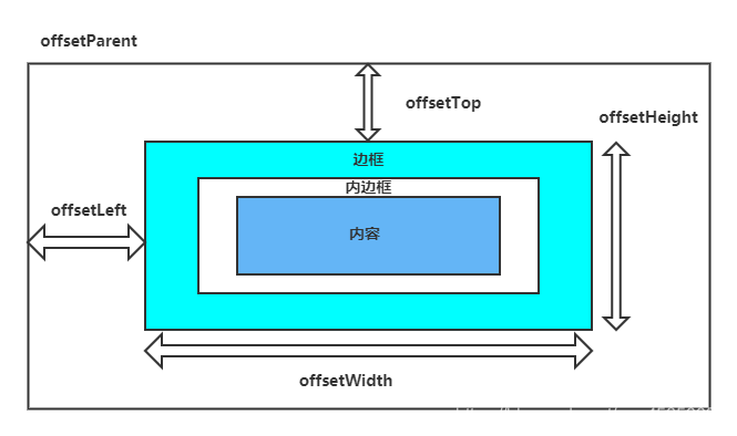
- 2.offsetParent
- 3.offsetleft、offsetTop
以下代码均在Chrome浏览器中测试
1.offsetWidth与offsetHeight
1.offsetWidth:元素的布局宽度。
2.offsetHeight:元素的布局高度。
offsetWidth、offsetHeight 的计算:width/height + padding + border
接下来我们看一个例子:
<!DOCTYPE html>
<html lang="en">
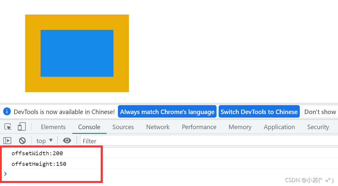
<head><meta charset="UTF-8"><meta name="viewport" content="width=device-width, initial-scale=1.0"><title>Document</title><style>* {padding: 0;margin: 0;}#div {width: 200px;height: 150px;background-color: rgb(21, 138, 235);border: 30px solid rgb(235, 174, 9);padding: 40px;margin: 50px;box-sizing: content-box;}</style>
</head>
<body><div id="div"></div><script>window.onload = function () {var oDiv = document.getElementById('div');var Width = oDiv.offsetWidth //340 = width200 + border30 * 2 + padding40 * 2var Height = oDiv.offsetHeight //290 = height150 + border30 * 2 + padding40 * 2console.log("offsetWidth:"+Width);//offsetWidth:340console.log("offsetHeight:"+Height);//offsetWidth:290}</script>
</body>
</html>效果如下:

1.这里我们要注意,offsetWidth和offsetHeight 的值是个数值,没有单位。
2.而且,offsetWidth、offsetHeight 的计算受 box-sizing 影响。
3.box-sizing: content-box;是默认样式,而box-sizing:border-box;会重新计算盒子模型,将原本设置好的width和height当做盒子内容的宽度(width)加内边距(padding)和边框(border)的总和。
接下来我们看看设置了box-sizing:border-box;后offsetWidth、offsetHeight的值:
<!DOCTYPE html>
<html lang="en">
<head><meta charset="UTF-8"><meta name="viewport" content="width=device-width, initial-scale=1.0"><title>Document</title><style>* {padding: 0;margin: 0;}#div {width: 200px;height: 150px;background-color: red;border: 30px solid blue;padding: 40px;margin: 50px;box-sizing: border-box;}</style>
</head>
<body><div id="div"></div><script>window.onload = function () {var oDiv = document.getElementById('div');var Width = oDiv.offsetWidth  //200 = width200var Height = oDiv.offsetHeight //150 = height150 console.log("offsetWidth:"+Width);//offsetWidth:200console.log("offsetHeight:"+Height);//offsetWidth:150}</script>
</body>
</html>
效果如下:
2.offsetParent
1.依次向上寻找定位的父级元素
2.只和定位的父级有关,如果向上没有找到定位的父级,返回body元素。
接下来我们看一个例子:
<head><meta charset="UTF-8"><meta name="viewport" content="width=device-width, initial-scale=1.0"><title>Document</title><style>#div3 {position: relative;}</style>
</head>
<body><div id="div3"><div id="div2"><div id="div1"></div></div></div><hr><script>window.onload = function () {var div1 = document.getElementById('div1');var parent1 = div1.offsetParentconsole.log(parent1);//div3 }</script>
</body>
注意:div1 设置 fixed时,parent-谷歌返回 null,火狐返回 body 2、div1 未设置 fixed时,parent 返回父级定位的元素,如果没有 返回 body
以下代码在谷歌中演示
<head><meta charset="UTF-8"><meta name="viewport" content="width=device-width, initial-scale=1.0"><title>Document</title><style>#div3 {position: relative;}#div1{position: fixed;}</style>
</head>
<body><div id="div3"><div id="div2"><div id="div1"></div></div></div><hr><script>window.onload = function () {var oDiv = document.getElementById('div1');var parent1 = oDiv.offsetParentconsole.log(parent1);//null}</script>
</body>
3.offsetleft、offsetTop
offsetTop表示元素的上外边框至offsetParent元素的上内边框之间的像素距离
offsetLeft表示元素的左外边框至offsetParent元素的左内边框之间的像素距离
接下来我们看一个例子:
<!DOCTYPE html>
<html lang="en"><head><meta charset="UTF-8"><meta name="viewport" content="width=device-width, initial-scale=1.0"><title>Document</title><style>* {padding: 0;margin: 0;}#div1 {width: 200px;height: 150px;padding: 10px;border: 5px solid rgb(235, 174, 9);background-color: rgb(21, 138, 235);margin: 6px;}#div2 {border: 10px solid rgb(32, 169, 187);padding: 15px;margin: 7px;}#div3 {padding: 20px;border: 10px solid green;margin: 8px;position: relative;}</style></head><body><div id="div3"><div id="div2"><div id="div1"></div></div></div><script>window.onload = function () {var div1 = document.getElementById('div1');var left = div1.offsetLeftvar top = div1.offsetTopconsole.log(left, top) // 58,58// #div1 (6) + #div2 (10+15+7) + #div3 (20) = 58// 如果父级没有设置定位标签,div1 的 offsetParent 为 body 此时为76,76}</script></body>
</html>

最后整理成图片,如下图所示:
相关文章:
链接: 一篇弄懂 scrollWidth、scrollHeight、scrollLeft和scrollTop的区别!(2).
链接: 一篇弄懂 clientWidth、clientHeight、clientLeft、clientTop的区别!(3).