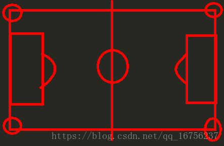
那要写出这样一个界面,首先了解一下球场结构,如图,具体比例就不坐详细说明了自行百度.
颜色上白线绿地没啥问题,发球弧和角球线通过父级的覆盖可以做到部分弧线效果.
先看一下整体效果:

具体地:
1 )场地外围我们使用混合色:
background: radial-gradient(sandybrown,maroon);2 )线条我们要自定义白粗线:
--line: 0.3em solid white;
border: var(--line);
3 )定下整个container容器之后,field为球场区域作为定位父体,内部span通过absolute定位:
.container{display:block;}
.field{position:relative:width:inherit;height:ingerit;}
4 )位置的具体数值可通过数学关系确定:
calc(计算式子)5 )css中数值可以通过 –变量名 的形式记录某一数值,后续通过
var(–变量名)调用:
body{--num = calc((100px + 0.7px)/3);top:var(--num);}6 )然后就是关于角球线,可以两种方法
方法一::before/after在隐藏边角线的应用.
/*:before 选择器在被选元素的内容前面插入内容。请使用 content 属性来指定要插入的内容。*/
.corner-arc::after,
.corner-arc::before{content: '';position: absolute;width: 5em;height: 5em;border: 0.3em solid white;border-radius: 50%;}
方法二:制作两个扇形,定位到相应位置.
.corner-arc-bottom ,
.corner-arc-top{width: 100px;height: 100px;line-height: 100px;text-align: center;border: 0.3em solid white;border-radius:  0  100px 0 0    ;position: absolute;top:880px;left: -20px;}
7 )最后由于半场是关于中线对称,我们可以做好左边,以中点(0,50%)旋转
.right {position: absolute;top: 0px;left: 50%;transform: rotateY(180deg);}大体思路就这些,下面是css代码和html:
/*中间注释部分为相对定位实现的,但是不能做到响应式*/
<style>body {margin: 100px;/* height: 100px; */display: flex;align-items: center;justify-content: center;/*  项目位于容器的中心*/background: radial-gradient(sandybrown, maroon);--line: 0.3em solid white;}.container {width: 120em;height: 80em;background-color: green;font-size: 5px;padding: 5em;}.container span {display: block;}.field {border: var(--line);position: relative;overflow: hidden;/*角球线隐藏*/width: inherit;height: inherit;z-index: 1;}.halfway-line {width: 60em;height: 80em;border-right: var(--line);}.centre-circle,.penalty-arc {width: 20em;height: 20em;border: var(--line);border-radius: 50%;position: absolute;top: 30em;}.centre-circle {left: calc((120em - 20em - 0.3em)/2);}.centre-mark {width: 2em;height: 2em;background-color: white;border-radius: 50%;position: absolute;top: calc(80em / 2 - 1em);left: calc(120em / 2 - 1em + 0.3em / 2);}.penalty-mark {width: 2em;height: 2em;background-color: white;border-radius: 50%;position: absolute;top: calc(80em / 2 - 1em);left: calc(12em - 2em / 2);}.penalty-area {width: 18em;height: 44em;border: var(--line);position: absolute;top: calc((80em - 44em) / 2);left: -0.3em;background-color: green;}.penalty-arc {left: calc(12em - 20em / 2);z-index: -1;}.goal-area {width: 6em;height: 20em;border: var(--line);position: absolute;top: calc((80em - 20em) / 2);left: -0.3em;}.corner-arc{border:1px solid red;}.corner-arc::after,.corner-arc::before{content: '';position: absolute;width: 5em;height: 5em;border: 0.3em solid white;border-radius: 50%;left:calc(-5em / 2 - 0.3em);}.corner-arc::before {top:calc(-5em / 2 - 0.3em);}.corner-arc::after {bottom:calc(-5em / 2 - 0.3em);}/* .corner-arc-top {width: 100px;height: 100px;line-height: 100px;text-align: center;border: 0.3em solid white;border-radius: 0 0 100px 0;position: absolute;top: -5%;left:-5%;position: absolute;}.corner-arc-bottom {width: 100px;height: 100px;line-height: 100px;text-align: center;border: 0.3em solid white;border-radius: 0 100px 0 0;position: absolute;top: 880px;left: -20px;position: absolute;} */.right {position: absolute;top: 0px;left: 50%;transform: rotateY(180deg);}
</style>
body部分
<body><div class="container"><div class="field"><div class="left"><span class="halfway-line"></span><span class="centre-circle"></span><span class="centre-mark"></span><span class="penalty-area"></span><span class="penalty-mark"></span><span class="penalty-arc"></span><span class="goal-area"></span><span class="corner-arc-top"></span><span class="corner-arc-bottom"></span></div><div class="right"><span class="halfway-line"></span><span class="centre-circle"></span><span class="centre-mark"></span><span class="penalty-area"></span><span class="penalty-mark"></span><span class="penalty-arc"></span><span class="goal-area"></span><span class="corner-arc-top"></span><span class="corner-arc-bottom"></span></div></div></div>
</body>