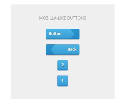
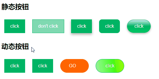
用css写了几个按钮样式:静态的,不可编辑的,立体的,圆角的,胶囊状的,动态效果的样式。
效果预览(录屏保存后有点抖动,稍微有点影响最后两个效果):
要写按钮样式首先要去除按钮默认样式:
1、更改背景 background ;
2、去除边框或更改边框 border ;
3、去除默认的按钮点击后的蓝色边框,这是很容易忽略的一个:outline:none;
最后一个动态渐变按钮使用了css动画。
注意:在编写动态渐变按钮样式时,需要设置渐变的首尾为相同颜色。
在编写最后一个动态渐变按钮样式时,遇到一个问题:设置渐变背景时发现使用 -webkit-linear-gradient() 和使用 linear-gradient() 效果不一致,原因我还不知,希望知道的朋友可以告知一下。
代码
HTML:
<h2>静态按钮</h2>
<button class="btn">click</button>
<button class="btn disable">don't click</button>
<button class="btn shadow">click</button>
<button class="btn cir1">click</button>
<button class="btn cir2">click</button><h2>动态按钮</h2>
<button class="btn change change1">click</button>
<button class="btn change change2">click</button>
<button class="btn change3"><span>GO</span></button>
<button class="btn change4">click</button>
css:
.btn{background-color:rgba(0,180,100,1);border:rgba(0,180,100,1) 1px solid;outline:none;  /*去除点击时的蓝色边框*/cursor:pointer;padding:14px 20px;color:rgba(255,255,255,1);text-align: center;font-size: 16px;margin:10px;
}
.disable{background-color:rgba(0,180,100,0.5);cursor:not-allowed;
}
.shadow{box-shadow:0 5px 13px 0 rgba(0,0,0,0.3);
}
.cir1{border-radius:10px;
}
.cir2{padding:13px 25px;border-radius:30px;box-shadow:0 3px 10px 0 rgba(0,0,0,0.3);background: -webkit-linear-gradient(bottom,  rgba(0,180,100,0.2),  rgba(0,180,100,1), rgba(0,200,100,1) ); /* Safari 5.1 - 6.0 */background: -o-linear-gradient(bottom,  rgba(0,180,100,0.2),  rgba(0,180,100,1), rgba(0,200,100,1) ); /* Opera 11.1 - 12.0 */background: -moz-linear-gradient(bottom,  rgba(0,180,100,0.2),  rgba(0,180,100,1), rgba(0,200,100,1) ); /* Firefox 3.6 - 15 */background: linear-gradient(to bottom,  rgba(0,180,100,0.2),  rgba(0,180,100,1), rgba(0,200,100,1) ); /* 标准的语法 */
}/*动态效果*/
.change{transition: all 0.5s;-webkit-transition: all 0.5s; /* Safari */
}
.change1:hover{background-color:rgba(0,180,100,0.1);color:rgb(0,0,0);
}
.change2:hover{box-shadow:0 5px 13px 0 rgba(0,0,0,0.3);
}
.change3{background-color:rgba(255,100,0,1);border:rgba(255,120,0,1) 1px solid;border-radius:30px;width:100px;
}
.change3 span{transition: 0.6s;
}
.change3 span:after {content: ' »';opacity: 0;top: 0;right: -15px;transition: 0.6s;
}
.change3:hover span{padding-right:20px;transition: 0.6s;
}
.change3:hover span:after {opacity: 1;right: 0;
}
.change4{width:100px;border-radius:30px;background-image: -webkit-linear-gradient(10deg,#3CFA14,#F0FA00,#98FB98,#3CFA14);background-size: 200% 100%;animation:move 3s infinite linear;-webkit-animation:move 3s infinite linear; /* Safari 与 Chrome */
}
@keyframes move{0% {background-position: 0 0;}100% {background-position: -200% 0;}
}