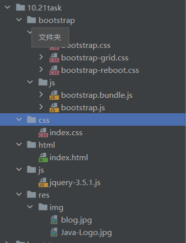
目录
问题原因
解决方案
顺便记录一下使用
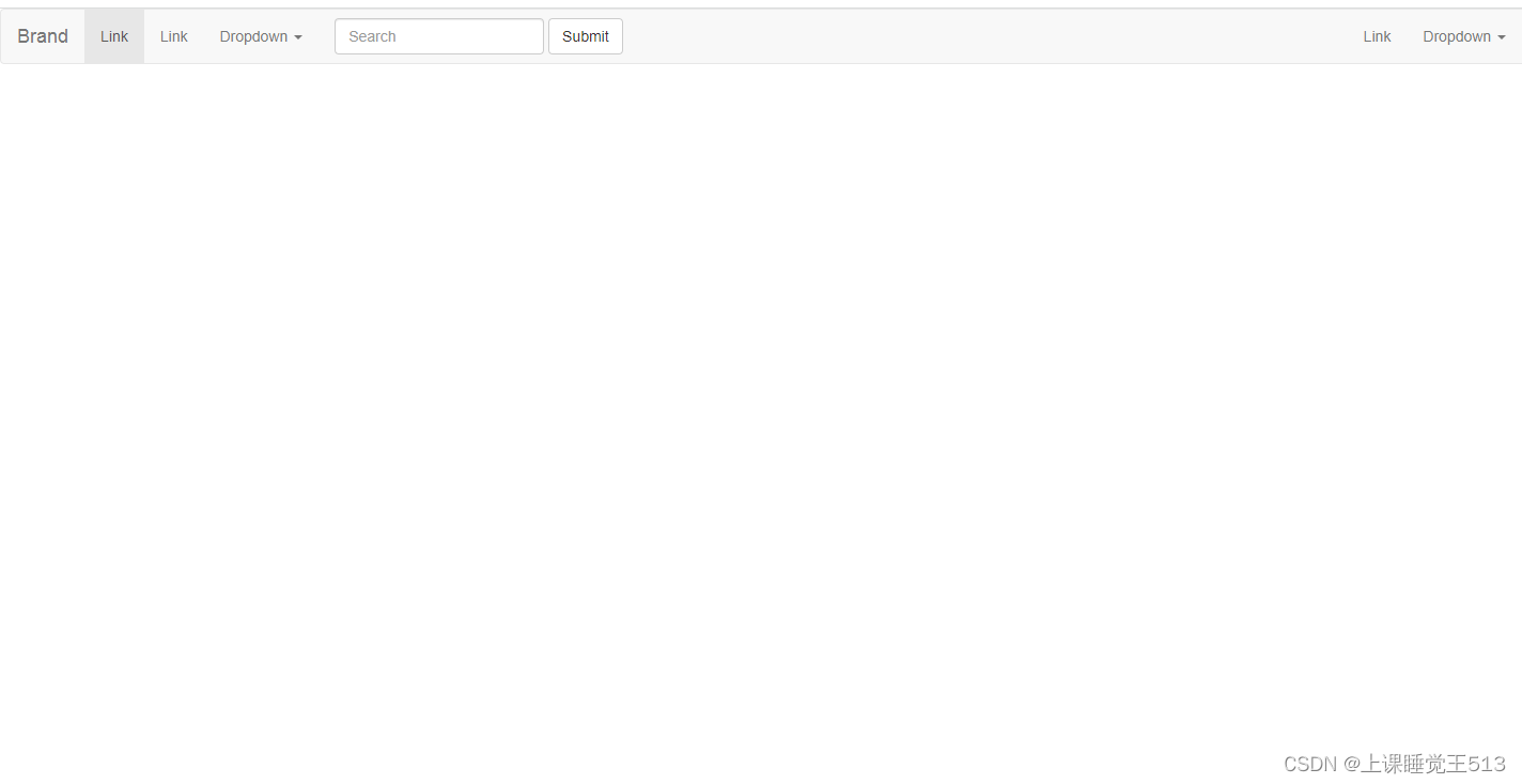
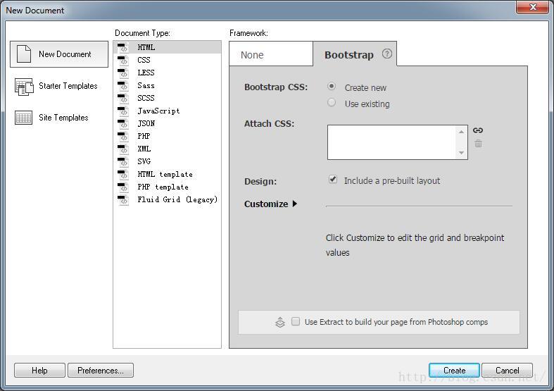
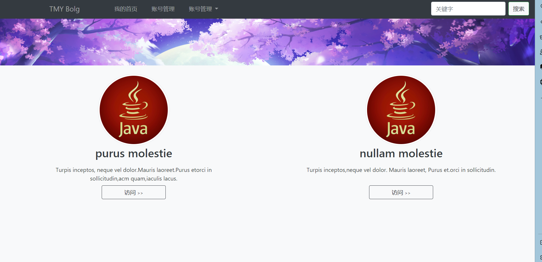
效果图
HTML
CSS
目录
问题原因
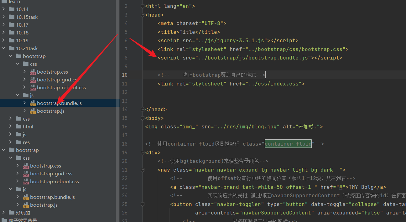
两个js文件冲突/没有引入指定的js文件
我们不能同时引入这两个js只能引入其一,同时引入会使得部分功能失效
解决方案
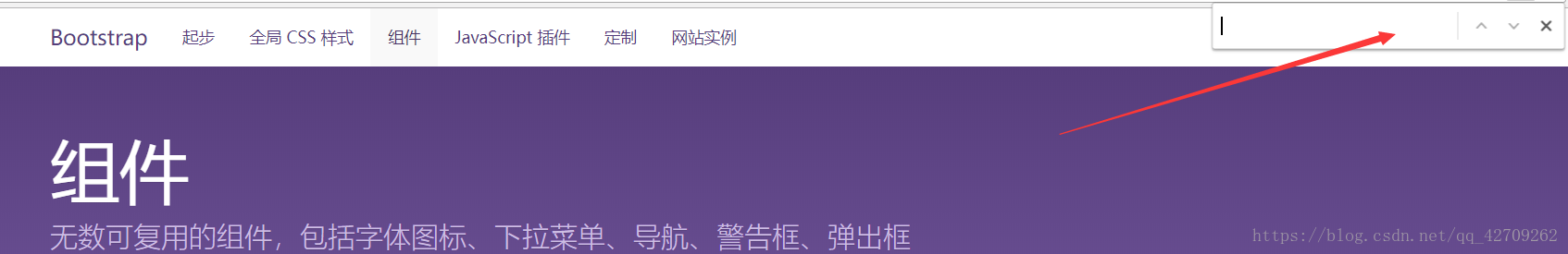
注意我们使用下拉菜单时使用的js是这个
bootstrap.bundle.js
并不是
bootstrap.js
如图是正确的使用
顺便记录一下使用
效果图
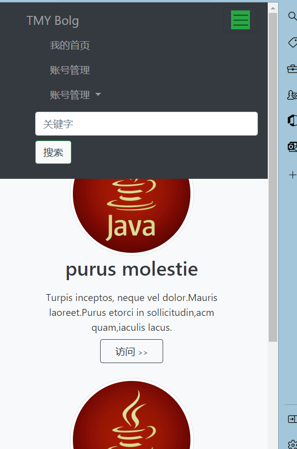
下图提现了响应式
HTML
文件名 index.html
<!DOCTYPE html>
<html lang="en">
<head><meta charset="UTF-8"><title>Title</title><script src="../js/jquery-3.5.1.js"></script><link rel="stylesheet" href="../bootstrap/css/bootstrap.css"><script src="../bootstrap/js/bootstrap.bundle.js"></script><!--    防止bootstrap覆盖自己的样式--><link rel="stylesheet" href="../css/index.css"></head>
<body>
<img class="img_" src="../res/img/blog.jpg" alt="未加载."><!--使用container-fluid尽量撑起行 class="container-fluid"-->
<div><!--使用bg(background)来调整背景颜色--><nav class="navbar navbar-expand-lg navbar-light bg-dark  "><!--        使用offset设置行中块的横向位置(默认1行12块)从左到右--><a class="navbar-brand text-white-50 offset-1 " href="#">TMY Bolg</a><!--        实现响应式的关键 通过绑定navbarSupportedContent(被挤压内容块的id)在页面被挤压时,通过js改变页面布局 --><button class="navbar-toggler" type="button" data-toggle="collapse" data-target="#navbarSupportedContent"aria-controls="navbarSupportedContent" aria-expanded="false" aria-label="Toggle navigation"><!--            被挤压时显示出来的图标--><span class="navbar-toggler-icon bg-success"></span></button><!--        使用ml(margin-left)来调整间距--><div class="collapse navbar-collapse ml-5" id="navbarSupportedContent"><ul class="navbar-nav mr-auto"><li class="nav-item ml-4"><!--                    使用text-color设置文本颜色--><a class="nav-link text-white-50 " href="#">我的首页</a></li><li class="nav-item  ml-4"><a class="nav-link text-white-50" href="#">账号管理</a></li><li class="nav-item dropdown  ml-4"><a class="nav-link dropdown-toggle text-white-50" href="#" id="navbarDropdown" role="button"data-toggle="dropdown" aria-expanded="false">账号管理</a><div class="dropdown-menu" aria-labelledby="navbarDropdown"><a class="dropdown-item" href="#">修罗</a><a class="dropdown-item" href="#">无极</a><a class="dropdown-item" href="#">魁拔</a></div></li></ul><form class="form-inline my-2 my-lg-0"><input class="form-control mr-sm-2" type="search" placeholder="关键字" aria-label="Search"><button class="btn btn-outline-success bg-light text-dark my-2 my-sm-0" type="submit">搜索</button></form></div></nav>
</div><!--这里设置position-absolute才能使得图片在最下面-->
<!--使用栅栏布局 先重写container-fluid 使得 没有左右边距-->
<div class="container-fluid bg-light fixed-bottom row h-75 position-absolute" id="contentid">
<!--   使用col-sm布局左右两列 mt-4表示距离页面上的标签4格--><div class="col-sm mt-4">
<!--        使用弹性盒子 d-flex(display-flex) flex-column定义方向为列(盒子内的标签会竖直排列)--><div class="d-flex flex-column">
<!--            img 定义了logo class用于设置宽高圆边程度 img-thumbnail 设置边框 ml-auto mr-auto使其趋于中心 --><img class="logo img-thumbnail float-left ml-auto mr-auto" src="../res/img/Java-Logo.jpg"><h2 class="text-dark w-100 text-center">purus molestie</h2><span class="text-dark w-75 text-center ml-auto mr-auto mt-2 mb-2"> Turpis inceptos, neque vel dolor.Mauris laoreet.Purus etorci in sollicitudin,acm quam,iaculis lacus. </span><button class="btn border-dark w-25 ml-auto mr-auto">访问<span STYLE="font-size: 8px">>></span></button></div></div><div class="col-sm mt-4"><div class="d-flex flex-column bd-highlight"><img class="logo img-thumbnail  ml-auto mr-auto" src="../res/img/Java-Logo.jpg"><h2 class="text-dark w-100 text-center">nullam molestie</h2><span class="text-dark w-75 ml-auto mr-auto text-center mt-2 mb-2">Turpis inceptos,neque vel dolor. Mauris laoreet, Purus et.orci in sollicitudin. </span><button class="btn border-dark w-25 ml-auto mr-auto mt-4">访问<span STYLE="font-size: 8px">>></span></button></div></div>
</div></body></html>
CSS
文件名index.css
.img_{position:absolute;height: 100%;width: 100%;/*设置在最底层*/z-index: -2;background: rgba(255,255,255,0.1);
}
.logo{width: 200px;height: 200px;border-radius: 200px;
}
.container-fluid{padding-left: 0;padding-right: 0;margin-left: 0;margin-right: 0;margin-top: 60px;
}
#contentid{z-index: -1;
}
目录