弹性布局
弹性布局相关属性
弹性布局相关属性
属性 说明 display 值为flex时, 创建弹性布局容器 flex-direction 伸缩流方向 flex-wrap 伸缩流换行 flex-flow 伸缩流(包括方向与换行),综合了flex direction和flex-wrap属性 justify-content 主轴对齐 align-items 侧轴对齐 align-content 堆栈伸缩行,只有在flex-wrap:wrap和wrap-reverse 设置下且伸缩项目存在多行时才生效 flex 用于设置或检索弹性模型对象的子元素如何分配空间,是flex-grow、flex-shrink和flex-basis属性的简写属性,即伸缩性。默认值是0 1. auto order 设置或检索弹性模型对象的子元素出现的顺序。默认值是0 flex-grow 一个数字,规定项目将相对于其他灵活的项目进行扩展的量,即扩展比率 flex-shrink 一个数字, 规定项目将相对于 其他灵活的项目进行收缩的量,即收缩比率。 flex-basis 项目的长度。合法值“auto”"inherit"或一个后跟“%”‘ px”“ em"或任何其他长度单位的数字,即伸缩基准值
flex-direction相关属性
属性 说明 row 主轴为水平方向,排列顺序与页面的文档顺序相同 row-reverse 主轴为水平方向,排列顺序与页面的文档顺序相反 column 主轴为垂直方向,排列顺序为从上到下 column-reverse 主轴为垂直方向,排列顺序为从下到上
flex-wrap相关属性
属性 说明 nowrap (默认值) 值为flex时, 创建弹性布局容器 wrap 伸缩流方向 wrap-reverse 伸缩流换行 column-reverse 伸缩流(包括方向与换行),综合了flex direction和flex-wrap属性
justify-content相关属性
属性 说明 flex-start 默认值。项目位于容器的开头 flex- end 项目位于容器的结尾 center 项目位于容器的中心 space-between 项目位于各行之间留有空白的容器内 space-around 项目位于各行之前、之间、之后都留有空白的容器内
align-items相关属性
属性 说明 stretch 默认值。项目被拉伸以适应容器 center 项目位于容器的中心 flex-start 项目位于容器的开头 flex- end 项目位于容器的结尾 baseline 项目位于容器的基线上
align-content相关属性
属性 说明 stretch 默认值。项目被拉伸以适应容器 center 项目位于容器的中心 flex-start 项目位于容器的开头 flex-end 项目位于容器的结尾 space-between 项目位于各行之间留有空白的容器内space-around
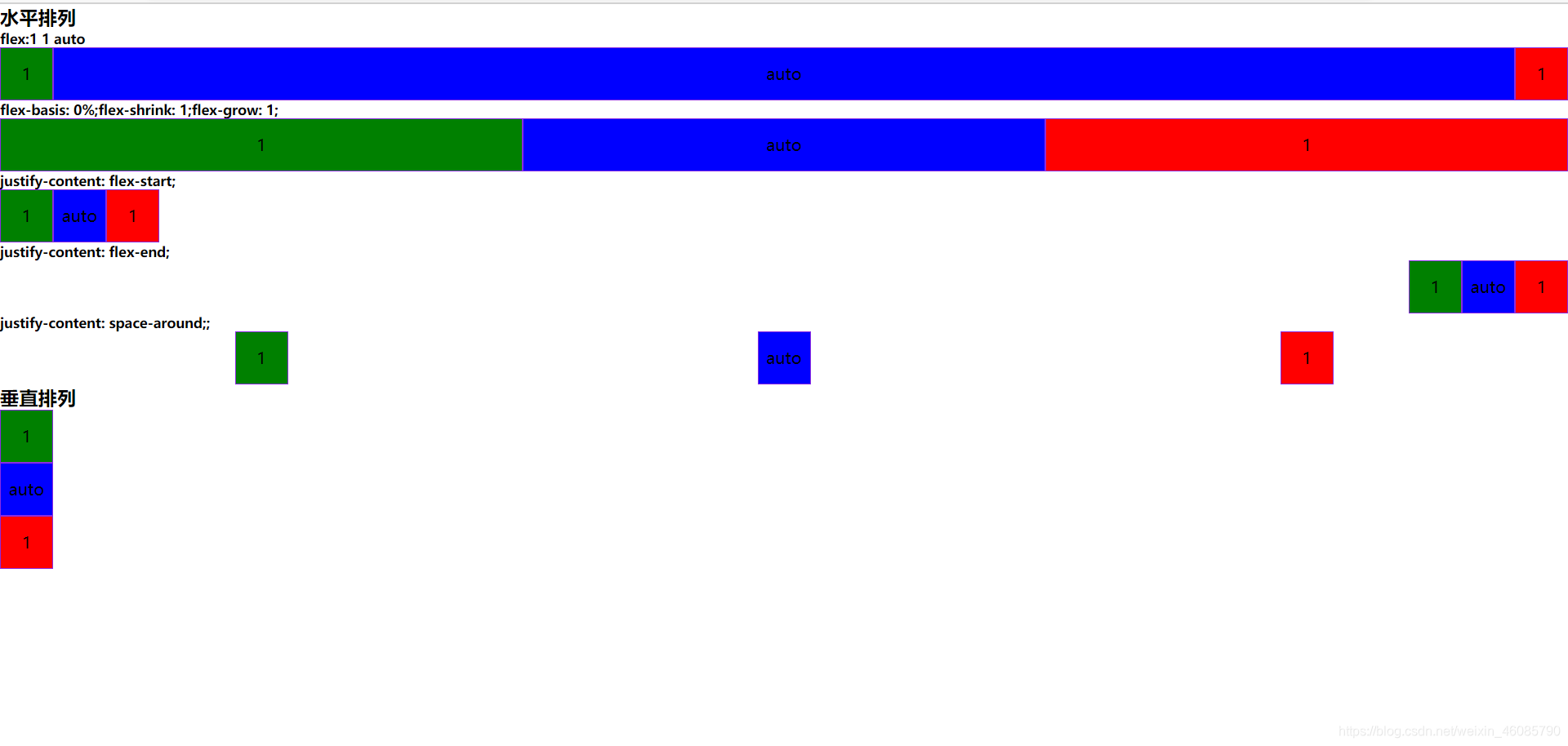
样例Demo
效果图:
<!DOCTYPE html>
< html> < head> < metacharset = " utf-8" /> < metaname = " viewport" content = " width=device-width,initial-scale=1.0" /> < title> </ title> < styletype = " text/css" > * { margin : 0; padding : 0; } .box { width : 50px; height : 50px; border : 1px solid blueviolet; text-align : center; line-height : 50px; } .flex-item1 { background : red; order : 3; } .flex-item2 { background : green; order : 1; } .flex-item3 { background : blue; order : 2; } .flex-container1 { display : flex; flex-direction : row; flex-wrap : wrap; justify-content : flex-start; } .flex-container2 { display : flex; flex-direction : row; flex-wrap : wrap; justify-content : flex-end; } .flex-container3 { display : flex; flex-direction : row; flex-wrap : wrap; justify-content : space-around; } .flex-container4 { display : flex; flex-direction : column; flex-wrap : wrap; justify-content : space-around; } .flex-center1 { flex : 1 1 auto; } .flex-center2 { flex-basis : 0%; flex-shrink : 1; flex-grow : 1; } </ style> </ head> < body> < h3> </ h3> < h5> </ h5> < divclass = " flex-container1" > < divclass = " flex-item1 box" > </ div> < divclass = " flex-item2 box" > </ div> < divclass = " flex-item3 box flex-center1" > </ div> </ div> < h5> </ h5> < divclass = " flex-container1" > < divclass = " flex-item1 box flex-center2" > </ div> < divclass = " flex-item2 box flex-center2" > </ div> < divclass = " flex-item3 box flex-center2" > </ div> </ div> < h5> </ h5> < divclass = " flex-container1" > < divclass = " flex-item1 box" > </ div> < divclass = " flex-item2 box" > </ div> < divclass = " flex-item3 box" > </ div> </ div> < h5> </ h5> < divclass = " flex-container2" > < divclass = " flex-item1 box" > </ div> < divclass = " flex-item2 box" > </ div> < divclass = " flex-item3 box" > </ div> </ div> < h5> </ h5> < divclass = " flex-container3" > < divclass = " flex-item1 box" > </ div> < divclass = " flex-item2 box" > </ div> < divclass = " flex-item3 box" > </ div> </ div> < h3> </ h3> < divclass = " flex-container4" > < divclass = " flex-item1 box" > </ div> < divclass = " flex-item2 box" > </ div> < divclass = " flex-item3 box flex-center1" > </ div> </ div> </ body> </ html>