背景
照惯例,先交待下背景,从真实需求出发,讲述实现效果、设计思路和实现方式。
软件系统中,会有一些常见常用的选择功能,如部门选择、人员选择等,用于填报表单,使用频率很高。直接使用一方面会比较繁琐,另一方面造成代码重复,当需要调整时,则需要遍历整个项目源码,容易因漏改引发问题。这种情况下,更好的实现方案,是通过封装组件,来实现简化使用和复用的目的。
前面有一篇,介绍了使用VUE自定义组件封装数据字典,功能比较简单,今天进一步,封装一个比较复杂的部门单选组件,其他业务实体,如人员、角色等,实现非常类似,就不再赘述。
实现效果
首先展示下实现效果。
用户管理列表,左边是部门树,右侧是用户列表,如下图。
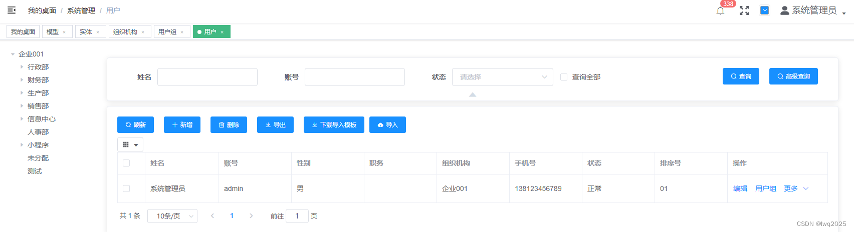
点击“新增”按钮,打开用户编辑页面,自动显示传入的部门。
第一行就是我们封装的部门单选组件,点击最右侧的图标,弹出部门选择页面来。
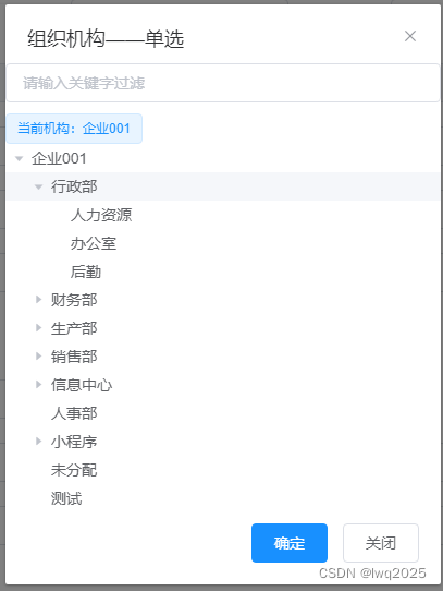
选择新部门后,确定,即可实现部门的变更。
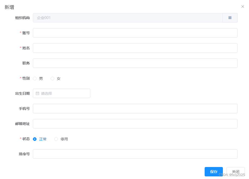
站在使用的角度看,也非常简单,用户编辑页面整体源码如下
<template><el-dialog :title="title" :visible="visible" @close="visible=false"><el-formref="form":model="entityData":rules="rules"label-width="80px"label-position="right"style="width:90%;margin:0px auto;"><!--表单区域 --><el-form-item label="组织机构" prop="organizationId"><organization-single-selectv-model="entityData.organizationId"/></el-form-item><el-form-item label="账号" prop="account"><el-input v-model="entityData.account" /></el-form-item><el-form-item label="姓名" prop="name"><el-input v-model="entityData.name" /></el-form-item><el-form-item label="职务" prop="position"><el-input v-model="entityData.position" /></el-form-item><el-form-item label="性别" prop="gender"><dictionary-radio-groupv-model="entityData.gender":code="constant.DICTIONARY_TYPE_CODES.GENDER"/></el-form-item><el-form-item label="出生日期" prop="birthday"><el-date-pickerv-model="entityData.birthday"value-format="yyyy-MM-dd HH:mm:ss"format="yyyy年MM月dd日"type="date"placement="bottom-end"placeholder="请选择"class="form-item"/></el-form-item><el-form-item label="手机号" prop="telephone"><el-input v-model="entityData.telephone" /></el-form-item><el-form-item label="邮箱地址" prop="email"><el-input v-model="entityData.email" /></el-form-item><el-form-item label="状态" prop="status"><dictionary-radio-groupv-model="entityData.status":code="constant.DICTIONARY_TYPE_CODES.STATUS"/></el-form-item><el-form-item label="排序号" prop="orderNo"><el-input v-model="entityData.orderNo" /></el-form-item></el-form><div slot="footer" class="dialog-footer"><el-button v-show="saveButtonVisible" type="primary" @click="save">保存</el-button><el-button @click="close">关闭</el-button></div></el-dialog>
</template>
,引入部门单选组件后,具体使用的时候,只需要如下代码即可
<el-form-item label="组织机构" prop="organizationId"><organization-single-selectv-model="entityData.organizationId"/></el-form-item>
也就是说,封装组件后,使用部门单选功能,跟使用一个文本输入框类似,所有与之相关的页面展现和逻辑处理都在组件内部实现了,是不是对使用方非常友好?
设计与实现
技术栈采用的还是vue2.0,UI组件库使用element ui。
使用简单,是因为将复杂工作封装在了内部,这里同样用组件化的思路,将部门单选组件拆分成了两个vue页面,一个是整体组件,负责文本框的展示,对弹出部门选择页面的调度,另一个是负责具体的部门选择。
源码实现
先附上整体组件源码
<template><div><el-input v-model="organizationName" disabled><el-button slot="append" icon="el-icon-s-grid" @click="openModal" /></el-input><organization-modal ref="organizationModel" @ok="handleOK" /></div>
</template><script>
import OrganizationModal from './OrganizationModal'
export default {name: 'OrganizationSingleSelect',components: {OrganizationModal},model: {prop: 'value',event: 'change'},props: {width: {type: Number,default: 500,required: false},value: {type: String,default: '',required: false},disabled: {type: Boolean,required: false,default: false}},data() {return {visible: false,organizationName: ''}},watch: {value: {immediate: true,handler: 'handleValue'}},methods: {openModal() {this.$refs.organizationModel.show(this.value, this.organizationName)},handleValue() {if (this.value) {this.$api.system.organization.get(this.value).then((res) => {this.organizationName = res.data.name})}},handleOK(id) {// 更新父组件绑定值this.$emit('change', id)}}
}
</script><style scoped>
</style>
注意事项
下面重点说下封装需要注意的点。
1.UI元素比较简单,就一个文本框,默认设置为禁用状态,并且追加了一个按钮,用于触发部门选择页面的弹出。
<el-input v-model="organizationName" disabled><el-button slot="append" icon="el-icon-s-grid" @click="openModal" /></el-input>
在这基础上当然也可以进行功能扩展,如再追加一个清空已选择的按钮,视需求而定。
2.很重要的一点,是设置model选项。因为默认情况下,model使用名为 value 的 prop 和名为 input 的事件,而我们封装的效果是选择控件,将文本框禁用了,事件应该使用chang而不是input,所以需要做如下设置:
model: {prop: 'value',event: 'change'}
3.为了组件的可配置性,设置了部分prop属性,如宽度、是否禁用等,这样在使用的时候,就能通过属性绑定的方式灵活配置了。
width: {type: Number,default: 500,required: false},value: {type: String,default: '',required: false},disabled: {type: Boolean,required: false,default: false}
4.通过vue的watch机制,监视value的变化,该值变化后,调用后端部门服务接口,拿到部门名称后更新显示。
watch: {value: {immediate: true,handler: 'handleValue'}},……handleValue() {if (this.value) {this.$api.system.organization.get(this.value).then((res) => {this.organizationName = res.data.name})}}
5.选择项变化时,通过change事件,调用emit,把最新的值传递给使用方,这一步很关键。
change(value) {this.$emit('change', value)}
接下来看下部门选择页面的实现,完整源码如下:
<template><div><el-dialog title="组织机构——单选" :visible="visible" width="400px" append-to-body @close="close"><el-input v-model="searchValue" placeholder="请输入关键字过滤" style="margin-bottom:10px" /><el-tag>当前机构:{{ selectedName }}</el-tag><el-treeref="tree":data="treeData"node-key="id":default-expanded-keys="defaultExpandedKeys":filter-node-method="filterNode"@current-change="handleTreeSelectChange"/><div slot="footer" class="dialog-footer"><el-button type="primary" @click="confirm">确定</el-button><el-button @click="close">关闭</el-button></div></el-dialog></div>
</template><script>export default {data() {return {visible: false,treeData: [],searchValue: '',defaultExpandedKeys: [],selectedValue: '',selectedName: ''}},watch: {searchValue(value) {this.$refs.tree.filter(value)}},methods: {show(id, name) {this.searchValue = ''this.defaultExpandedKeys = []this.selectedValue = idthis.selectedName = namethis.loadTree()this.visible = true},loadTree() {this.$api.system.organization.tree().then(res => {this.treeData = res.data// 默认展开根节点this.defaultExpandedKeys.push(this.treeData[0].id)// 默认展开当前节点this.defaultExpandedKeys.push(this.selectedValue)})},close() {this.visible = false},confirm() {this.$emit('ok', this.selectedValue)this.visible = false},// 树节点选中改变handleTreeSelectChange(data) {this.selectedValue = data.idthis.selectedName = data.label},filterNode(value, data) {if (!value) return truereturn data.label.indexOf(value) !== -1}}
}</script><style scoped>
</style>
具体功能包括了数据加载、默认展开、显示已选择值、搜索功能,已经可以满足常见的需求了。
多选功能的实现
上面实现了单选功能,其实多选功能实现也类似,这里只放代码,就不再展开介绍了
<template><div><el-input v-model="organizationName" disabled><el-button slot="append" icon="el-icon-s-grid" @click="openModal" /></el-input><organization-modal ref="organizationModel" @ok="handleOK" /></div>
</template><script>
import OrganizationModal from './organizationModal'
export default {name: 'OrganizationMultipleSelect',components: {OrganizationModal},model: {prop: 'value',event: 'change'},props: {value: {type: String,default: '',required: false},width: {type: Number,default: 500,required: false},disabled: {type: Boolean,required: false,default: false}},data() {return {visible: false,organizationName: ''}},watch: {value: {immediate: true,handler: 'handleValue'}},methods: {openModal() {this.$refs.organizationModel.show(this.value)},handleValue() {if (this.value) {const idList = this.value.split(',')this.$api.system.organization.getOrganization({ idList: idList }).then((res) => {this.organizationName = res.data.map(x => x.name).join(',')})}},handleOK(value) {// 处理父组件绑定值this.$emit('change', value.join(','))}}
}
</script><style scoped>
</style>
<template><div><el-dialog title="组织机构——多选" :visible="visible" width="400px" append-to-body @close="close"><el-input v-model="searchValue" placeholder="请输入关键字过滤" style="margin-bottom:10px" /><el-treeref="tree":data="treeData"node-key="id"show-checkbox:default-expanded-keys="defaultExpandedKeys":filter-node-method="filterNode":default-checked-keys="checkedNodesId"/><div slot="footer" class="dialog-footer"><el-button type="primary" @click="confirm">确定</el-button><el-button @click="close">关闭</el-button></div></el-dialog></div>
</template><script>export default {data() {return {visible: false,treeData: [],searchValue: '',defaultExpandedKeys: [],selectedValue: [],checkedNodesId: []}},watch: {searchValue(value) {this.$refs.tree.filter(value)}},methods: {show(idList) {this.searchValue = ''this.defaultExpandedKeys = []this.selectedValue = idListthis.loadTree()this.visible = true},loadTree() {this.$api.system.organization.tree().then(res => {this.treeData = res.data// 默认展开根节点this.defaultExpandedKeys.push(this.treeData[0].id)this.checkedNodesId = []this.getLeafNodeChecked(this.treeData)this.$refs.tree.setCheckedKeys(this.checkedNodesId)})},close() {this.visible = false},confirm() {this.$emit('ok', this.$refs.tree.getCheckedKeys())this.visible = false},filterNode(value, data) {if (!value) return truereturn data.label.indexOf(value) !== -1},getLeafNodeChecked(node) {// 遍历树节点,设置for (const treeNode of node) {// 如果节点有子节点,那他的选中状态不被考虑,继续往下找if (treeNode.children && treeNode.children.length > 0) {this.getLeafNodeChecked(treeNode.children)} else {// 是叶子节点,如果是check状态就记录if (this.selectedValue.includes(treeNode.id)) {this.checkedNodesId.push(treeNode.id)}}}}}
}</script><style scoped>
</style>Vue3的实现方案
对于组件的封装,设计和实现思路不变的,并不受vue2还是vue3的影响。不过,vue3版本还是做了一些调整,以及Element plus也做了相应调整,补充一下vue3+Element Plus环境下的组件封装。
单选功能
<template><div class="w-full"><el-input v-model="displayName" disabled style="width: 152px" /><el-button-group><el-button icon="grid" @click="init" style="border-left-width: 0; padding: 10px" /><el-button icon="delete" @click="clear" style="border-left-width: 0; padding: 10px" /></el-button-group><Dialog title="组织机构选择" v-model="visible" width="300px"><el-input v-model="searchValue" placeholder="请输入名称查询" style="margin-bottom: 10px" /><el-tag>当前选中:{{ currentName }}</el-tag><el-treeref="tree"class="aside-tree":data="treeData"node-key="id":filter-node-method="filterNode":default-expanded-keys="cacheTreeExpandedKeys"@current-change="handleTreeSelectChange"@node-expand="handleNodeExpand"@node-collapse="handleNodeCollapse"/><template #footer><el-button type="primary" @click="confirm">确定</el-button><el-button @click="close">关闭</el-button></template></Dialog></div>
</template><script>
import { treeReferenceMixin } from '@/mixin/treeReferenceMixin.js'
const MODULE_CODE = 'system'
const ENTITY_TYPE = 'organization'
export default {mixins: [treeReferenceMixin],data() {return {entityType: ENTITY_TYPE,moduleCode: MODULE_CODE,// eslint-disable-next-line no-evalapi: eval('this.$api.' + MODULE_CODE + '.' + ENTITY_TYPE),pageCode: MODULE_CODE + ':' + ENTITY_TYPE + ':',// 名称键值nameKey: 'name'}},methods: {}
}
</script><style></style>
这里使用了mixin混入功能,代码如下:
/*** 树参照页面混入*/
import { Dialog } from '@/components/abc/Dialog'export const treeReferenceMixin = {emits: ['update:modelValue', 'my-change', 'change-selected', 'change'],components: {Dialog},data() {return {treeData: [],cacheTreeExpandedKeys: [],currentId: '',currentName: '',// 显示名称displayName: '',// 搜索值searchValue: '',// 可见性visible: false}},props: {modelValue: {type: String,default: '',required: false},disabled: {type: Boolean,required: false,default: false}},watch: {modelValue: {immediate: true,handler: 'getSelectedName'},searchValue(value) {this.$refs.tree.filter(value)}},methods: {// 初始化init(param) {if (this.beforeInit != null) {this.beforeInit(param)}this.currentId = this.modelValuethis.loadData().then((res) => {if (this.afterInit) {this.afterInit(param)}this.visible = true})},loadData() {return new Promise((resolve) => {this.api.tree().then((res) => {this.treeData = res.data// 如没有默认选中节点if (!this.currentId || this.currentId === '') {// 默认设置根节点this.currentId = this.treeData[0].idthis.currentName = this.treeData[0].label// 设置根节点默认展开this.cacheTreeExpandedKeys.push(this.treeData[0].id)// 手工触发选择节点改变this.$emit('change-selected', this.treeData[0].id, this.treeData[0].label)} else {// 默认展开当前节点this.cacheTreeExpandedKeys.push(this.currentId)// 手工触发选择节点改变this.$emit('change-selected', this.currentId, this.currentName)}resolve()})})},// 树表相关操作handleTreeSelectChange(data) {// 保存标识及名称用于新增操作this.currentId = data.idthis.currentName = data.labelthis.$emit('change-selected', this.currentId, this.currentName)},// 展开树节点handleNodeExpand(data) {this.cacheTreeExpandedKeys.push(data.id)},// 折叠树节点handleNodeCollapse(data) {const index = this.cacheTreeExpandedKeys.findIndex((item) => item === data.id)this.cacheTreeExpandedKeys.splice(index, 1)},// 根据名称查询树节点filterNode(value, data) {if (!value) return truereturn data.label.indexOf(value) !== -1},close() {this.visible = false},confirm() {// 更新父组件绑定值this.$emit('update:modelValue', this.currentId)this.$emit('my-change', this.currentId)this.visible = false},// 清空选择clear() {this.displayName = ''this.$emit('update:modelValue', '')this.$emit('my-change', '')},// 获取选中的名称getSelectedName() {if (this.modelValue) {this.api.get(this.modelValue).then((res) => {this.displayName = res.data[this.nameKey]this.currentName = this.displayName})}}},provide() {return {}}
}
多选功能
<template><div class="w-full"><el-input v-model="displayName" disabled style="width: 152px" /><el-button-group><el-button icon="grid" @click="init" style="border-left-width: 0; padding: 10px" /><el-button icon="delete" @click="clear" style="border-left-width: 0; padding: 10px" /></el-button-group><Dialog title="组织机构——多选" v-model="visible" width="300px"><el-input v-model="searchValue" placeholder="请输入过滤值" style="margin-bottom: 10px" /><el-treeref="tree"class="aside-tree":data="treeData"node-key="id"show-checkbox:filter-node-method="filterNode":default-expanded-keys="cacheTreeExpandedKeys":default-checked-keys="checkedNodesId"/><template #footer><el-button type="primary" @click="confirm">确定</el-button><el-button @click="close">关闭</el-button></template></Dialog></div>
</template><script>
import { treeMultipleReferenceMixin } from '@/mixin/treeMultipleReferenceMixin.js'
const MODULE_CODE = 'system'
const ENTITY_TYPE = 'organization'
export default {mixins: [treeMultipleReferenceMixin],data() {return {entityType: ENTITY_TYPE,moduleCode: MODULE_CODE,// eslint-disable-next-line no-evalapi: eval('this.$api.' + MODULE_CODE + '.' + ENTITY_TYPE),pageCode: MODULE_CODE + ':' + ENTITY_TYPE + ':'}},methods: {}
}
</script><style></style>
mixin混入代码如下:
/*** 树多选页面混入*/
import { Dialog } from '@/components/abc/Dialog'export const treeMultipleReferenceMixin = {emits: ['confirm'],components: {Dialog},props: {modelValue: {type: Array,default: () => [],required: false}},data() {return {treeData: [],cacheTreeExpandedKeys: [],// 显示名称displayName: '',// 搜索值searchValue: '',// 可见性visible: false,checkedNodesId: [],selectedValue: []}},watch: {modelValue: {immediate: true,handler: 'getSelectedName'},searchValue(value) {this.$refs.tree.filter(value)}},methods: {// 初始化init(param) {if (this.beforeInit != null) {this.beforeInit(param)}this.searchValue = ''this.cacheTreeExpandedKeys = []this.selectedValue = this.modelValuethis.loadData().then((res) => {if (this.afterInit) {this.afterInit(param)}this.visible = true})},loadData() {return new Promise((resolve) => {this.api.tree().then((res) => {this.treeData = res.data// 默认展开根节点this.cacheTreeExpandedKeys.push(this.treeData[0].id)this.checkedNodesId = []this.getLeafNodeChecked(this.treeData)resolve()})})},// 根据名称查询树节点filterNode(value, data) {if (!value) return truereturn data.label.indexOf(value) !== -1},close() {this.visible = false},// 清空选择clear() {this.displayName = ''this.$emit('update:modelValue', [])},confirm() {// 获取半选节点IDconst halfCheckedKeys = this.$refs.tree.getHalfCheckedKeys()// 拼接全选节点IDconst idList = halfCheckedKeys.concat(this.$refs.tree.getCheckedKeys())this.$emit('update:modelValue', idList)this.visible = false},getLeafNodeChecked(node) {if (this.selectedValue) {// 遍历树节点,设置for (const treeNode of node) {// 如果节点有子节点,那他的选中状态不被考虑,继续往下找if (treeNode.children && treeNode.children.length > 0) {this.getLeafNodeChecked(treeNode.children)} else {// 是叶子节点,如果是check状态就记录if (this.selectedValue.includes(treeNode.id)) {this.checkedNodesId.push(treeNode.id)}}}}},// 获取选中的名称getSelectedName() {let length = 0if (this.modelValue) {length = this.modelValue.length}this.displayName = '已选择[ ' + length + ' ]条'}}
}
最后需要说一下的是,通过组件化的思想,可以将大型的复杂功能拆分成一个个小的功能组件,这些小组件可以独立进行开发、测试和维护,从而降低了整个系统的复杂性,同时也提高了整个系统的可维护性和可扩展性。这种组件化的方法可以大大提高开发效率和降低开发成本,同时也提高了系统的稳定性和性能。另外,这种组件化的思想还可以促进代码的复用,因为一个小的功能组件可以在不同的系统中进行重用,从而减少了代码的重复编写,提高了开发效率和代码质量。总的来说,组件化的思想是一种非常有用和实用的开发方法,可以使得开发更加高效、灵活和可靠。