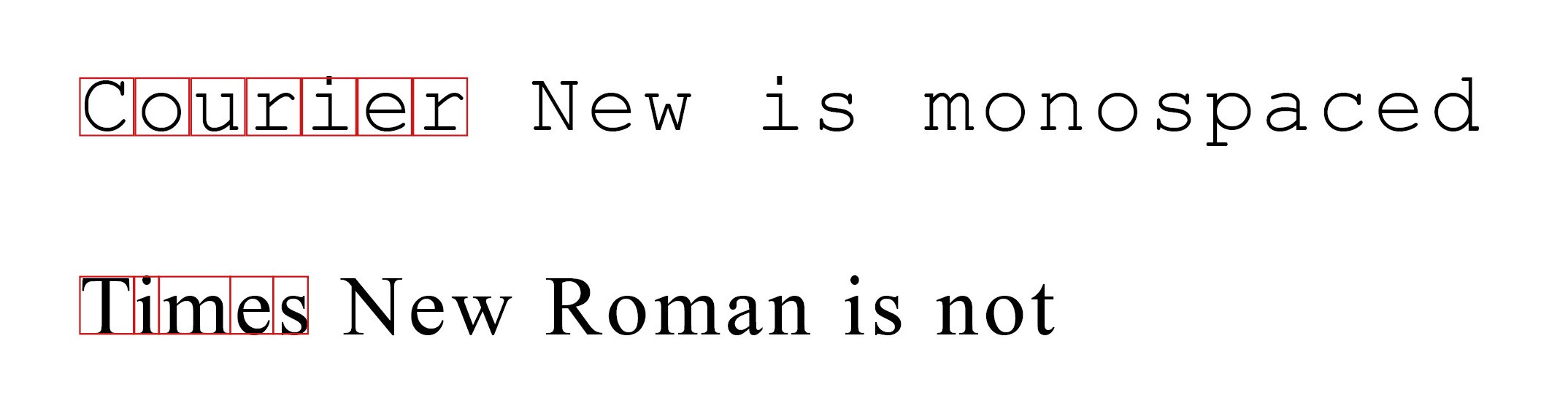
等宽字体与非等宽字体
If you’ve read a few of my other pieces, you already know that I’m kinda backwards. I enjoy old tech (where applicable) and the nostalgia and focus associated with using it. So, it comes of no surprise, that I have a thing for old typewriter and computer fonts.
如果您已经阅读了其他几篇文章,那么您已经知道我有点倒退。 我喜欢旧技术(在适用的地方)以及与使用它相关的怀旧和专注。 因此,拥有一台老式打字机和计算机字体就不足为奇了。
As I am working as a graphics designer, I naturally work a lot with typography and I stumble across new and old fonts on a regular basis. This is the source of my habit collecting fontsets that I like. Especially monospaced fonts.
在担任图形设计师的过程中,我自然会从事很多排版工作,并且会定期偶然发现新旧字体。 这是收集我喜欢的字体集的习惯的来源。 特别是等宽字体。
If you’re a font-afficionado as well, read on to get to know some of the most beautiful and practical monospaced fonts.
如果您也是字体狂热者,请继续阅读以了解一些最美丽,最实用的等宽字体。
等宽字体 (Monospace fonts)
What does “monospace” mean?
“等宽”是什么意思?
Simple answer: All letters take up the same horizontal space. They all have the same width. This was necessary, back in the day of typewriters and early computers. Typewriters had a fixed number of letters, that could fit into any one line of text, so the letters all had to be the same width. It was similar on early computers, like the C64 and early IBM compatibles. These old computers usually were capable of either showing 40 or 80 characters in a line. Imagine them as separate blocks, that could be inhabited by a character/letter. It was not possible of showing a single letter “between” two blocks, so again, all the characters of a fontset had to have the same width. Each letter had to fit exactly in one block.
简单的答案:所有字母都占据相同的水平空间。 它们都具有相同的宽度。 早在打字机和早期计算机时代,这是必要的。 打字机有固定数量的字母,可以容纳任意一行文本,因此字母的宽度必须相同。 在早期的计算机上,例如C64和早期的IBM兼容机,情况与此相似。 这些旧计算机通常能够在一行中显示40或80个字符。 可以将它们想象成一个单独的块,一个字符/字母可能会占用它们。 不可能在两个块之间显示单个字母,所以同样,字体集的所有字符都必须具有相同的宽度。 每个字母都必须完全适合一个块。
Modern fonts today have slimmer (i.e. “l”) or wider letters (i.e. “B”) and are spaced accordingly. The advantage of this is a better use of available space and a more natural looking typography.
当今的现代字体具有更细的字体(即“ l”)或更宽的字母(即“ B”),并相应地隔开。 这样做的好处是可以更好地利用可用空间和更自然的字体。
But monospaced fonts also have several advantages. They’re still being used in machine-processed typography (like in contracts or cheques) and can easily be identified by OCR software (text recognizing software). As the tech behind the software improves though, the “need” for monospaced fonts disappears.
但是等距字体也有几个优点。 它们仍在机器处理的版式中使用(如合同或支票),并且可以通过OCR软件(文本识别软件)轻松识别。 但是,随着软件背后技术的改进,等宽字体的“需求”消失了。
What’s left is people li
相关文章

等宽字体 Monospaced Font

树莓派入门之—树莓派3B+不支持ExFAT格式而启动不了的解决方案
树莓派3B+插入电源后状态灯只有红灯常亮,无法接入屏幕
树莓派4B爽上流安装python3的OpenCV(人脸检测识别—门禁“环境搭建篇”)

【方法】树莓派开机使用教程(看这个就够了)
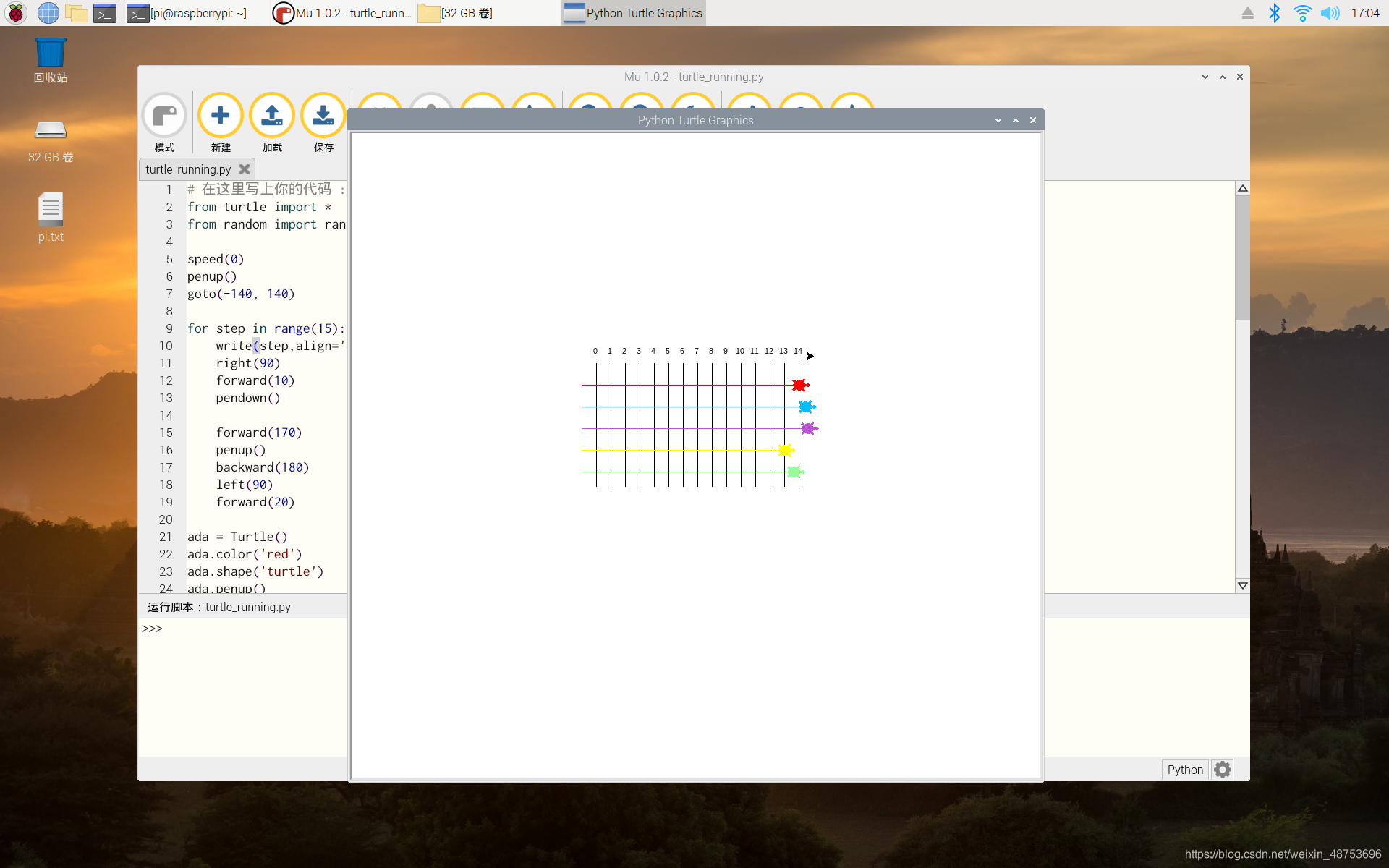
树莓派开箱+上手python小游戏
【树莓派】系统刷机教程
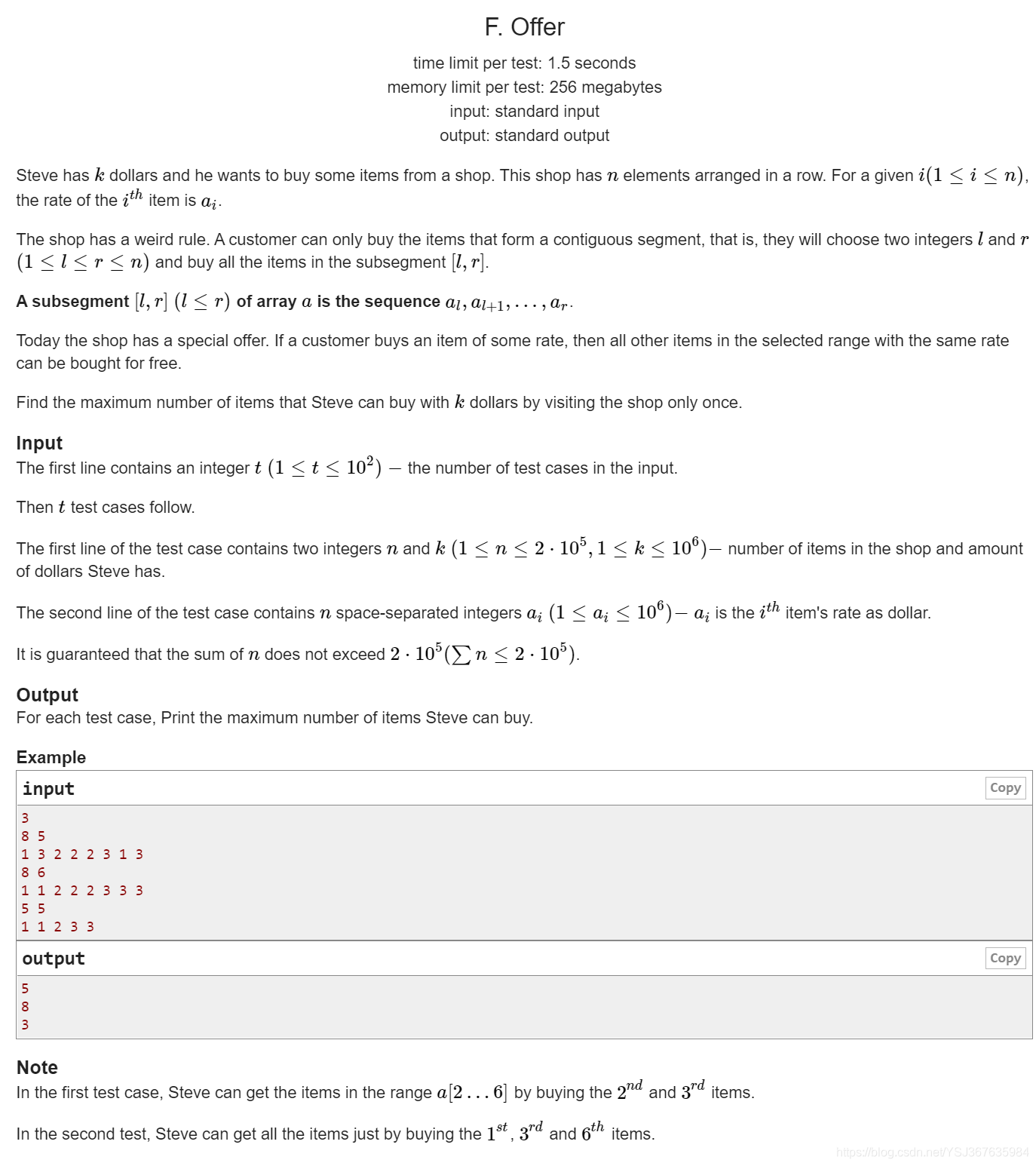
codeforse比赛:Noobs Round #2 (Div. 4) by Rudro25

树莓派之老的方式重刷Raspbian系统-2015

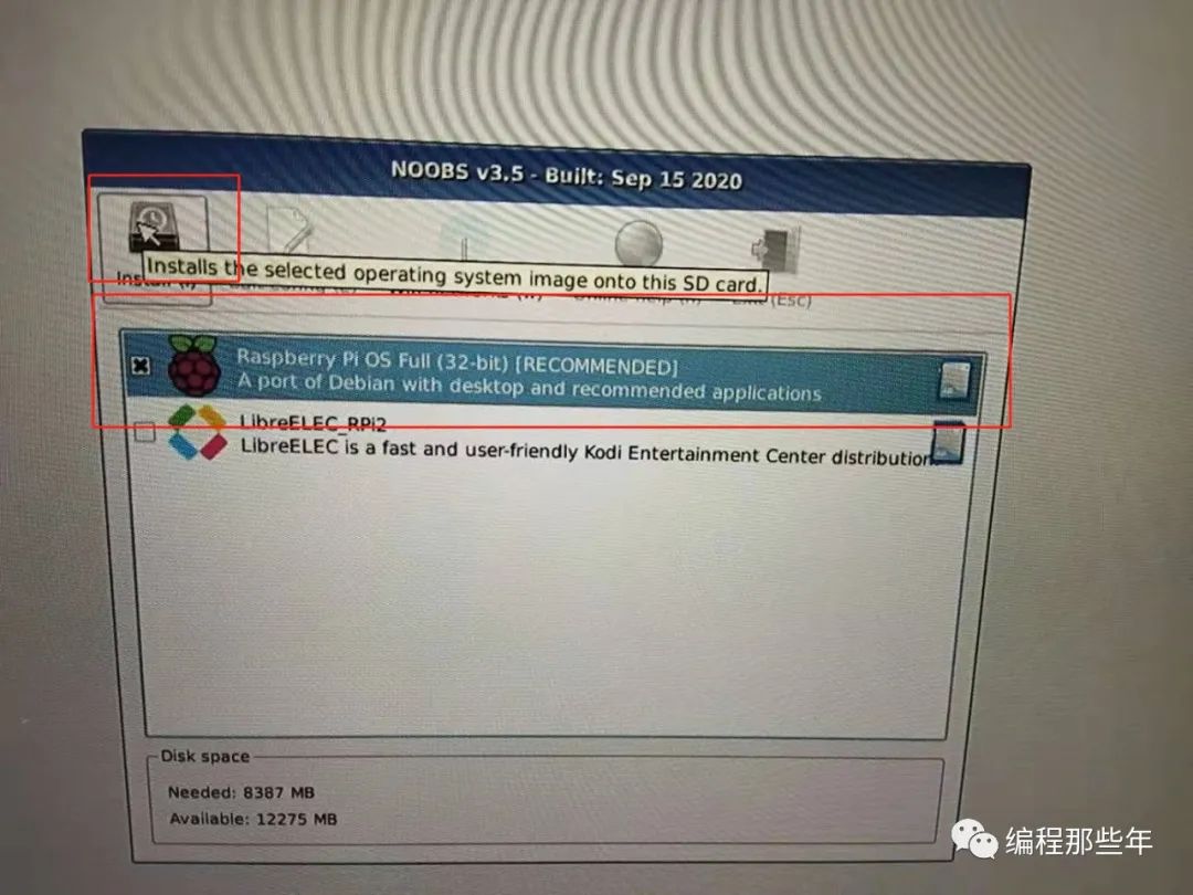
树莓派安装NOOBS失败
树莓派新手通过NOOBS一键安装系统

安装配置树莓派的最佳工具——NOOBS
树莓派 Learning 001 装机 ---之 1 安装NOOBS系统

树莓派入门(四)—— 使用NOOBS为树莓派4B安装系统

Raspberry pi,一个好玩的派:第四季 NOOBS

【树莓派】树莓派4无痛安装系统(NOOBS篇)