在工作中经常遇到要求图片自适应的需求,下面就谈一下我在工作中经常使用的一些方法
- 单独使用img标签的情况
单独使用img的时候,可以只设置width就可以了,height不用设置,因为img不设置height,它会自动根据图片的比例设置自适应高度
例如:
<!doctype html>
<html lang="en">
<head><meta charset="UTF-8"><meta name="viewport"content="width=device-width, user-scalable=no, initial-scale=1.0, maximum-scale=1.0, minimum-scale=1.0"><meta http-equiv="X-UA-Compatible" content="ie=edge"><title>Document</title><style>.imgs{width:500px;}</style>
</head>
<body>
<img src="./11-min.jpg" alt="" class="imgs">
</body>
<script>
</script>
</html>
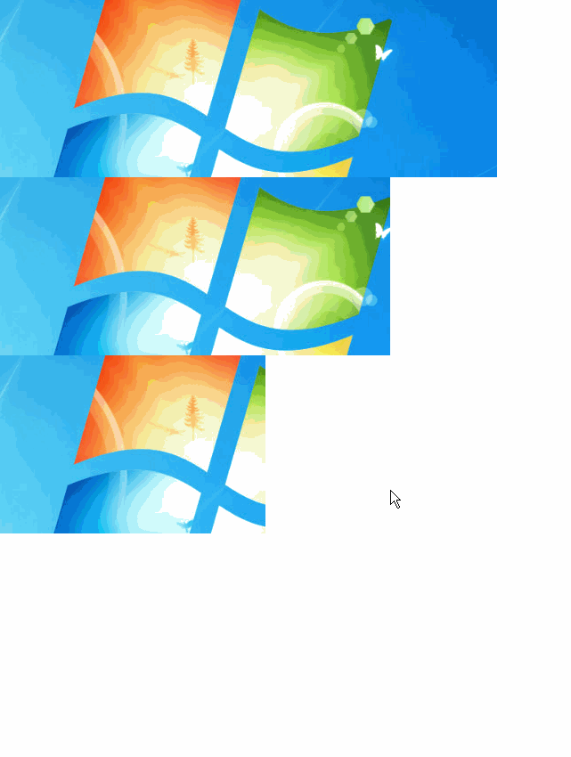
显示效果:
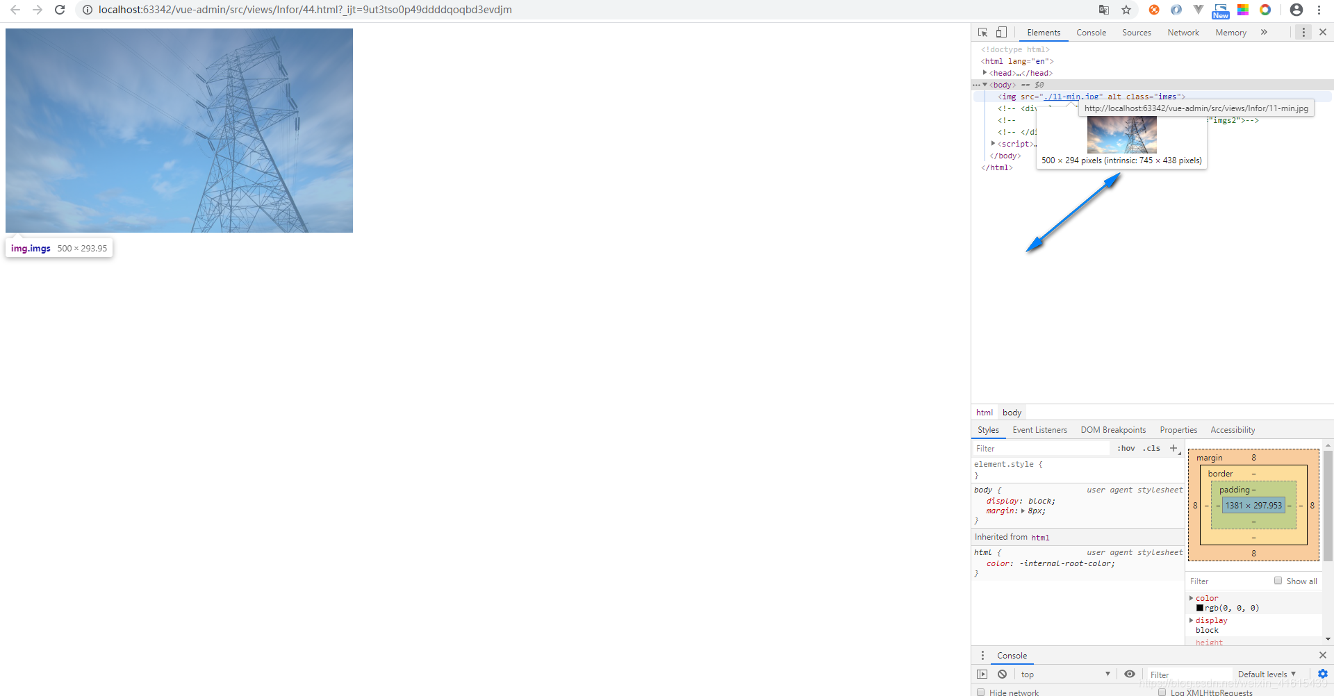
在上面的例子中图片的原本的分辨率是745*438,img标签设置了width:500px而且没有设置height,所以根据自适应的比例height变成了294px(500*(745/438))
2.在div中嵌入img标签
div的样式:按照设计稿设置width,height以及添加position: relative;,例如
width:400px;height: 219px;position: relative;img标签的样式:按照设计稿设置width,以及设置在div居中的样式,例如:
width: 100%;position:absolute;top: 50%;left: 50%;transform: translate(-50%, -50%);完整代码:
<!doctype html>
<html lang="en">
<head><meta charset="UTF-8"><meta name="viewport"content="width=device-width, user-scalable=no, initial-scale=1.0, maximum-scale=1.0, minimum-scale=1.0"><meta http-equiv="X-UA-Compatible" content="ie=edge"><title>Document</title><style>.background-div{width:400px;/*padding:5px;*//*overflow: hidden;*/height: 219px;position: relative;}.imgs2{width: 100%;position:absolute;top: 50%;left: 50%;transform: translate(-50%, -50%);}</style>
</head>
<body><div class="background-div"><img src="./11-min.jpg" alt="" class="imgs2"></div>
</body>
<script>
</script>
</html>
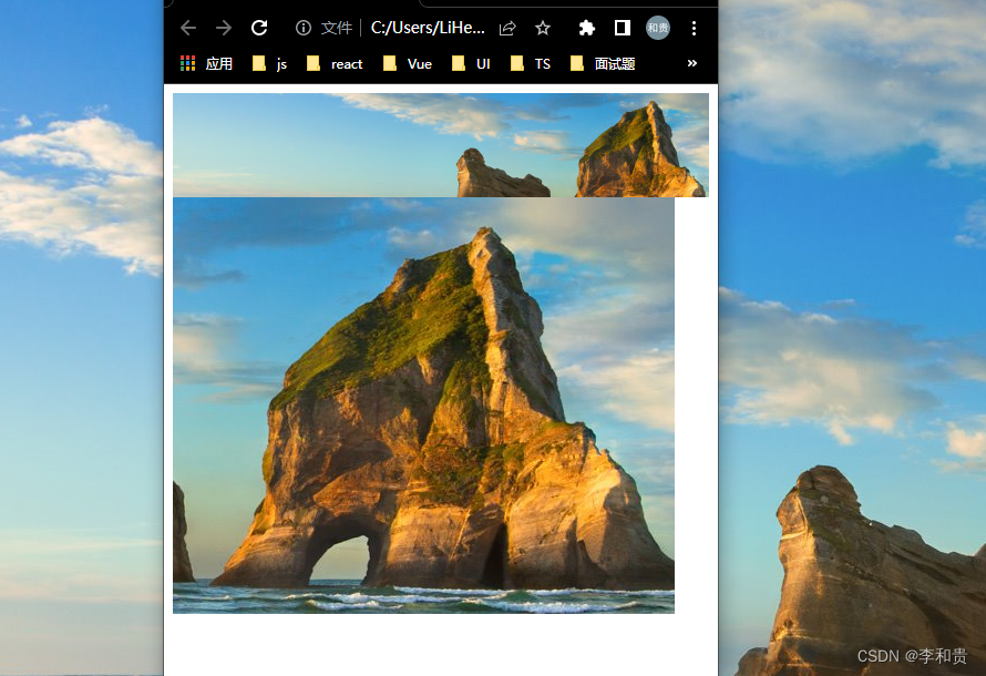
显示如下:
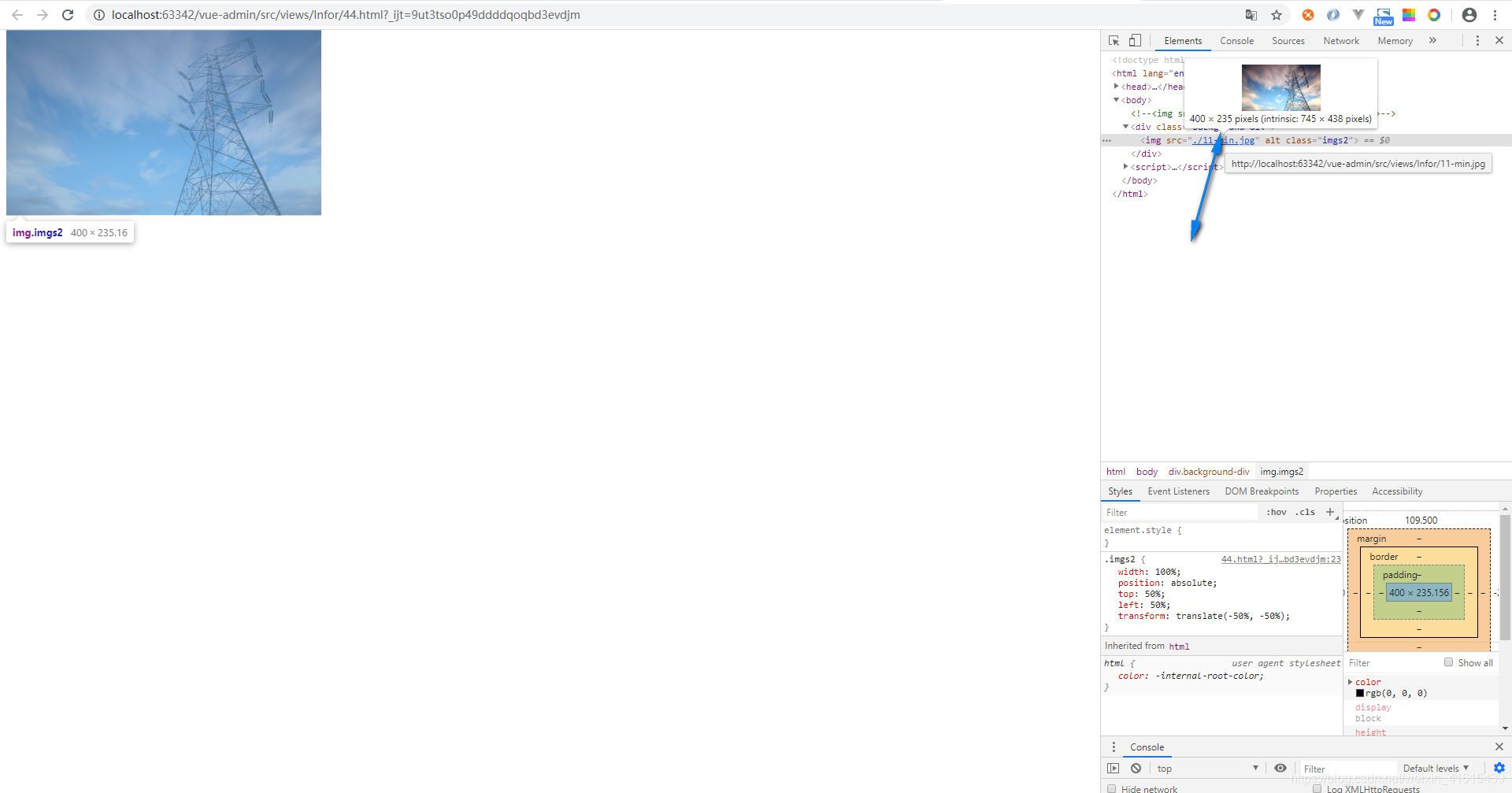
在上面的例子中图片的原本的分辨率是745*438,img标签设置了width:400px而且没有设置height,所以根据自适应的比例height变成了235px(400*(745/438))
3.使用背景图片(适应不同的屏幕分辨率)
3.1使用rem单位设置height,width以及配合background-size: contain;
例如:
width: p2r(1920);overflow: hidden;height: p2r(624);background: url("../../../../assets/images/baner6.png") 0 0 no-repeat;background-size: contain;上面的p2r()是一个px转换rem的sass函数,
3.2使用百分比单位设置height,width以及配合background-size: contain;
例如:
width:38.8%;height:45.2%;background: url("./11-min.jpg") 0 0 no-repeat;background-size: contain;完整代码:
<!doctype html>
<html lang="en">
<head><meta charset="UTF-8"><meta name="viewport"content="width=device-width, user-scalable=no, initial-scale=1.0, maximum-scale=1.0, minimum-scale=1.0"><meta http-equiv="X-UA-Compatible" content="ie=edge"><title>Document</title><style>html, body, div, span, applet, object, iframe,h1, h2, h3, h4, h5, h6, p, blockquote, pre,a, abbr, acronym, address, big, cite, code,del, dfn, em, img, ins, kbd, q, s, samp,small, strike, strong, sub, sup, tt, var,b, u, i, center,dl, dt, dd, ol, ul, li,fieldset, form, label, legend,table, caption, tbody, tfoot, thead, tr, th, td,article, aside, canvas, details, embed,figure, figcaption, footer, header, hgroup,menu, nav, output, ruby, section, summary,time, mark, audio, video {margin: 0;padding: 0;// border: 0;font-size: 100%;font: inherit;vertical-align: baseline;}/* HTML5 display-role reset for older browsers */article, aside, details, figcaption, figure,footer, header, hgroup, menu, nav, section {display: block;}body {line-height: 1;font-size:15px;}ol, ul {list-style: none;}blockquote, q {quotes: none;}blockquote:before, blockquote:after,q:before, q:after {content: '';content: none;}table {border-collapse: collapse;border-spacing: 0;}html,body{height:100%;}.background-div{width:38.8%;height:45.2%;background: url("./11-min.jpg") 0 0 no-repeat;background-size: contain;}</style>
</head>
<body><div class="background-div"></div>
</body>
<script>
</script>
</html>
上面例子中width以及height的百分比是根据选择一个屏幕分辨率除以图片的分辨率得到的,例如屏幕的分辨率是1920*1080,图片的分辨率745*438,但是在显示区域的高度只有969,所以div的设置成width:38.8%(745/1920),height:45.2%(438/969)
显示如下: