AlertDialog
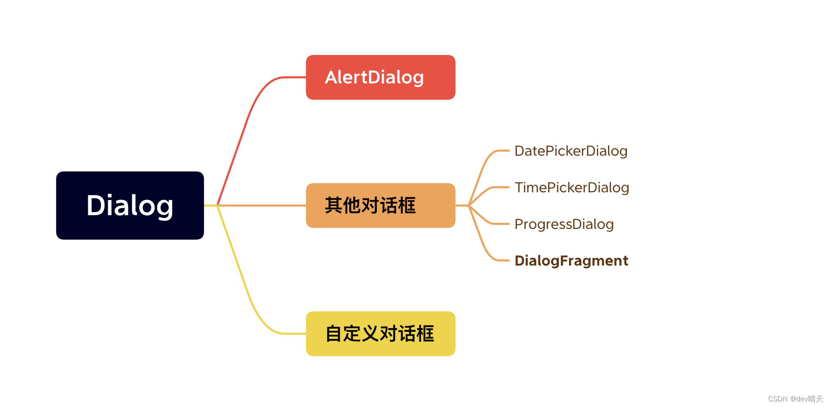
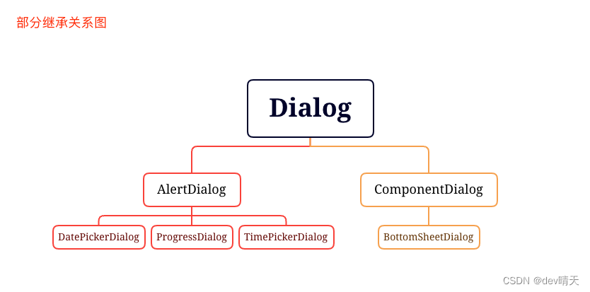
Dialog类是所有弹窗的父类,官方建议我们不要直接实例化它,而是使用其子类来获取实例。AlertDialog是系统提供的一个直接子类,它能帮助我们快速构建出不同类型的弹窗。接下来就看下各种类型弹窗的使用。
1、普通对话框
/*** AlertDialog默认UI样式* */
private fun showNormalAlertDialog() {val builder = AlertDialog.Builder(this).setIcon(R.mipmap.ic_launcher).setTitle("Dialog Title").setMessage("Dialog Message").setPositiveButton("Sure", object : DialogInterface.OnClickListener {override fun onClick(dialog: DialogInterface?, which: Int) {Toast.makeText(applicationContext, "Sure", Toast.LENGTH_SHORT).show()}}).setNegativeButton("Cancel", object : DialogInterface.OnClickListener {override fun onClick(dialog: DialogInterface?, which: Int) {Toast.makeText(applicationContext, "Cancel", Toast.LENGTH_SHORT).show()}})//Neutral按钮,显示在dialog的最左面。.setNeutralButton("Neutral", object : DialogInterface.OnClickListener {override fun onClick(dialog: DialogInterface?, which: Int) {Toast.makeText(applicationContext, "Neutral", Toast.LENGTH_SHORT).show()}})val dialog = builder.create()dialog.show()
}

2、单选对话框
private fun showSingleChoiceAlertDialog(){val subj = arrayOf("android", "linux", "java", "ios", "c", "html")val builder = AlertDialog.Builder(this@AlertDialogActivity).setIcon(R.mipmap.ic_launcher).setTitle("单选对话框")// 第二个参数为默认选中项 在这里设为第一项.setSingleChoiceItems(subj, 0) { dialog, which ->Toast.makeText(this@AlertDialogActivity, "我选择" + subj[which] + "这门课", Toast.LENGTH_SHORT).show()}.setPositiveButton("提交") { dialog, which ->Toast.makeText(this@AlertDialogActivity, "您已经提交您的选择", Toast.LENGTH_SHORT).show()}.setNeutralButton("取消"){dialog, which ->Toast.makeText(this@AlertDialogActivity, "您点击了取消按钮", Toast.LENGTH_SHORT).show()}val dialog = builder.create()dialog.show()}

3、多选对话框
private fun showMultipleChoiceAlertDialog() {val subj = arrayOf("android", "linux", "java", "ios", "c")val builder = AlertDialog.Builder(this).setIcon(R.mipmap.ic_launcher).setTitle("多选对话框").setMultiChoiceItems(subj, null) { dialog, which, isChecked ->if (isChecked) {Toast.makeText(this@AlertDialogActivity,"我喜欢" + subj[which],Toast.LENGTH_SHORT).show()} else {Toast.makeText(this@AlertDialogActivity,"我不喜欢" + subj[which],Toast.LENGTH_SHORT).show()}}.setPositiveButton("提交") { dialog, which ->Toast.makeText(this@AlertDialogActivity, "您已经提交您的选择", Toast.LENGTH_SHORT).show()}.setNeutralButton("取消") { dialog, which ->Toast.makeText(this@AlertDialogActivity, "您关闭了弹窗", Toast.LENGTH_SHORT).show()}val dialog = builder.create()dialog.show()}

4、列表对话框
/*** 列表对话框,内容多了就可滚动。这个dialog感觉没啥用。* ps:当单选、多选对话框的内容多了也可滚动。* */private fun showListAlertDialog() {val subj = arrayOf("android", "linux", "java", "ios", "c","kotlin")val builder = AlertDialog.Builder(this).setIcon(R.mipmap.ic_launcher).setTitle("列表对话框").setItems(subj) { dialog, which ->Toast.makeText(this@AlertDialogActivity, "您选择了" + subj[which], Toast.LENGTH_SHORT).show()}val dialog = builder.create()dialog.show()}

5、自定义对话框
AlertDialog的UI我们不满意时也是可以稍加定制的。
/*** 基于AlertDialog进行自定义对话框* 标题、title的UI格式已经被定制过了,我们可以定义其下方区域的ui* */private fun showCustomAlertDialog() {val builder = AlertDialog.Builder(this)builder.setIcon(R.mipmap.ic_launcher)builder.setTitle("Custom AlertDialog")val inflater = LayoutInflater.from(this)val v: View = inflater.inflate(R.layout.layout_custom_alert_dialog, null)builder.setView(v)val dialog = builder.create()dialog.show()}

6、小结
可以看出AlertDialog的UI是系统帮我们定制过的:
(1)上方区域:左上角icon、iocn旁边是标题。
(2)下方区域:不同类型的AlertDialog下方区域各自实现。
系统还提供了api可自定义下方区域的UI。
其他对话框
1、DatePickerDialog
系统提供的一个默认的日期选择对话框
/**context – the parent contextthemeResId – the resource ID of the theme against which to inflate this dialog,or 0to use the parent context's default alert dialog themelistener – the listener to call when the user sets the dateyear – the initially selected yearmonthOfYear – the initially selected month of the year(0-11 for compatibility with Calendar.MONTH)dayOfMonth – the initially selected day of month(1-31,depending on month)*/
public DatePickerDialog (@NonNull Context context,@StyleRes int themeResId,@Nullable OnDateSetListener listener,int year,int monthOfYear,int dayOfMonth)
private fun datePickerDialog() {DatePickerDialog(this, object : DatePickerDialog.OnDateSetListener {override fun onDateSet(view: DatePicker?, year: Int, month: Int, dayOfMonth: Int) {Toast.makeText(applicationContext, "$year-$month-$dayOfMonth", Toast.LENGTH_SHORT).show()}}, 2023, 3, 15).show()
}
上面是默认的UI,然而它还有另外一种UI,只需构造中传递一个UI参数AlertDialog.THEME_HOLO_LIGHT控制下即可:

2、TimePickerDialog
系统提供的一个默认的时间选择对话框
```java
/*** context – the parent context** themeResId – the resource ID of the theme to apply to this dialog** listener – the listener to call when the time is set** hourOfDay – the initial hour** minute – the initial minute** is24HourView – Whether this is a 24 hour view, or AM/PM.** */
public TimePickerDialog(Context context, int themeResId, OnTimeSetListener listener,int hourOfDay, int minute, boolean, is24HourView)
private fun timePickDialog() {TimePickerDialog(this, object : TimePickerDialog.OnTimeSetListener {override fun onTimeSet(view: TimePicker?, hourOfDay: Int, minute: Int) {// todo}},22,56,true).show()}

上面是默认的UI,然而它还有另外一种UI,只需构造中传递一个UI参数AlertDialog.THEME_HOLO_LIGHT控制下即可:

3、ProgressDialog
已经弃用,官方建议使用ProgressBar代替。
4、DialogFragment
DialogFragment本质上是一个Fragment,也就具有Fragment所拥有的生命周期。在使用时,更容易通过生命周期回调来管理弹窗。对于复杂样式的弹窗,使用DialogFragment更加方便和高效。
自定义Dialog
系统提供的AlertDialog还是有一定的局限性的,开发中不一定会满足我们的需求,此时我们就需要自定义Dialog了。
最近在开发购物车流程中看到UI设计了好多弹窗,这个些弹窗有相似点:
- 底部弹窗
- 顶部两个角是圆角
- 各个弹窗各自内容自定义

接下来就以这个简单的需求来实现下自定义Dialog
1、核心代码
/*** Create by SunnyDay /04/23 18:06:24*/
class BottomDialog @JvmOverloads constructor(@UiContext mContext: Context,dialogStyle: Int = R.style.BottomDialog,@LayoutRes layoutId: Int
) : Dialog(mContext, dialogStyle) {init {setContentView(layoutId)makeDialogBottom()}private fun makeDialogBottom() {window?.apply {setGravity(Gravity.BOTTOM)attributes.apply {width = ViewGroup.LayoutParams.MATCH_PARENTheight = ViewGroup.LayoutParams.WRAP_CONTENT}}}fun <T : View> getViewById(resId: Int): T {return findViewById<View>(resId) as T}
}
2、BottomDialog#style
稍微处理下dialog的样式
<!--自定义dialog的样式--><style name="BottomDialog" parent="@style/AlertDialog.AppCompat"><!--无边框--><item name="android:windowFrame">@null</item><!--浮现在activity之上--><item name="android:windowIsFloating">true</item><!--半透明--><item name="android:windowIsTranslucent">false</item><!--无标题--><item name="android:windowNoTitle">true</item><!--提示框背景--><item name="android:windowBackground">@android:color/transparent</item><!-- 触摸dialog以外的地方可关闭dialog--><item name="android:windowCloseOnTouchOutside">true</item></style>
3、BottomDialog#bg
白色背景&上面两个角是圆角
<?xml version="1.0" encoding="utf-8"?>
<shape xmlns:android="http://schemas.android.com/apk/res/android"android:shape="rectangle"><solid android:color="@color/white" /><cornersandroid:topLeftRadius="20dp"android:topRightRadius="20dp" />
</shape>
4、食用
private fun showCustomDialog() {//注意这里直接使用第三个参数时需要写参数名val bottomDialog = BottomDialog(this, layoutId = R.layout.dialog_permission)bottomDialog.show()bottomDialog.getViewById<View>(R.id.sure).setOnClickListener {Toast.makeText(applicationContext,"got permission !",Toast.LENGTH_SHORT).show()bottomDialog.dismiss()}bottomDialog.getViewById<View>(R.id.cancel).setOnClickListener {Toast.makeText(applicationContext,"no permission !",Toast.LENGTH_SHORT).show()bottomDialog.dismiss()}}
小结
1、本章能够了解到
- AlertDialog 基本用法
- Dialog的关系图
- 如何自定义dialog
- @JvmOverloads关键字作用
- kotlin具名参数注意点
2、感悟
有没有发现一个问题,dialog需要的context我们传递非activity的context(如service的或者Application的)会怎样?dialog深究起来也是一块知识点,以后再总结喽。完事,溜了~
官方文档