文章目录
- 一、移动 Web 开发基础概念
- 1. 像素
- (1) 分辨率
- (2) 物理像素
- (3) CSS 像素
- (4) 设备像素比
- (5) 标清屏和高清屏
- (6) 缩放
- (7) PPI / DPI
- 2. 视口 viewport
- 二、移动 Web 开发基础知识
- 1. box-sizing
- 2. 图标字体
- 3. flex 布局
- (1) 什么是 flex 布局
- (2) flex 布局的基本概念
- (3) flex 容器的属性
- (4) flex 项目的属性
- 4. 媒体查询
- (1) 什么是媒体查询(media query)
- (2) 为什么需要媒体查询
- (3) 媒体类型
- (4) 媒体查询中的逻辑
- (5) 媒体特征表达式
- (6) 媒体查询策略
- 5. 移动端常用单位
- 三、响应式布局
- 1. 概念
- 2. 原理
- 3. 结构、内容、布局
- 4. 优、缺点
- 5. 栅格系统
- 四、移动端屏幕适配
- 1. 介绍
- (1) 与响应式布局的关系
- 2. 简单适配
- 3. 通用适配
一、移动 Web 开发基础概念
1. 像素
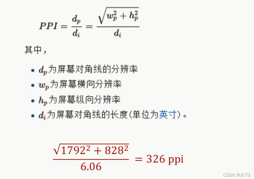
(1) 分辨率
- 1798 x 828 像素分辨率:
横向有 828 个点,纵向有 1792 个点
(2) 物理像素
- 物理像素(physical pixel),也可以叫做设备像素(dp:device pixel)
- 实际开发中不会以物理像素为准
(3) CSS 像素
- CSS 像素,也可以叫做逻辑像素(logical pixel)、设备独立像素(dip:device independent pixel)
- 是实际开发中使用的像素
.box {width: 200px;height: 200px;
}
(4) 设备像素比
- 设备像素比(dpr:device pixel ratio)
- dpr = 设备像素 / CSS 像素(缩放比是 1 的情况下)
dpr = 2 表示 1 个 CSS 像素用 2x2 个设备像素来绘制

(5) 标清屏和高清屏

(6) 缩放
- 缩放改变的是 CSS 像素的大小
- 缩放——放大

- 缩放——缩小

(7) PPI / DPI
- PPI:Pixels Per Inch
- DPI:Dots Per Inch
- 每英寸的物理像素点
2. 视口 viewport
- 设置视口:
<meta name="viewport" content="width=device-width, initial-scale=1, user-scalable=no, maximum-scale=1, minimum-scale=1">
- 获取视口宽度:
<script>console.log(window.innerWidth);console.log(document.documentElement.clientWidth);console.log(document.documentElement.getBoundingClientRect().width);var viewWidth = document.documentElement.clientWidth || window.innerWidth;// 兼容性问题,不要用// console.log(screen.width);// dprconsole.log(window.devicePixelRatio);
</script>
二、移动 Web 开发基础知识
1. box-sizing
box-sizing 的两个值:
- content-box
盒模型宽 / 高 = width / height + padding + border
(向外扩张) - border-box
盒模型宽 / 高 = width / height
(向内压缩)
2. 图标字体
- 图标字体库:iconfont-阿里巴巴矢量图标库
- 引入方式:
<i class="iconfont icon-scan"></i>
3. flex 布局
(1) 什么是 flex 布局
- Flex 是 Flexible Box 的缩写,意为"灵活的盒子"或"弹性的盒子",所以 flex 布局一般也叫作"弹性布局"
(2) flex 布局的基本概念
- flex 容器(flex container):
采用 flex 布局的元素,称为 flex 容器
.box {display: flex | inline-flex;
}
- flex 项目(flex item):
flex 容器的所有子元素自动成为容器成员,称为 flex 项目
(只是子元素成为容器成员,孙子元素等不会成为容器成员)

- 项目默认沿主轴(main axis)排列
(3) flex 容器的属性
- display 属性
display 属性决定是否使用flex布局
flex:将对象作为弹性伸缩盒显示
inline-flex:将对象作为内联块级弹性伸缩盒显示
.box {display: flex | inline-flex;
}
- flex-direction 属性
flex-direction 属性决定主轴的方向(即项目的排列方向)
① row(默认值):主轴为水平方向,起点在左端
② row-reverse:主轴为水平方向,起点在右端
③ column:主轴为垂直方向,起点在上沿
④ column-reverse:主轴为垂直方向,起点在下沿
.box {flex-direction: row | row-reverse | column | column-reverse;
}
- flex-wrap 属性
默认情况下,项目都排在一条线(又称 “轴线” )上
flex-wrap 属性定义,如果一条轴线排不下,如何换行
① nowrap(默认):不换行
② wrap:换行,第一行在上方
③ wrap-reverse:换行,第一行在下方
.box{flex-wrap: nowrap | wrap | wrap-reverse;
}
- flex-flow 属性
flex-flow 属性是 flex-direction 属性和 flex-wrap 属性的简写形式,默认值为 row nowrap
.box {flex-flow: <flex-direction>; || <flex-wrap>;
}
- justify-content 属性
justify-content 属性定义了项目在主轴上的对齐方式
① flex-start(默认值):左对齐
② flex-end:右对齐
③ center: 居中
④ space-between:两端对齐,项目之间的间隔都相等(项目与边框之间没有间隔)
⑤ space-around:每个项目两侧的间隔相等;所以,项目之间的间隔比项目与边框的间隔大一倍
.box {justify-content: flex-start | flex-end | center | space-between | space-around;
}
- align-items 属性
align-items 属性定义项目在交叉轴上如何对齐
① flex-start:交叉轴的起点对齐
② flex-end:交叉轴的终点对齐
③ center:交叉轴的中点对齐
④ baseline: 项目的第一行文字的基线对齐
⑤ stretch(默认值):如果项目未设置高度或设为auto,将占满整个容器的高度
.box {align-items: flex-start | flex-end | center | baseline | stretch;
}
- align-content 属性
align-content 属性定义了多根轴线(多行)在交叉轴上的对齐方式
如果项目只有一根轴线(一行),该属性不起作用
① flex-start:与交叉轴的起点对齐
② flex-end:与交叉轴的终点对齐
③ center:与交叉轴的中点对齐
④ space-between:与交叉轴两端对齐,轴线之间的间隔平均分布
⑤ space-around:每根轴线两侧的间隔都相等;所以,轴线之间的间隔比轴线与边框的间隔大一倍
⑥ stretch(默认值):轴线占满整个交叉轴
.box {align-content: flex-start | flex-end | center | space-between | space-around | stretch;
}
(4) flex 项目的属性
- order 属性
order 属性定义项目的排列顺序
数值越小,排列越靠前,默认为 0
.item {order: <integer>;
}
- flex-grow 属性
flex-grow 属性定义项目的放大比例,默认为 0,即如果存在剩余空间,也不放大
① 如果所有项目的 flex-grow 属性都为 1,则它们将等分剩余空间(如果有的话)
② 如果一个项目的 flex-grow 属性为 2,其他项目都为 1,则前者占据的剩余空间将比其他项多一倍
③ 如果有的项目有 flex-grow 属性,有的项目有 width 属性,有 flex-grow 属性的项目将等分剩余空间
.item {flex-grow: <number>; /* default 0 */
}
- flex-shrink 属性
flex-shrink 属性定义了项目的缩小比例,默认为1,即如果空间不足,该项目将缩小
① 如果所有项目的 flex-shrink 属性都为 1,当空间不足时,都将等比例缩小
② 如果一个项目的 flex-shrink 属性为 0,其他项目都为 1,则空间不足时,前者不缩小
③ 负值对该属性无效
.item {flex-shrink: <number>; /* default 1 */
}
- flex-basis 属性
flex-basis 属性定义了在分配多余空间之前,项目占据的主轴空间(main size)
浏览器根据这个属性,计算主轴是否有多余空间
它的默认值为 auto,即项目的本来大小
.item {flex-basis: <length>; | auto; /* default auto */
}
- flex 属性
flex 属性是 flex-grow, flex-shrink 和 flex-basis 的简写,默认值为 0 1 auto(后两个属性可选)
该属性有两个快捷值:auto (1 1 auto) 和 none (0 0 auto)
.item {flex: none | [ <flex-grow> <flex-shrink>? || <flex-basis> ]
}
- align-self 属性
align-self 属性允许单个项目有与其他项目不一样的对齐方式,可覆盖 align-items 属性
默认值为 auto,表示继承父元素的 align-items 属性,如果没有父元素,则等同于 stretch
.item {align-self: auto | flex-start | flex-end | center | baseline | stretch;
}
4. 媒体查询
(1) 什么是媒体查询(media query)
@media screen and (min-width: 900px) {body {background-color: red;}
}
(2) 为什么需要媒体查询
- 一套样式不可能适应各种大小的屏幕
- 针对不同的屏幕大小写样式,让我们的页面在不同大小的屏幕上都能正常显示
(3) 媒体类型
- all (default)
- screen / print / speech
@media (min-width: 900px) {body {background-color: red;}
}@media print and (min-width: 900px) {body {background-color: red;}
}
(4) 媒体查询中的逻辑
- 与 ( and )
- 或 ( , )
- 非 ( not )
/*与*/
@media screen and (min-width: 900px) and (max-width: 1024px) {body {background-color: red;}
}
/*或*/
@media screen and (min-width: 1024px), (max-width: 900px) {body {background-color: red;}
}
@media screen and (min-width: 1024px), screen and (max-width: 900px) {body {background-color: red;}
}
/*非*/
@media not screen and (min-width: 900px) and (max-width: 1024px) {body {background-color: red;}
}
@media not screen and (min-width: 1024px), screen and (max-width: 900px) {body {background-color: red;}
}
(5) 媒体特征表达式
- width / max-width / min-width
- -webkit-device-pixel-ratio / -webkit-max-device-pixel-ratio / -webkit-min-pixel-ratio
- orientation: landscape 横屏 / portrait 竖屏
- height
- device-width / device-height
screen.width / screen.height - aspect-ratio 视口的宽高比
(6) 媒体查询策略
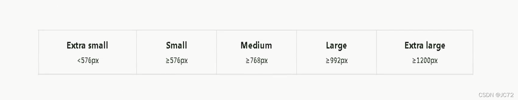
<style>/*css reset*/* {box-sizing: border-box;padding: 0;margin: 0;}body {padding-top: 200px;}img {width: 100%;height: 100%;}.row {width: 100%;display: flex;flex-wrap: wrap;}.col {padding-top: 10px;padding-bottom: 10px;background-color: rgba(86, 61, 124, 0.15);border: 1px solid rgba(86, 61, 124, 0.2);}/*断点xs: < 576pxsm: 576px ~ 768pxmd: 768px ~ 992pxlg: 992px ~ 1200pxxl: > 1200px断点怎么来的改变屏幕大小,当页面显示不正常的时候,你就需要设置断点了经验值预设一些*//*@media (max-width: 576px) {.col {width: 100%;}}@media (min-width: 577px) and (max-width: 768px) {.col {width: 50%;}}@media (min-width: 769px) and (max-width: 992px) {.col {width: 25%;}}@media (min-width: 993px) and (max-width: 1200px) {.col {width: 16.6666666667%;}}@media (min-width: 1201px) {.col {width: 8.333333333%;}}*//*pc first*//*.col {width: 8.333333333%;}@media (max-width: 1200px) {.col {width: 16.6666666667%;}}@media (max-width: 992px) {.col {width: 25%;}}@media (max-width: 768px) {.col {width: 50%;}}@media (max-width: 576px) {.col {width: 100%;}}*//*mobile first*/.col {width: 100%;}@media (min-width: 576px) {.col {width: 50%;}}@media (min-width: 768px) {.col {width: 25%;}}@media (min-width: 992px) {.col {width: 16.6666666667%;}}@media (min-width: 1200px) {.col {width: 8.33333333%;}}</style>
5. 移动端常用单位
- px:像素
- %:利用百分比设置宽度
- em:font-size 的倍数,可用于文字段落缩进
- rem:对应 html 的 font-size
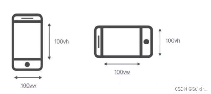
- vw:viewport width,50vw 即为视口宽度的 50%
- vh:viewport height,50vh 即为视口高度的 50%
三、响应式布局
1. 概念
- 2010 年 5 月由 Ethan Marcotte 提出的一个概念
- 一个网站兼容多种终端
- 响应式布局:对不同屏幕尺寸(大小)做出响应,并进行相应布局的一种移动 Web 开发方式
2. 原理
- 如何响应不同的屏幕尺寸
- 媒体查询
3. 结构、内容、布局
<body><!-- 结构 --><header class="header-container"><div class="container"><div class="header-logo-container"><!-- 内容 --><a href="###"><img src="img/logo.svg" alt="logo"></a></div><div class="header-nav-container"></div></div></header>
</body>
4. 优、缺点
- 优点:
一个网站能够兼容多种终端,不用为每种终端开发一个网站 - 缺点:
需要兼容多种终端,工作量大,效率低下;
代码累赘,加载时间长(在特定终端会出现无用代码) - 适用场景:
适用于结构比较简单的页面(展示性质的网站),比如企业站等;
不适用于结构复杂、交互多的页面(功能性网站),比如电商网站等
5. 栅格系统
- 响应式布局的一种实现方式
- 将页面栅格化
四、移动端屏幕适配
1. 介绍
- 移动端屏幕适配:使页面在移动端各种大小的屏幕上都能够正常显示的一种移动端开发方案
(1) 与响应式布局的关系
- 适应各种屏幕尺寸

- 移动端适配疑问
1)必须使用 rem ?
不是
px、%、em、rem、vw / vh 只要合适都可以使用
2)媒体查询只能用在响应式布局?
不是,只要合适都可以使用
2. 简单适配
- 1rem = viewWidth / 系数(18.75)
simple.js
(function () {'use strict';setRemUnit();window.addEventListener('resize', setRemUnit);function setRemUnit() {var docEl = document.documentElement;var ratio = 18.75;var viewWidth = docEl.getBoundingClientRect().width || window.innerWidth;docEl.style.fontSize = viewWidth / ratio + 'px';}
})();
3. 通用适配
(function () {'use strict';// dpr->scale = 1 / dprvar docEl = document.documentElement,viewportEl = document.querySelector('meta[name="viewport"]'),dpr = window.devicePixelRatio || 1,maxWidth = 540,minWidth = 320;dpr = dpr >= 3 ? 3 : (dpr >= 2 ? 2 : 1);docEl.setAttribute('data-dpr', dpr);docEl.setAttribute('max-width', maxWidth);docEl.setAttribute('min-width', minWidth);var scale = 1 / dpr,content = 'width=device-width, initial-scale=' + scale + ', maximum-scale=' + scale + ', minimum-scale=' + scale + ', user-scalable=no';if (viewportEl) {viewportEl.setAttribute('content', content);} else {viewportEl = document.createElement('meta');viewportEl.setAttribute('name', 'viewport');viewportEl.setAttribute('content', content);document.head.appendChild(viewportEl);}setRemUnit();window.addEventListener('resize', setRemUnit);function setRemUnit() {var ratio = 18.75;var viewWidth = docEl.getBoundingClientRect().width || window.innerWidth;// console.log(viewWidth);if (maxWidth && (viewWidth / dpr > maxWidth)) {viewWidth = maxWidth * dpr;} else if (minWidth && (viewWidth / dpr < minWidth)) {viewWidth = minWidth * dpr;}docEl.style.fontSize = viewWidth / ratio + 'px';}
})();